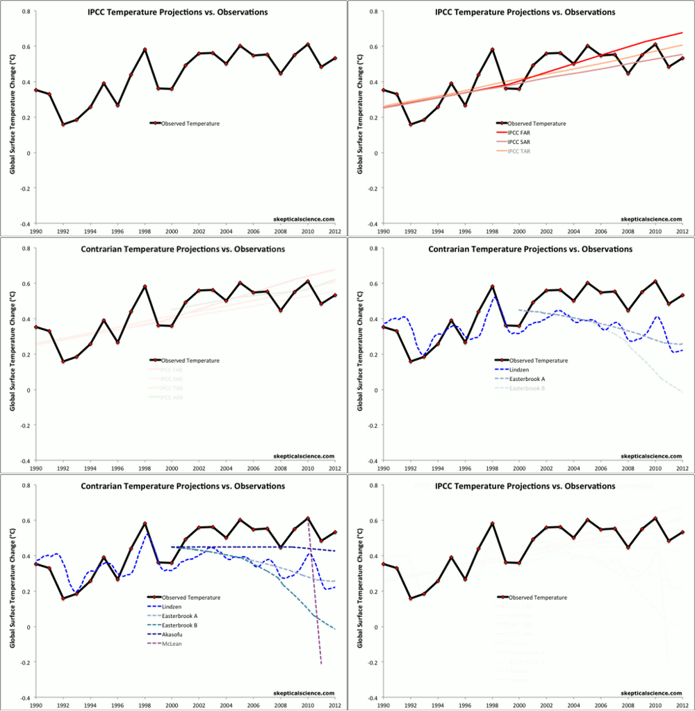

This animation compares the observed global temperature change since 1990 (black curve) to projections of global temperature change from the first four Intergovernmental Panel on Climate Change (IPCC) reports (red, pink, orange, green) and from various "climate contrarians" (blue, purple, green, gray dashed). The observations are given by the average of 3 primary global temperature datasets (NASA GISS, NOAA NCDC, and HadCRUT4). All of the IPCC projections have proven to be quite accurate, suggesting high reliability. The contrarian projections all underestimate the global warming substantially, and in fact they erroneously predict global cooling and are quite unreliable. Details of the projections are described here, and additional comparisons can be found in the Lessons from Past Predictions series.
 |
The Skeptical Science website by Skeptical Science is licensed under a Creative Commons Attribution 3.0 Unported License. |