In my under-graduate days, studying engineering some years ago (quite a few actually but the less said about that the better), one idea was drummed into us again and again. If you want to study any sort of system you absolutely need to define your ‘system boundaries’ correctly. What are the boundaries of the thing you are studying? Get this right and your analysis may be solid. Get it wrong and your analysis will be rubbish.
So when we think about Global Warming we need to be really certain that our ‘system boundaries’ are right. So what is the theory of Global Warming, in a nutshell? And what does this tell us about where we need to set our boundaries. Put at its simplest, Global Warming says that more GH Gases will cause an imbalance between the amount of energy the Earth receives from the Sun, and the energy it looses to Space. More of the GH gases make it harder for the Earth to loose energy to space, so heat starts to build-up here. And this heat build up can lead to higher temperatures.
So what does this tell us about what needs to be inside our ‘system boundary’?
Our system boundary needs to include anywhere where this extra heat can accumulate! To understand Global Warming we need to look at all the places where heat can go and account for all of them.
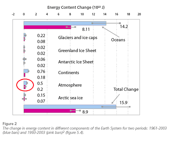
And this is what the scientists have done. This graph, taken from the IPCC’s 2007 report shows the estimates of how much heat has been added to different parts of the environment – melting ice, warming the land, air and oceans between 1961-2003 and 1993 - 2003.

I have highlighted the atmosphere part for a very simple reason. This is what most of us think of when we talk about ‘Global Warming’; that it is changes in the air temperature!
Yet look at the graph; warming of the atmosphere really is small potatoes! The main game in Global Warming is what happens in the Oceans. Around 90% of the heat added since 1961 has happened there. In contrast warming of the atmosphere is only around 3% of the heat.
Here is a different way of looking at the same thing with data from Church et al 2011
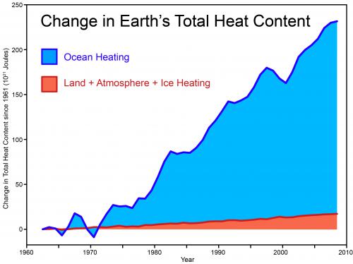
So if we were to set our ‘system boundary’ incorrectly and just looked at the atmosphere, we would be looking at only a very small part of the system and could easily reach a poor conclusion. Like trying to understand the Dog by just looking at its Tail!
So what has been happening in the oceans? How do we measure the data needed to produce these graphs? To understand this we need to measure temperatures down through the depths of the ocean at many points. Then by observing how these measurements change and knowing the thermal properties of sea water, its Specific Heat, we can start to calculate heat accumulation.
First a little bit of history. The very first measurements of deep ocean temperatures were performed with instruments lowered from a ship down into the ocean. This method is still used today for detailed studies and for looking at what is happening all the way to the sea bottom. But this method has a big disadvantage. A research ship is needed that can stop, lower a sensor platform over the side from a crane, and sample all the way down. This might take several hours to take measurements at one location. Then it moves on to another location. It is very slow and very expensive and doesn't actually cover much area.
In the 1960’s a better idea was developed. The Expendable Bathythermograph or XBT. A fairly simple, expendable device that could be dropped over the side of a ship while it was underway and report basic data as it sank. Then it just fell to the sea floor. And this didn’t just have to be done from research ships. Any commercial vessel could do it. So now there was a tool for gathering ocean temperature data cheaply from around the world. But it was limited to reporting the top 700 metres of the ocean.
Then through the 2000’s, a consortium of many nations began deploying a smarter answer; the Argo Float Array. This is a series of several thousand free floating ‘smart’ buoys that drift with the currents around the world’s oceans.
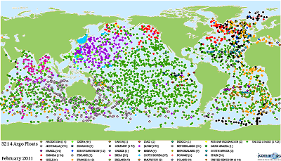

These buoys are able to auto-dive down to 2000 metres, measuring as they go, then surface and report their data, and their location via GPS, to satellites that collect the information. Now we have a more sophisticated measuring system for the world’s oceans. So what does all this data show us?
As the figure above suggests, most of the heat has gone into the oceans. But for the last decade or so Mother Nature has been playing some tricks!
Compare these two graphs which are from the National Oceanographic Data Centre (NODC) which also provides a range of other graphs looking at different aspects of sea level rise.
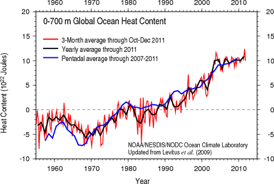
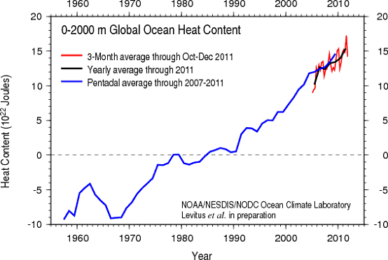
The upper graph shows data from the top 700 metres of the ocean. This is a combination of XBT data going back to the 1960’s and ARGO data. The second graph is showing data all the way down to 2000 metres. How can we have data to 2000 metres for those past decades when ARGO only began operation in the 2000’s? By combining data from 0-700 metres from the XBT’s, with deep data from the ‘lower a sensor over the side’ type measurement programs an estimate can be made of what was happening down deeper. But during the 2000’s we have live data from both depth ranges.
And the picture is rather strange! Up until the early 2000’s, the two trends are broadly similar. The top layer grew by about 1.7 x 10²³ joules while the entire 0-2000 range warmed by about 2.1 x 10²³ joules. The top layer contained about 80% of the added heat.
But for the last decade or so the top layer has nearly flat lined while the full range has continued warming. Since 2004 there is around 0.5 x 10²³ joules in the full depth that isn’t in the top layer! It must be down deeper, between 700 & 2000 metres. What is Mother Nature up to? How can the deeper water be warming if the upper layer isn’t?
Here both Climate Models and Oceanography can come to our rescue. In a paper published last year Meehl et al (2011) looked at what a range of different climate models predict might happen in the future. And one rather surprising result they found were ‘Hiatus periods’. Periods of a decade or so where air temperatures - that 3% part that we live in - seem to plateau. But it is what the various models show is happening in the oceans during these periods that is really interesting.
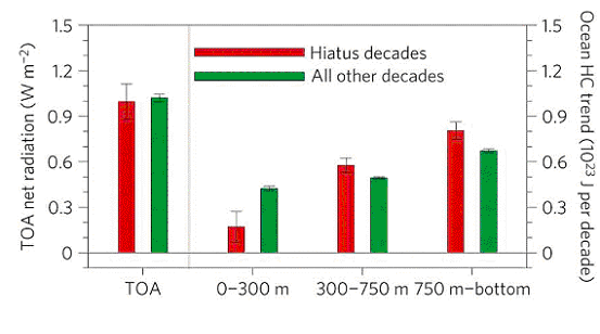
During ‘normal’ periods, more heat goes into the upper part of the oceans and less into the lower depths. But during the ‘Hiatus’ periods, the top of the ocean doesn’t accumulate nearly as much heat whereas the next lower levels accumulate more. Exactly what the current ocean data is telling us!
But why? How can heat reach these greater depths without also heating the top layer?
It’s all about circulation patterns in the ocean. The major circulation patterns are about large surface and bottom currents. Connecting these are regions of major up-welling and down-welling – locations where significant exchanges occur between the surface and the abyssal deeps. But these abyssal deeps aren’t at 2000 metres – more like 5,000 to 8,000 metres.
However, there are also regions in the open ocean with smaller scale vertical-mixing currents that combine the very surface layer with the next level down.
Here for example is the climate model simulation of the mixing currents that overturn the upper layers of the ocean across the Pacific.
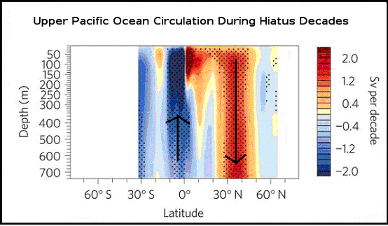
So all that Mother Nature has to do is crank these upper ocean circulation patterns up a notch for a period and heat is drawn down from the surface to the next level, to be replaced with colder water from below.
So lets consider what such a pattern will do to the Earth’s climate patterns while it lasts. The next lower level of the ocean will warm because warm water is being pumped down from above. The surface of the ocean won’t warm as much, if at all, because its heat is continually being pumped lower to be replaced by colder water. And because the ocean surface doesn’t warm very much during this period, the atmosphere doesn’t warm as much either. So from our rather limited perspective here on the surface it looks like warming has stopped. When in fact it is simply going on somewhere else. The Dog may have temporarily stopped wagging its Tail but the Dog is still trotting along.
And the models predict that these Hiatus periods last for a decade or so. Then the ocean heat patterns revert to their ‘normal’ structure. And the top layer of the ocean resumes normal heating. And then the Atmosphere resumes heating! So the Dog will resume wagging its Tail soon. It’s a Dog, it can’t help doing that.
So when you hear or read anywhere or are told by anyone that ‘warming stopped in (insert preferred date)’ the simple, observed fact is that it hasn’t stopped warming! It’s just that much of the warming has been happening somewhere else recently.
So anyone who says otherwise is simply falling into the most basic trap that any under-graduate engineer or scientist is taught to avoid. Not using the correct system boundary! And if the person saying this is a professional scientist or engineer what conclusion can we draw from their opinion? That they are incompetent? Or…?
When the first studies of the XBT data were produced in then early 2000’s, showing just how much heat had been added to the oceans, the climate science community labelled this ‘The Smoking Gun’. They knew that increased Greenhouse Gases had to be causing a heat accumulation – the understanding of the physics of this is very solid. But they knew also that the Surface Temperature records that had been compiled to date only showed where a small percentage of the extra heat was going. The surface was warming much as the climate modelling predicted but until they could begin to confirm what was happening in the oceans, they didn’t have enough of the pieces of the jigsaw puzzle. They knew how to draw their system boundaries.
The appearance of the first studies on Ocean Heat Content during the 2000’s would have been one of the significant factors in the IPCC increasing its level of confidence that AGW was real in its 4th report in 2007.
Because the pattern of where the heat is going says something very important about what is causing it. It is sometimes argued that the global warming we are observing is due to internal variability, a recovery from the Little Ice Age etc. These suggestions are always based on just the surface temperature record. For these ideas to be reasonable, heat has to come from some other part of the climate system in order to warm the atmosphere. If every other part of the climate system is also warming at the same time then this cannot be ‘internal variability’. And if the total heat in the system is accumulating this can’t be due to a ‘recovery’ from the Little Ice Age. This must be new heat being added today.
But the absolute clincher is that the amount of heat going into the oceans is so great that no other source of heat here on Earth could supply it. The first two graphs at the start of this post are absolute proof that something is disturbing the Earth’s external energy balance. And since we know that the Sun’s energy output has, if anything, been declining slightly over the last ½ century the only remaining possibility is something affecting the Earth’s ability to release heat to space. There are three candidates.
So both through many lines of evidence, and also by applying some basic engineering understanding, the idea that increased GH gases are the primary cause of the warming the Earth has seen in the last ½ century or so seems very solid. No other explanation fits the evidence.
It seems my old Professors were right; its simple really when you get your system boundaries right. Watch the Dog, not just its Tail!
So when someone tells you that warming has stopped they are simply wrong. Probably spending too much time just looking at the Dog's Tail.
Posted by Glenn Tamblyn on Friday, 17 February, 2012
 |
The Skeptical Science website by Skeptical Science is licensed under a Creative Commons Attribution 3.0 Unported License. |