There are three main versions of the instrumental temperature record, HadCRUT3 from the UK meteorological office, GISTEMP from NASA, and the NCDC dataset from NOAA. Of the three, HadCRUT3 shows the least warming over the last 15 years, and GISTEMP shows the most. The difference is quite striking:
| Dataset | 1997-2012 trend |
|---|---|
| HadCRUT3v | 0.013 ±0.142 °C/decade |
| NCDC | 0.049 ±0.132 °C/decade |
| GISTEMP | 0.103 ±0.143 °C/decade |
Given the short-term cooling influences which have been operating over the last decade, the GISTEMP trend is much as expected. But the HadCRUT3 and NCDC trends are much lower.
In the previous article we examined the problem of sampling a stratified data set, and how this impacts the HadCRUT3 temperature record. We saw that the land temperature anomalies are both higher and have been increasing faster than ocean temperature anomalies. However land temperatures are under-represented in the HadCRUT3 data over the last decade, and the proportion of land temperatures has been declining. These effects both contribute to an increasing cool bias in the HadCRUT3 data.
Is there another source of bias which might explain the divergence of the three datasets? Studies from the ECMWF and GISS have indentified one such source in the HadCRUT3 data: Poor coverage at high latitudes. Can we find any evidence which might confirm this?
Coverage maps for the three datasets, along with values for the proportion of the land and ocean area of the globe, are shown for the month of December 2010 in the following figure:

HadCRUT3 suffers from poor land coverage of the continental interiors apart from Europe and the USA - this effect was identified in the previous article. But both HadCRUT3 and the NCDC data omit the Arctic and Antarctic regions. Could this explain the lower trends of these datasets?
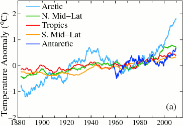
As with the land/ocean bias, a problem arises when our sample contains unrepresentative proportions of different strata from the population, where the strata behave differently from one another. We saw that the temperature data was stratified into land and ocean strata. Is the global temperature data also stratified by latitude? The University of Columbia group provide this figure based on the GISTEMP data:

Note that Arctic temperature anomalies are both higher and increasing more rapidly over recent decades than those for the rest of planet. The Northern mid-latitudes are also warmer than the global mean, but show little change since 2000. The Antarctic also shows a recent warming trend.
This is exactly the same problem as we saw in the previous article: The fastest warming regions of the globe being underrepresented in both the HadCRUT3 and NCDC datasets. The problem has only arisen during the last decade because that is the timescale over which Arctic temperature anomalies have been diverging from the rest of the planet.
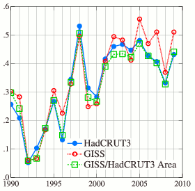
The GISTEMP dataset provides gridded global temperature estimates covering almost the entire planet over recent decades: This data allows us to estimate the effect of poor coverage in the other datasets. For each month, the temperature anomaly map can be modified to eliminate all the map cells which are missing from the corresponding month of the less complete data set. Then a global average temperature is calculated using only the remaining cells. The GISTEMP team did precisely this calculation for the HadCRUT3 data in Hansen et al (2010) figure 13 (full version):

The result is that if you reduce the coverage of GISTEMP to match HadCRUT3, the bulk of the difference between the two datasets disappears. The difference between the results can be explained by the poorer coverage of HadCRUT3.
All three temperature records provide gridded datasets, so it is fairly simple to reproduce this calculation; the only minor complication being that GISTEMP uses a different grid. The GISTEMP data was regridded to match the others, and then masked to match the poorer coverage of first the HadCRUT3 data, and then the NCDC data. Temperature series were calculated from the resulting maps. The resulting trends over recent periods in °C/decade are given in the following table:
| Period | GISTEMP | HadCRUT3v | GISTEMP masked to HadCRUT3v | NCDC | GISTEMP masked to NCDC |
|---|---|---|---|---|---|
| 1990-2011 | 0.173 | 0.141 | 0.131 | 0.149 | 0.140 |
| 1995-2011 | 0.130 | 0.081 | 0.076 | 0.098 | 0.090 |
| 1997-2011 | 0.103 | 0.013 | 0.017 | 0.049 | 0.036 |
Note that when the GISTEMP data is masked to reduce the coverage to match one of the other datasets, the resulting temperature trend is a good match for the trend in the incomplete dataset. The datasets agree over the regions where they share coverage. The differences in the global trends between the three datasets must arise from the regions where the HadCRUT3 and NCDC datasets have no coverage.
The GISTEMP result differs because GISTEMP covers the polar regions missing from the other datasets. But could this additional data be wrong?
The polar coverage of GISTEMP arises mainly from the fact that GISTEMP allows each weather station to contribute to an area of radius 1200km around the station - this distance was determined by examining how temperature changes with distance in regions with good coverage (see Of Averages and Anomalies - Part 1B). In addition, land stations are allowed to provide temperature estimates for ocean cells where no sea surface temperature is available - in practice, this means that coastal stations around the Arctic provide temperature readings for the pole.
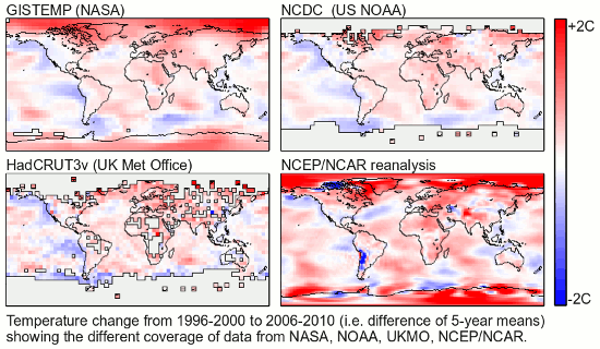
Is this approach reasonable? We can compare the temperature maps obtained from the different datasets. The first three panels of the following figure show maps of the changes in the pentadal mean temperature between the years 1996-2000 and 2006-2010. (Cells without 30 months of data in both periods are omitted).

Again we can see that the three datasets agree well in the regions where all have coverage. The smoothing effect of the 1200km radius in the GISTEMP data is also apparent. In both the HadCRUT3 data and the NCDC data the top edge of the observed region is mostly red, and the few isolated Arctic cells in the HadCRUT3 data show large positive anomalies. That provides tentative support for a larger temperature increase in the Arctic.
There is another source of data which can help with this question. The NCEP/NCAR reanalysis dataset provides an alternative method of determining global temperatures. Instead of just performing a statistical analysis of the weather station and sea surface observations, the reanalysis attempts to construct a complete model of the state of the Earth's atmosphere at any point in time. This is achieved by using a modern weather model to produce a 'nowcast' for any date in the past using not just the weather stations, but also data from weather balloons, satellites and radar. This data is less useful for determining long term trends because the results are influenced by the introduction of new data sources (in particular the satellite data in 1979; e.g. Chen et al, 2008), but is useful for determining a physically consistent geographical picture.
The fourth panel in the previous figure shows the results (which can be recalculated here). The resolution is rather higher than the instrumental records, but shows the same hot Arctic and Antarctic features.
Additional reading: Glenn Tamblyn's series 'Of averages and anomalies' contains more information on the methods used in determining the instrumental temperature records: Parts 1A, 1B, 2A, 2B. Dana also has a first Look at HadCRUT4.
The data for the original three temperature records along with the two masked GISTEMP records may be downloaded as a spreadsheet file for further study. An obvious experiment would be to calculate correlation coefficients between all the datasets over the past 30 years.
Posted by Kevin C on Thursday, 19 April, 2012
 |
The Skeptical Science website by Skeptical Science is licensed under a Creative Commons Attribution 3.0 Unported License. |