McLean, de Freitas and Carter rebutted... by McLean, de Freitas and Carter
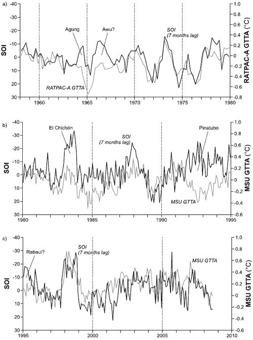
Stephan Lewandowsky has written a thorough critique of the McLean 2010 paper on El Nino. Lead author John McLean subsequently published an illuminating reply. The key contention surrounding McLean's paper is the assertion that the El Nino Southern Oscillation is responsible for the long-term warming trend over the last few decades. How do they come to this conclusion? McLean clarifies how they prove that "there is no detectable sign of any global warming driven by carbon dioxide" - by eyeballing Figure 7 from their paper:

Figure 7 from McLean 2009: Seven-month shifted SOI with (a) weather balloon RATPAC-A temperature data 1958–1979 and satellite UAH temperature data (b) 1980–1995. Dark line indicates SOI and light line indicates lower tropospheric temperature. Periods of volcanic activity are indicated.
Foster 2010 explains how this figure splices together two separate data-sets: weather balloon data (RATPAC) to the end of 1979 followed by satellite data (MSU) since 1980. The splicing is obscured by the fact that the graph is split into different panels precisely at the splicing boundary. However, John McLean defends this graph by stating "The Y-axes are clearly labelled". In other words, the graph clearly states that box a) is RATPAC weather balloon data while boxes b) and c) are MSU satellite data.
What is not clearly shown in this graph and only discovered through analysis of the original data is that the mean values of the weather balloon and satellite data during their period of overlap differ by nearly 0.2°C. Splicing them together introduces an artificial 0.2°C temperature drop at the boundary between the two. In other words, they "hide the incline".
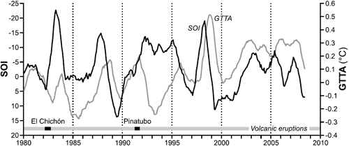
The crux of McLean's argument is that when you eyeball this graph split into several boxes, the temperature line fails to rise above the SOI line. Is there a plot of this data that isn't split into obscuring pieces? Is there a more rigorous analysis than a mere eyeballing of the data? To find such an analysis, you only need to go to an earlier section of McLean 2009. They start by plotting 12 month running means of the Southern Oscillation Index versus satellite temperature. This is before any long-term trends are removed. Eyeballing of the graph shows the temperature line clearly rising above the SOI line. Analysis of the data shows low correlation between the two data-sets. It's only by removing the long-term warming trend that they're able to establish a strong correlation between SOI and temperature.

Figure 1 from McLean 2009: Twelve-month running means of SOI (dark line) and MSU GTTA (light line) for the period 1980 to 2006 with major periods of volcanic activity indicated.
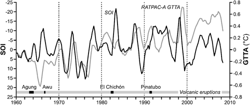
An even longer time period is possible by comparing weather balloon data to the Southern Oscillation Index. This is done in Figure 4 from McLean 2009.

Figure 4 from McLean 2009: Twelve-month running means of SOI (dark line) and RATPAC GTTA (light line) for the period 1960 to 2006 with major periods of volcanic activity indicated.
McLean argues that "If the SOI accounts for short-term variation then logically it also accounts for long-term variation". And yet despite McLean's attempt to hide the incline, his own analysis shows a strong divergence between temperature and the El Nino Southern Oscillation. Thus, the attempt to blame global warming on El Nino activity suffers from a serious divergence problem.
Posted by John Cook on Sunday, 4 April, 2010
