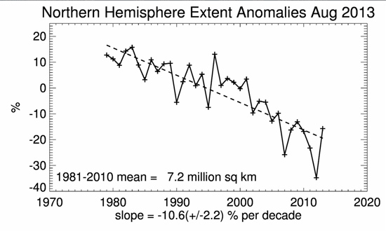
Cherrypicking is the practice, widespread amongst climate change contrarians, of carefully selecting particular points in the noisy short-term climate datasets and using them to show 'trends' that are not representative of the true situation. The huge global surface air temperature spike that accompanied the monster El Nino of 1997-98 is thus chosen as the starting point for the "no warming in 17 15 16 years" that you may read in internet comment-threads below climate stories (the number varies, apparently at random, from commentator to commentator). This year we have seen the Arctic sea-ice melting season once again reported by contrarians as a recovery, although as the graph below, from the National Snow and Ice Data Center, clearly shows, there have been a number of 'recoveries' in previous years too. The long-term trend, as shown by the dotted trendline, is downwards.

But that long term trend is exactly what the contrarians, their media allies and echo-chamber denizens do not want the public to read or hear about. Right now, in the run-up to the release of the IPCC Fifth Assessment Report (WG1) Summary for Policymakers, the contrarians are especially busy bombarding everywhere they can with climate change myths. Why not keep tabs on which myths are featuring the most, using our Most Used Climate Myths section on the left of this page? Cherrypicking is a vital tool in their armoury, so let's illustrate it with a working example: how to make Northern Hemisphere summers colder than winters. Sounds like ridiculous fantasy? It is, and is thus in good company with the other climate change myths that the contrarians like to put out.
So just to illustrate how cherrypicking is done, we'll take the upwards temperature trend from winter to summer in the Northern Hemisphere. I've downloaded the monthly HadCET (Central England Temperature) mean dataset, available here, and for 2012 (it should work for any year), I've put the values from January through to July into Excel and plotted a graph:
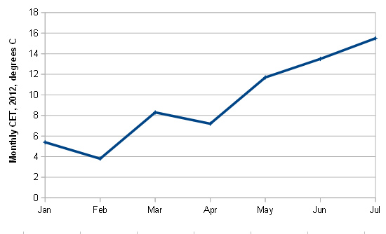
No suprises there. It shows a typical UK winter and spring, doesn't it? A chilly January, a colder February, a nice mild March followed by a disappointing April then a warmer but not especially hotter trend through May, June and July (2012 will be remembered in the UK for its awful wet summer).
We can even fit a trendline (red dotted line) to the data and, indeed, it shows that despite the ups and downs, the trend from winter to summer is that it gets warmer:

But how would we go about it if we wanted for some silly reason or other to show that it gets colder in the Northern Hemisphere instead? Well, the first thing to do would be to look for a short-term cooling trend, and we have one, from January into February: so we focus entirely on that, ditching everything else, and voila!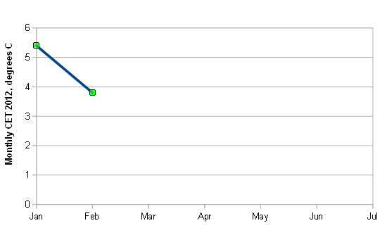
Let's fit a trendline to that and extrapolate. Hey Presto! there will be blizzards instead of heatwaves and by the start of the Summer Recess of the House of Commons, ice floes will be coming down the Thames past the Houses of Parliament!
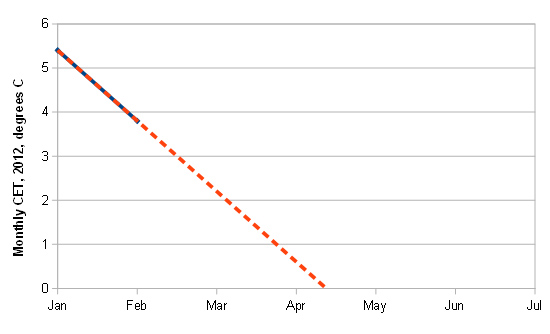
Looks daft, doesn't it? But that, dear readers, is exactly what cherrypicking can accomplish. Unfortunately for the contrarians, in this case it starts warming again into March, but the cooler April gives them another shot at making the same claim, before the May-July warming renders the tactic unusable. Never mind: they can move onto some other argument for a while and then it'll be time for the autumn-winter cooling trend - party-time! At that point, you will very likely hear, "look at all that sea-ice that's forming in the Arctic!", as if it was something new and unusual (it isn't), or, "look at that snow! And they told us we were warming!", as if anybody had even remotely suggested that climate change will make the seasons come to a crashing halt.
Thus, if you come across someone saying or writing things about trends that appear to wildly contradict mainstream science, be they talking about Arctic sea-ice, surface air temperatures or whatever, carefully check their starting point. Was there anything unusual about it? Think of the noise factor: was it particularly big or particularly small? With a bit of practise, cherrypicking is easy to spot, and as illustrated above, it really can be used to claim the impossible.
The global warming signal itself is a multidecadal feature of the climate, but just like the seasonal example above, it has been possible at times to take one period of one temperature record - surface air temperatures in most cases - and do a 'January-February' job with it, thereby making the claim that temperatures are flatlining or even cooling. This tactic works (so far as the contrarians are concerned), of course, until the next record warm year occurs, at which point they have to start out again. However, one may also expect a proportion of them, at that point, to direct their firepower on the temperature-record itself, claiming it is all wrong somehow - yes, the very same temperature record that they had previously been using to 'show' that "global warming had stalled"!
On the bigger scale of things, then, taking carefully-selected bits of the temperature-record that are way too short to be anything but noise, and using them to try and pretend that global warming has stopped, is such a popular contrarian trick that we illustrated it with 'The Escalator':
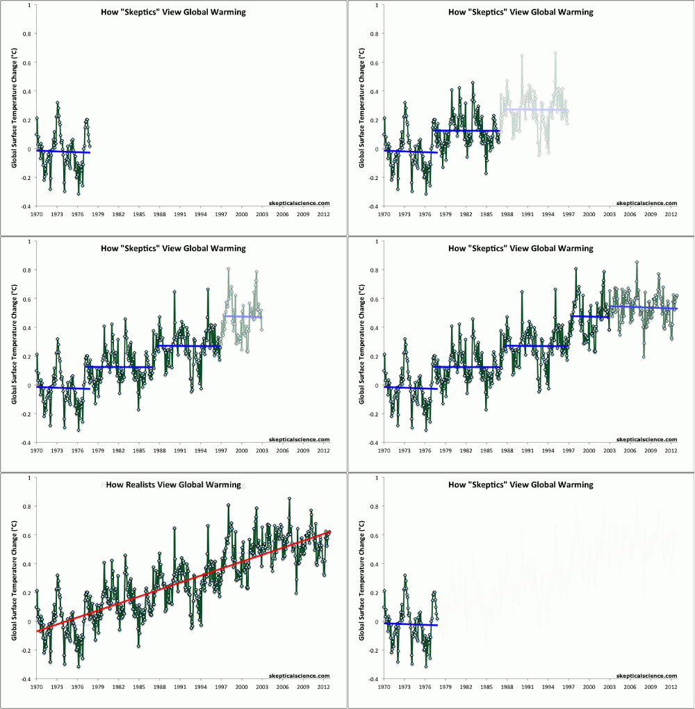
The same principles may be applied to other ongoing aspects of global warming such as sea-level rise or Arctic sea-ice retreat. We'll be taking a look at some other tactics popular with the opposition in forthcoming posts, but to see these things for what they really are, you need not to pick the odd cherry here and there, but step back and look at the reality of the whole tree.
Posted by John Mason on Wednesday, 25 September, 2013
 |
The Skeptical Science website by Skeptical Science is licensed under a Creative Commons Attribution 3.0 Unported License. |