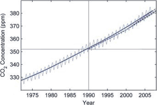
Figure 1: Monthly carbon dioxide concentration (blue thin line) and its long term trend (strong blue line) as measured at Mauna Loa, Hawaii. Dashed line is IPCC's projected carbon dioxide levels.
The best way to check the reliability of climate models is to compare projections to actual observations. However, this is a catch-22. You need a decent time period to accurately discern climate trends amid the noise of weather fluctuations. Over that time, the climate model would've been superseded by new models running on faster computers at higher resolutions using better understood science. Nevertheless, a paper recently published in Science, Recent Climate Observations Compared to Projections (Rahmstoorf 2007), gives it a shot, comparing 2001 IPCC projections to observations up to 2007.
This is a short period for comparing climate trends. However, the 2001 model projections were essentially independent from the observed climate data since 1990. Sea-level data were not yet available at the time. Plus the climate models used by the IPCC are physics-based and not "tuned" to reproduce the most recent temperatures.
They start by comparing IPCC projections of CO2 levels to observations at Mauna Loa, Hawaii. Estimating CO2 levels is a complicated business, factoring in economical development, industrial emissions, carbon sinks, etc. The IPCC get it fairly right although you can't credit them too much. A kid with a ruler and some graph paper could've got it fairly right.

Figure 1: Monthly carbon dioxide concentration (blue thin line) and its long term trend (strong blue line) as measured at Mauna Loa, Hawaii. Dashed line is IPCC's projected carbon dioxide levels.
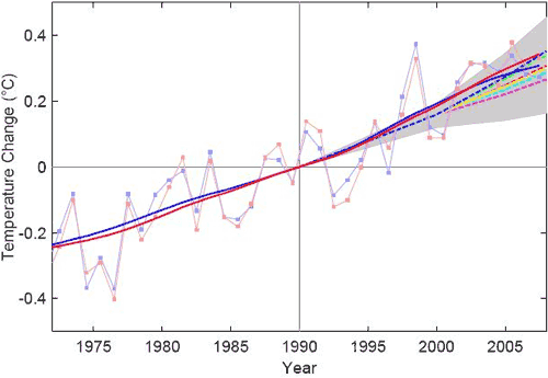
More interesting is the comparison of the various IPCC projections of global temperature change (coloured dotted lines) with observations from HadCRUT (blue) and NASA GISS data (red). The thin lines are the observed yearly average. The solid lines are the long term trends, which filter out short term weather fluctuations.

Figure 2: Global land and ocean surface temperature from GISS (red) and the Hadley Centre/Climatic Research Unit (blue) up to 2006. Thin lines are yearly average, solid lines are long term trends. Dashed lines are IPCC projections. Grey range encompasses IPCC uncertainty in climate sensitivity.
It's immediately apparent the IPCC underestimated temperature rise with observations warmer than all projections. The paper proposes several possible reasons for the difference. One is intrinsic internal variability which is possible over such a short period. Another candidate is climate forcings other than CO2 such as aerosol cooling being smaller than expected.
A third candidate is an underestimation of climate sensitivity. The IPCC assumed a climate sensitivity of 3°C with an uncertainty range between 1.7° to 4.2°C (this is indicated in the grey area of Figure 2). However, there are a number of positive feedbacks in the climate system that are poorly understood and hence not given much influence in IPCC models. Add to this the fact that model uncertainty is inherently skewed towards greater sensitivity. My guess is higher climate sensitivity is part of the story but not all. More on climate sensitivity...
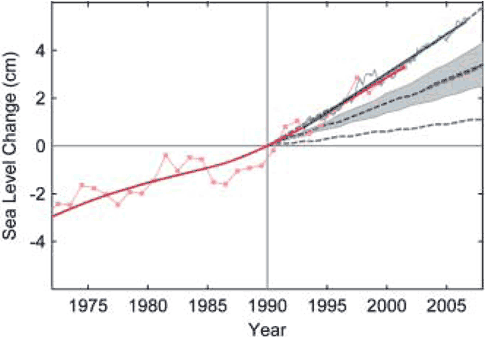
IPCC underestimation is even worse when it comes to sea levels, projecting a best-estimate rise of less than 2 mm/year. Satellite data shows a linear trend of 3.3 ± 0.4 mm/year and the tide gauge reconstruction trend is slightly less. Both sets of observations fall well above the IPCC uncertainty range. Again, internal variability may play a part over such a small period. As the largest contributor is ocean thermal expansion, warmer than expected temperatures would be a significant part of the discrepancy. Rapidly increasing melt from Greenland and Antarctica may also contribute although ice sheet contribution is a small part of sea level rise.

Figure 3: Sea-level data based primarily on tide gauges (annual, red) and from satellite altimeter (3-month data spacing, blue, up to mid-2006) and their trends. Dotted lines are IPCC projections. Grey range encompasses model uncertainty.
A common skeptic characterisation of the IPCC is that they exagerate warming projections and the dangers from global warming. In actuality, IPCC projections tend to underestimate climate change, particularly for sea level. Perhaps a more appropriate characterisation is a middle-of-the-road, conservative approach to science.
Update 27 Mar 2008: Tamino sheds more light on the IPCC projections, contacting Stefan Rahmstorf directly who provided an updated version of his temperature graph:

Figure 4 courtesy of Tamino: Solid blue and red lines are trends from GISS and HadCRU data, dashed lines are IPCC projections included in the TAR.
Posted by John Cook on Monday, 17 March, 2008
 |
The Skeptical Science website by Skeptical Science is licensed under a Creative Commons Attribution 3.0 Unported License. |