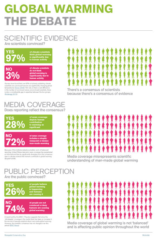
Matthew Glover at Renegade Conservatory Guy has created a telling visual on the disconnect between the scientific consensus on global warming, how the media portray the science and subsequent public opinion:
As there's plenty of detail, there's also a PDF version of the graphic (the above graphic also links directly to the PDF). The PDF also includes hyperlinks to the peer-reviewed papers where Matthew got his figures. While the graphic is quite simple and clear in how it presents the data, there's plenty of meat in there to chew over. Discuss...
Posted by John Cook on Sunday, 1 August, 2010
 |
The Skeptical Science website by Skeptical Science is licensed under a Creative Commons Attribution 3.0 Unported License. |