Cross-posted at The Numerate Historian
There are a few of us who actually enjoy arguing with “climate zombies” (a term coined by Joe Romm at ClimateProgress, and one too often apt) in comments and political forums online. If you hang around long enough, you’re bound to hear some of the silliest crackpottery one can imagine. For a long time Skeptical Science has been an important resource for me, so I’m happy to have a chance to give back.
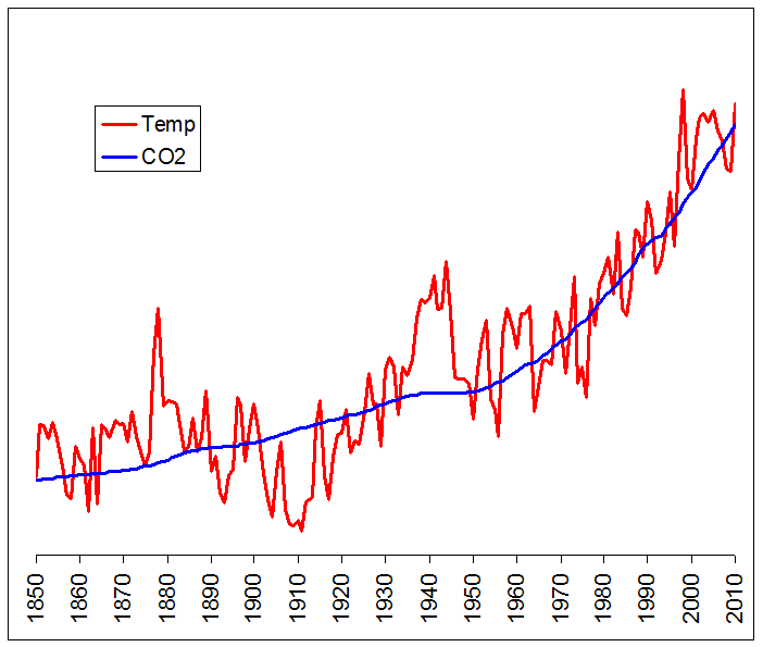
Recently, I pointed out to an adversary that CO2 and temperature were highly correlated, and to support my assertion I posted the following graph, which I did in Excel. For these graphs, the temperature data is from HADCRUTv3; and the CO2 data is from two sources: Mauna Loa (1959-2009) and the Law Dome ice core (pre-1959; using the 20-year smoothed values).

The blue CO2 line overlays the red Temperature line very nicely, and shows the relationship quite well. But there’s a big problem here: there is no vertical scale. And in fact, there can’t be a single vertical scale on a graph like this, because the two lines are valued very differently: temperature anomaly, in degrees Celsius, ranges between –.8 and +.6, while CO2, in parts per million, ranges between 280 and 390. In order to get the two lines to overlay in Excel, I had to alter the scale of the temperature line quite significantly, by multiplying each datapoint by a constant and adding a second constant. Ideally, I would like to put two vertical scales in place so that each line could be scaled separately. But Excel won’t allow that. Of course, adding and multiplying by constants makes no difference at all to the correlation; but my opponent was unimpressed and immediately accused me of data manipulation. How do you counter an argument like that when your opponent is nearly innumerate?
One thing you could do is draw two vertical scales on the graph, to make things perfectly explicit. Excel won’t do that, but there is other software out there that does. I happen to be familiar with GMT, an open-source mapping tool that also has extensive graphing capabilities. So let’s re-create the above graph in GMT but with two vertical scales, one for each dataset. Here is the result:
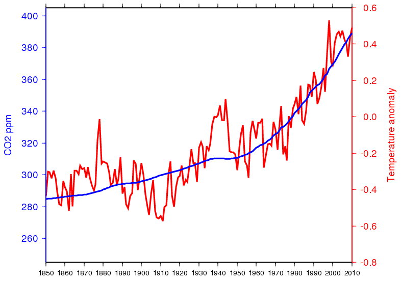
Well that’s better, but some zombies just won’t die. My opponent decided to attack the whole idea of correlation because, he claimed, the data wasn’t linear and therefore drawing a correlation coefficient wasn’t valid. The argument is utterly bogus, of course, but sometimes you can find interesting jewels even when rebutting the obviously silly. Here’s what I came up with: we eliminate the date from the graph and just plot CO2 against the global temperature anomaly in a scatterplot.
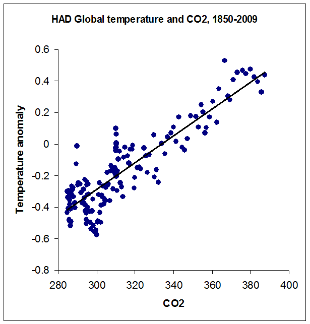
Now the strong linear relationship jumps out at you as big as life and impossible to miss. I like this graph so much that the next time someone tries to tell me that CO2 and temperature aren’t correlated, or that there's no proof that CO2 causes higher temperatures, this is the first graph I’m going to use. For the entire 160-year period, the Pearson correlation coefficient r = .89, which is highly significant.
And before anyone reading this jumps on me – yes, I realize that the relationship here is based on radiative forcing, and therefore should theoretically be logarithmic and not linear. But first, the range of CO2 values is too small here to show much of a curve; and second, forcing isn’t the only factor at work: there is also feedback to consider, which might drive the actual relationship toward linear or even worse, if for example long-term feedbacks are more positive than short term feedbacks (as seems likely). So the graphed linear relationship isn’t necessarily wrong, and certainly seems empirically justified for this range of values.
One interesting thing you can do with a graph like this is to (very roughly) estimate climate sensitivity to CO2 forcing, by finding the equation of the regression line (shown in black). The equation of that line in the graph above is: T = .0085C - 2.83. From this we can determine that the mean temperature anomaly for the pre-industrial CO2 value of 280 ppm would be ?.46, and for the doubled CO2 value of 560 ppm it would be expected to come in at +1.92; therefore doubling CO2 should raise the Earth’s temperature by about 2.38° C. This is in the ballpark of many recent (and much more sophisticated) estimates – though perhaps a bit on the low side; most recent estimates are in the range of 2° to 4.5° C increase for doubling of CO2, though some are as high as 6° C.
But then again, we’re using HADCRUT data, which omits much of the rapidly-warming polar regions of the Earth. We can switch to NASA’s GISS dataset, which loses 30 years of early data but which includes the poles, and draw a similar scatterplot.
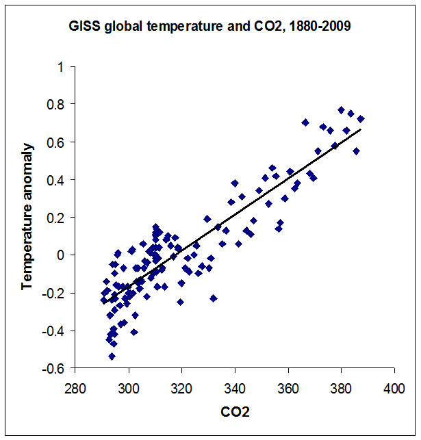
Here the correlation coefficient is unchanged at r = .89, but the regression slope is a little higher. For these data, T = .0096C - 3.05, and following the same procedure as above the regression line implies that doubling CO2 should raise global temperature by 2.68° C – which is still in the ballpark (but perhaps still a bit low). Still, not bad for a back-of-the-envelope calculation using publicly available data.
Posted by keithpickering on Thursday, 6 January, 2011
 |
The Skeptical Science website by Skeptical Science is licensed under a Creative Commons Attribution 3.0 Unported License. |