 Arguments
 Software
 Resources
Comments
 The Consensus Project
 Translations
 About
Support


Latest Posts
- Skeptical Science New Research for Week #14 2025
- Two-part webinar about the scientific consensus on human-caused global warming
- Sabin 33 #22 - How does waste from wind turbines compare to waste from fossil fuel use?
- Clean energy generates major economic benefits, especially in red states
- 2025 SkS Weekly Climate Change & Global Warming News Roundup #13
- Skeptical Science New Research for Week #13 2025
- Climate skeptics have new favorite graph; it shows the opposite of what they claim
- Sabin 33 #21 - How does production of wind turbine components compare with burning fossil fuels?
- China will need 10,000GW of wind and solar by 2060
- 2025 SkS Weekly Climate Change & Global Warming News Roundup #12
- Skeptical Science New Research for Week #12 2025
- Climate Fresk - a neat way to make the complexity of climate change less puzzling
- Sabin 33 #20 - Is offshore wind development harmful to whales and other marine life?
- Do Americans really want urban sprawl?
- 2025 SkS Weekly Climate Change & Global Warming News Roundup #11
- Fact brief - Is waste heat from industrial activity the reason the planet is warming?
- Skeptical Science New Research for Week #11 2025
- Visualizing daily global temperatures
- Sabin 33 #19 - Are wind turbines a major threat to wildlife?
- The National Hurricane Center set an all-time record for forecast accuracy in 2024
- 2025 SkS Weekly Climate Change & Global Warming News Roundup #10
- Fact brief - Is Greenland losing land ice?
- The Cranky Uncle game can now be played in 16 languages!
- Skeptical Science New Research for Week #10 2025
- Climate Adam: Protecting our Planet from President Trump
- Sabin 33 #18 - Can shadow flicker from wind turbines trigger seizures in people with epilepsy?
- Cuts to U.S. weather and climate research could put public safety at risk
- 2025 SkS Weekly Climate Change & Global Warming News Roundup #09
- Fact brief - Are high CO2 levels harmless because they also occurred in the past?
- Skeptical Science New Research for Week #9 2025
Archived Rebuttal
This is the archived Basic rebuttal to the climate myth "Global warming stopped in 1998, 1995, 2002, 2007, 2010, ????". Click here to view the latest rebuttal.
What the science says...
|
Global temperatures continue to rise steadily beneath the short-term noise. |
A common claim amongst climate skeptics is that the Earth has been cooling recently. 1998 was the first year claimed by skeptics for 'Global Cooling'. Then 1995 followed by 2002. Skeptics have also emphasized the year 2007-2008 and most recently the last half of 2010.
NASA and climate scientists throughout the world have said, however, that the years starting since 1998 have been the hottest in all recorded temperature history. Do these claims sound confusing and contradictory? Has the Earth been cooling, lately?
To find out whether there is actually a 'cooling trend,' it is important to consider all of these claims as a whole, since they follow the same pattern. In making these claims, skeptics cherrypick short periods of time, usually about 20 years or less.
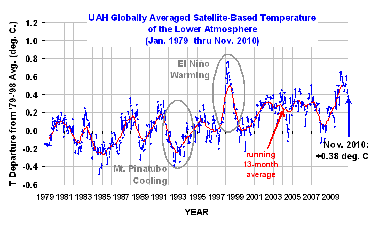
The temperature chart below is based on information acquired from NASA heat sensing satellites. It covers a 30 year period from January 1979 to November 2010. The red curve indicates the average temperature throughout the entire Earth.
The red line represents the average temperature. The top of the curves are warmer years caused by El Niño; a weather phenomenon where the Pacific Ocean gives out heat thus warming the Earth. The bottoms of the curves are usually La Niña years which cool the Earth. Volcanic eruptions, like Mount Pinatubo in 1991 will also cool the Earth over short time frames of 2-3 years.
Figure 1: University of Alabama, Huntsville (UAH) temperature chart from January 1979 to November 2010. This chart is shown with no trend lines so the viewer may make his own judgment.
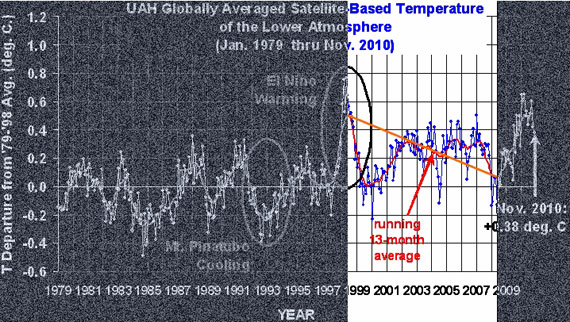
Below is the same temperature chart, showing how skeptics manipulate the data to give the impression of 'Global Cooling'. First they choose the warmest most recent year they can find. Then, in this case, they exclude 20 years of previous temperature records. Next they draw a line from the warmest year (the high peak) to the lowest La Niña they can find. In doing this they falsely give the impression that an ordinary La Niña is actually a cooling trend.
Figure 2: Representation of how skeptics distort the temperature chart. Even though the chart clearly indicates increased warming, skeptics take small portions of out of context to claim the opposite.
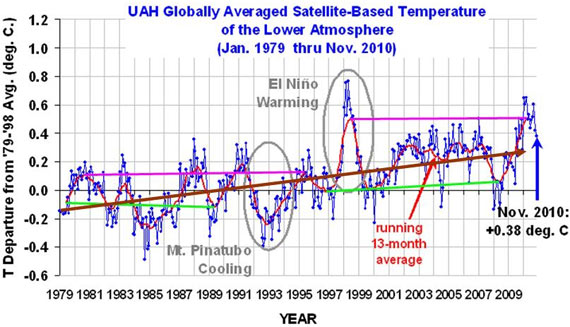
What do the past 30 years of temperature data really show? Below is the answer.
Figure 3: Trend lines showing the sudden jump in temperatures in the 1995 La Niña (Green lines) and the 1998 (Pink lines) El Niño events. Brown line indicates overall increase in temperatures.
The chart above clearly shows that temperatures have gone up. When temperatures for the warm El Niño years (pink lines) during 1980-1995 are compared to 1998-2010, there is a sudden increase of at least 0.2o Centigrade (0.36o Fahrenheit). Temperatures also jumped up by about 0.15oC (0.27oF) between the cool La Niña years (Green lines) of 1979-1989 and those of 1996-2008 (the eruption of Mount Pinatubo in 1991 lowered the Earth's temperatures in the midst of an El Niño cycle). The overall trend from 1979 through November 2010 (Brown line) shows an unmistakable rise.
This is particularly clear when we statistically remove the short-term influences from the temperature record, as Kevin C did here:
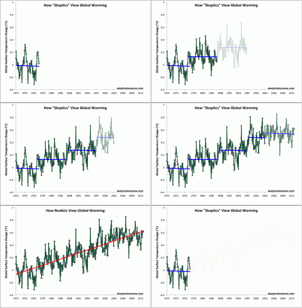
In spite of these facts, skeptics simply keep changing their dates for 'Global Cooling', constantly confusing short-term noise and long-term trends (Figure 4).
Figure 4: Average of NASA GISS, NOAA NCDC, and HadCRUT4 monthly global surface temperature anomalies from January 1970 through November 2012 (green) with linear trends applied to the timeframes Jan '70 - Oct '77, Apr '77 - Dec '86, Sep '87 - Nov '96, Jun '97 - Dec '02, and Nov '02 - Nov '12.
Basic rebuttal written by dana1981
Update July 2015:
Here is a related lecture-video from Denial101x - Making Sense of Climate Science Denial
Updated on 2016-06-22 by MichaelK.
THE ESCALATOR

(free to republish)


