


 Arguments


Visualizing daily global temperatures
Posted on 12 March 2025 by Zeke Hausfather
This is a re-post from The Climate Brink
Good data visualizations can help make climate change more visceral and understandable. Back in 2016 Ed Hawkins published a “climate spiral” graph that ended up being pretty iconic – it was shown at the opening ceremony of the Olympics that year – and is probably the second most widely seen climate graph after Hawkins’ later climate stripes.
However, I haven’t previously come across any versions of the spiral graph showing daily global temperatures, so I thought it would be fun to create my own (with, I should note, a bit of help from OpenAI’s o3 model to code it).
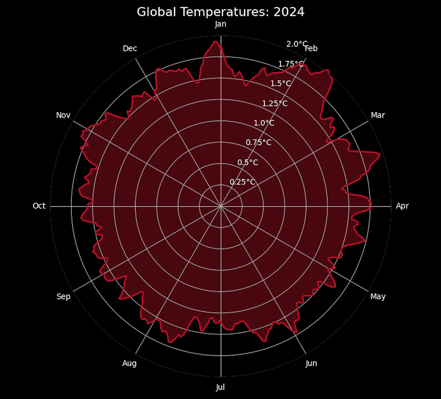
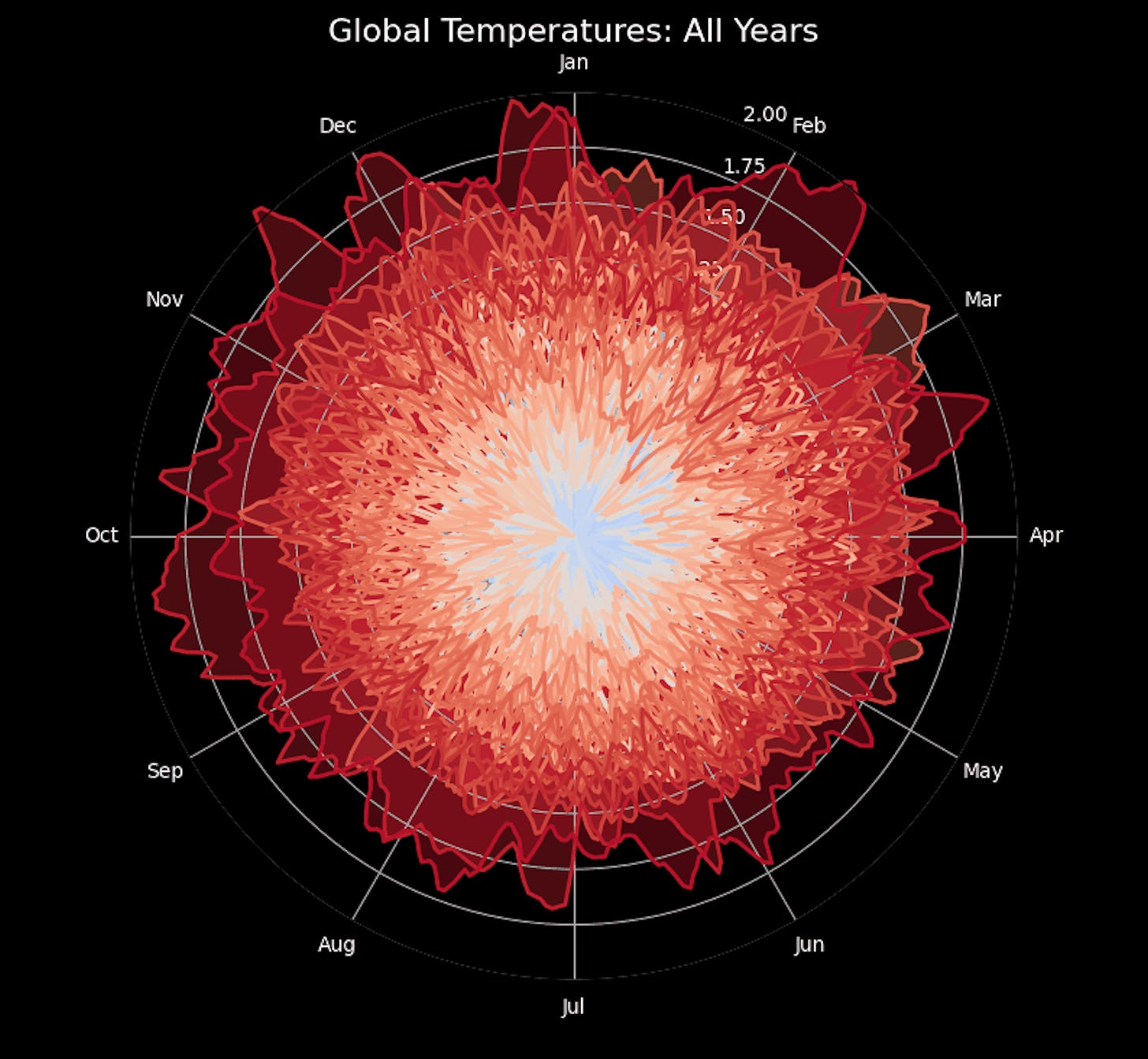
Here are daily global temperatures by year between 1940 (when the ERA5 daily dataset begins) and the end of 2024, with the color varying from blue to red over time.
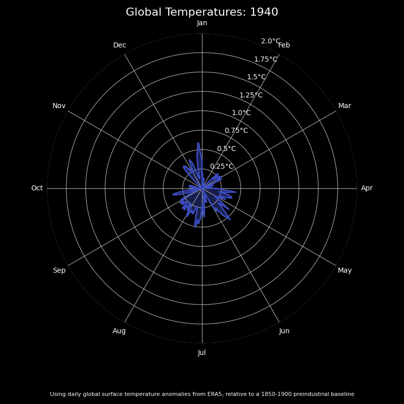
You can clearly see how anomalous the past few years have been, with a sizable portion of days in both 2023 and 2024 exceeding 1.5C above preindustrial levels:
I also quite like how the final frame turned out, when I showed all of the data at once. It looks like a flower, albeit a rather sinister one given whats being displayed!


Par Excellence!
Using my eyecrometer, it appears a large majority of days in 2024 are over 1.5 C and a sizeable proportion are over 1.75 C. Scientists try to be conservative in their comments.
Great visualisation but my eyecrometer is struggling with reading the very small numbers and letters. Bigger and bolder would help.
nigelj:
You can open the images in a new tab and see a larger version. (In Firefox, at least. Right click, open in new tab.)
michael sweet @2,
Firstly, the methodology used to establish an anomaly base 1850-1900 is not entirely robust, given ERA5 methods only allows a full re-analysis back to 1979. Their re-analysis back to 1940 is probably reasonable but by the earlier period the different records (GISS [which they don't use], NOAA, BEST, HadCRUT) are starting to diverge. They use an annual cycle for 1850-1900 which adds an off-set to 1991-2020 daily anomalies of between +0.79°C and +0.97°C. A table of the calculated-&-smoothed monthly off-sets is provided HERE in the 'Reference periods and other time-related definitions' dropdown.
The annual off-set is given as 0.88°C (with an uncertainty range given as +0.72°C to +0.99°C). That makes the magic annual 1991-2020 threshold anomaly as +0.62°C. The running 12-month average has been above that level since the year ending Jan 2024 and well-above since March. So in terms of the threshold, that uncertainty becomes entirely academic rather quickly.
Secondly, the number of days with a +1.50°C 1850-1900 anomaly will be dependent on the size of the wobbles/noise within the daily temperatures. Adding the annual off-set cycle, the number of days shown by ClimatePulse in 2024 above the magic +1.49°C theshold was 276. So 90-ish days were recorded below the +1.50°C theshold. Your 'above +1.74°C' threshold shows 52 days above.
The monthly averages are perhaps a more meaningful measure and prior to the 2023 "bananas" event ERA5 gives 5 months above the +1.50°C theshold (Jan to Mar 2016, Jan to Feb 2020) and only one month below since July 2023 (tat month being July 2024).