Medieval project gone wrong
Posted on 30 April 2011 by Hoskibui
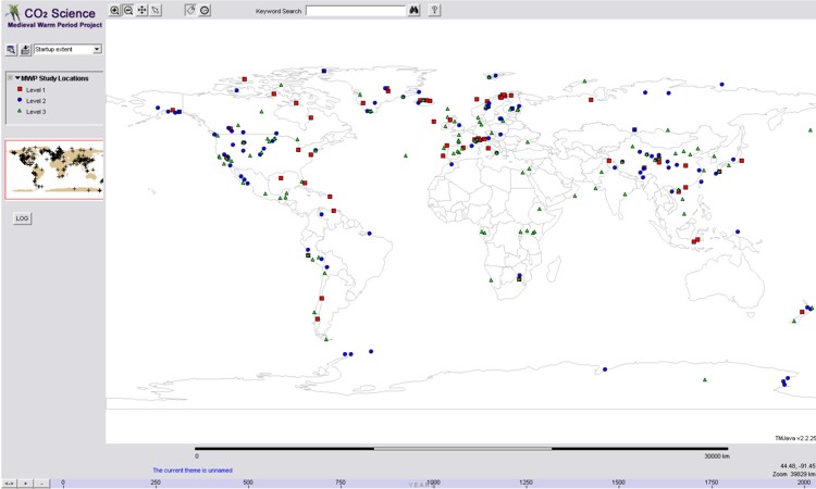
With regularity, you might hear skeptics mentioning a website called CO2 Science and its Medieval Project. It is a front for a research center called Center for the Study of Carbon Dioxide and Global Change and their goal is to distribute:
…factual reports and sound commentary on new developments in the world-wide scientific quest to determine the climatic and biological consequences of the ongoing rise in the air's CO2 content.
The website is run by the Idso family (Craig, Sherwood, Keith and Julene).
Medieval Project
One of the Idsos' main projects collects temperature reconstructions of the Medieval Warm Period (MWP) that claim to show local warming and then posts them on their website with the Idsos’ interpretation. They conclude that current warming is not unprecedented since there were warm periods in the past in various geographic locations around the globe.
The site is flooded with lots of references, but do the references say the same thing as the Idsos? CO2 Science has a powerful interactive map and by clicking on the dots on the map you get to a page where a summary of that study is displayed - or rather the CO2 Science interpretation of the study.
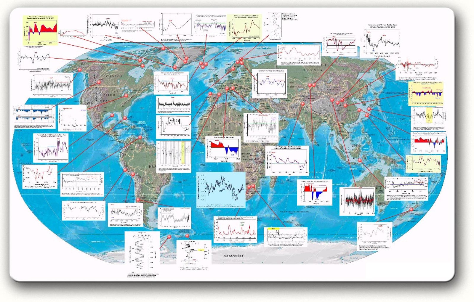
CO2 Science has also been a useful resource for other skeptics, see for example the Science Skeptical Blog * which has also available an i??nteractive map (pictured below):
This interactive map is useful to view the alleged global warming during the MWP in graphical form. You can click on the images and see a temperature reconstruction (or other proxy, see below) of that location. There you can also find sources for each graph, with abstracts.
Interaction for healthy skeptics?
For people with healthy skepticism these interactive maps are quite good. It is crucial that those maps are viewed with a critical mind. On Skeptical Science (as opposed to Science Skeptical Blog) we have looked before at common graphical tricks used to exaggerate the Medieval Warm Period, which include the following:
- Hide the temperature scale and/or the temperature values
- Pick one area or location of the world
- Cut out or ignore recent warming
The total effect of those maps is what is most effective for the casual reader. All of the selected articles on the map show at some point a period that can be interpreted as "Medieval Warming". The quotation mark is because in some cases the research is only about the period itself - but not the temperature. For example we can find graphs showing changes in precipitation, like, Zhang et al 2003 - astudy from Tibet, which states in its abstract (emphasis mine):
... We find that the annual growth rings mainly reflect variations in regional spring precipitation. The greatest change in spring precipitation during the last two millennia seems to occur in the second half of the 4th century. The North Atlantic MWP was accompanied by notable wet springs in the study region during AD 929–1031, with the peak occurring around AD 974. ...
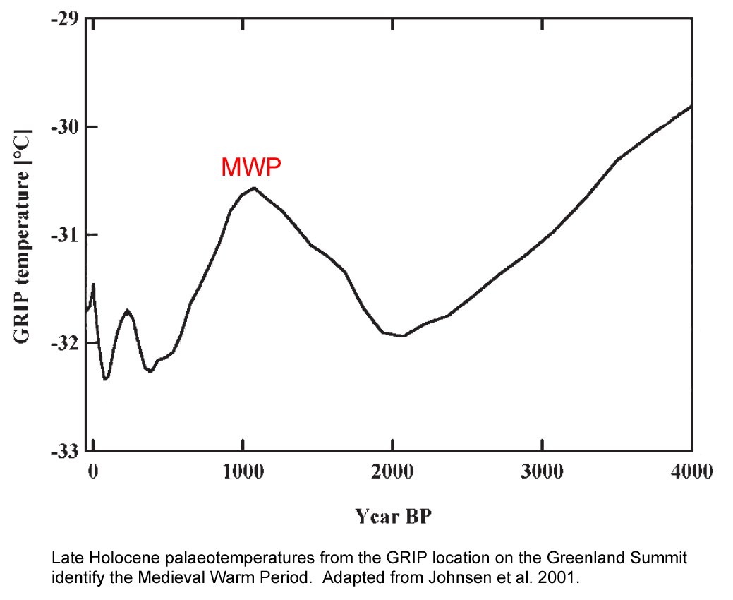
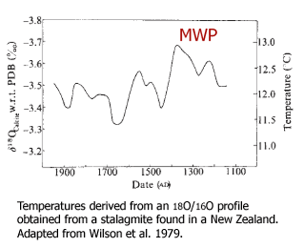
Few of the graphs in Figure 2 contain temperature data past the mid-20th Century, and thus do not reflect current temperatures; in addition the MWP is rather ill-defined. Usually the MWP is the period between 950-1250, but when you look at the graphs you see some inconsistency. In it you see a warm period during 800 AD, 1100 AD or even 1400 AD; that warming is - by their opinion - indication of a global warming during the MWP. For example if you take graphs from two separate locations you can see some difference. Here we have one graph with a proxy for temperature in Greenland (Johnsen et al 2001) and the other one for New Zealand (Wilson et al 1979):
Looking at those two graphs it is clear that the warming is not at the same time.
Another flaw is evident when looking at those graphs: the insistence on using old data. Many of the articles used has data that is old and outdated. It is difficult to imagine that there are no better and newer data on paleoclimate in New Zealand then a study of oxygen isotopes from the year 1979. There is also a tendancy to ignore corrected version of data. In the case of this map, they use for example Loehle 2007 instead of Loehle 2008 (See Kung-fu Climate).
CO2 Non-Science
On CO2 Science the problem is not just the way they pick the graphs, but how they change them and interpret them. As an example, there is research from the Alps (Mangini et al 2005) which CO2 Science interpret in a strange way and conclude that the MWP was warmer than today. The CO2 Science summary of the study says:
… at three different points during the MWP their data indicate temperature spikes in excess of 1°C above present (1995-1998) temperatures of 1.8°C.
In contrast, it states in the abstract of the paper:
…maxima during the Medieval Warm Period between 800 and 1300 AD are in average about 1.7 °C higher than the minima in the Little Ice Age and similar to present-day values.
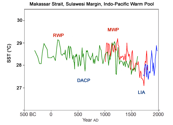
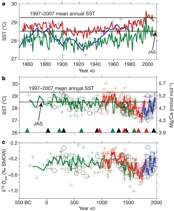
Another misinterpretation of data can be seen by looking at the sea temperature data from the Indian Ocean (Oppo et al 2009).
The CO2 Science interpretation reads:
Reconstructed SSTs were, in their words, “warmest from AD 1000 to AD 1250 and during short periods of first millennium.” From the authors' Figure 2b, adapted below, we calculate that the Medieval Warm Period was about 0.4°C warmer than the Current Warm Period.
Then they change the image 2b from the article and make it look like the medieval warming was 0.4 ° C higher than the current warming:
The original graph can be seen below (see graph b and the line representing the 1997-2007 mean annual SST):
As is evident from the 2b in figure 6 above, the mean annual SST for 1997-2007 was higher than the rest of the graph.
Conclusion
Both CO2 Science and its sister site Science Skeptical Blog use various methods or tricks to make the case for a global warm period during the medieval times. As can be seen with a critical look at the original papers and graphs, their conclusions don't hold water. In those pages we have a large collection of articles about paleoclimate, and we can't trust their conclusion or the graphs that we see because of many misrepresentations.
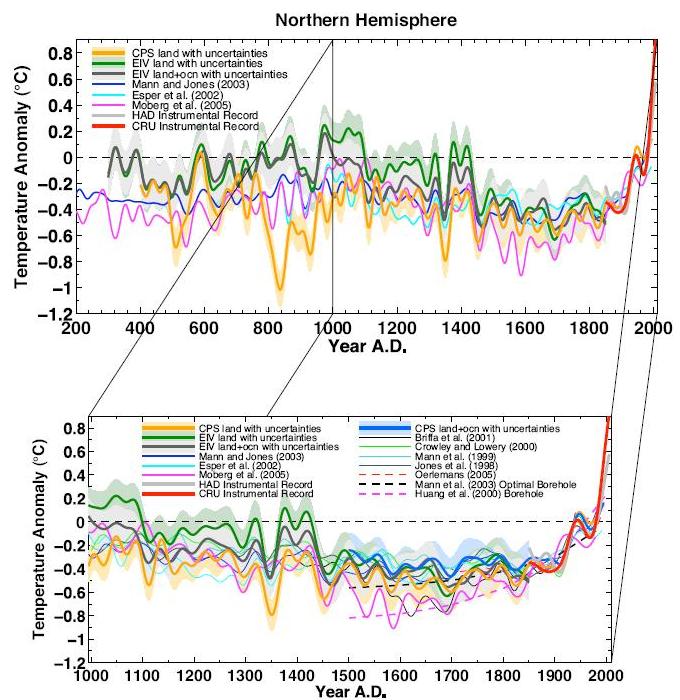
The story is half-told by pointing at a large set of data. Some scientists have actually used some of this data to make comparisons between current warming and the past (Mann et al 2008):
Further reading
Other reviews of CO2 Science and its false interpretations can be found at Climate Shift, on Kevin Oxford and Climate Feedback


 Arguments




Thanks. I've been a big fan of SS for some time, but this is my first post here. I got that medieval map sprung on me tonight by a commenter over at Mother Jones, so this article was an invaluable find. I had already noticed a few weird things in many of the map's data sets, e.g. spikes going both up and down at almost the same "medieval" time, but Hoskibui really lays it out in all its idiocy.
Hoskibui, thank you for a valuable article, you do a nice of explaining. It's come in very handy for a recent blog post regarding the misdeeds of CO2Science.org - and I've copied long sections to share.
"Is CO2Science.org 'criminally negligent'? Why not consider it?"
http://whatsupwiththatwatts.blogspot.com/2016/05/co2scienceorg-criminally-negligent.html