An overview of glacier trends
Posted on 14 November 2009 by John Cook
Glaciers are considered a proxy for climate. So what are we to make of the skeptic claim that glaciers around the world are growing. In 2008, Alaskan glaciers grew. Glaciers are growing in Washington State. There's a glacier in the Himalayas that's growing, which apparently is "confounding global warming alarmists". Does this selection of glaciers provide enough information to make accurate conclusions about global glacier trends? Let's dive in a little deeper and see what the data tells us.
Glaciers respond directly and quickly to atmospheric conditions. As temperatures warm, summer melting increases. However, accumulation of ice in the winter also increases due to more snowfall. Air temperature tends to play the dominant role - there's a strong statistical correlation between air temperature and glacier fluctuations over large distances (Greene 2005). Generally, when air temperatures warm, glaciers recede.
Consequently, because they're so sensitive to changes in temperature, glaciers provide clues about the effects of global warming. Glacier mass balance is measured through a variety of techniques. Direct glaciological methods include ablation stakes, snow pits and snow probing. This data is then combined with independent geodetic surveys, collected and published by the World Glacier Monitoring Service (WGMS).
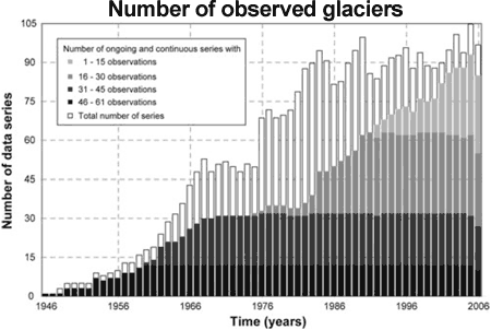
Over the period 1946 to 2005, the WGMS have monitored 228 glaciers. In the early years, just several glaciers were monitored. Over time, observations from more glaciers across the globe were added to the database, giving us a broader picture of global glacier mass balance. The highest quality glacier observations are ongoing, continuous and long term. There are 30 glaciers in 9 different mountain ranges that have been continuously measured since 1976 (11 of them reaching back to 1960 and earlier). These are considered 'reference glaciers'. Figure 1 shows the total number of glaciers monitored since 1946. The black and dark grey bar indicate the number of reference glaciers.

Figure 1: Observed glaciers from 1946 to 2006 (Zemp 2009).
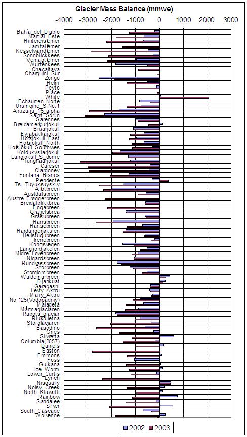
What do these glacier observations reveal? The following table shows the mass balance of individual glaciers over 2002 and 2003. Negative values indicate shrinkage. We see that there are isolated glaciers that are growing. However, focusing solely on these few glaciers to indicate global glacier growth paints a very misleading picture. The vast majority of glaciers are receding. And importantly, the shrinking trend is increasing (eg - 77% in 2002, 94% in 2003).

Figure 2: Glacier Mass Balance over 2002 (blue) and 2003 (red). (WGMS)
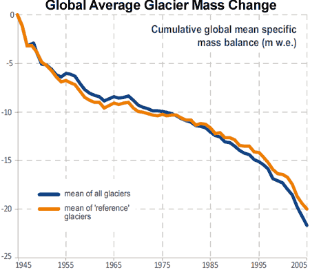
What about the long term trend in global glacier mass change? There are several method to calculating global glacier mass change. One way is to use the average value of the 30 reference glaciers. Another is to calculate the moving average of all available glaciers. The results for both methods are displayed in Figure 3. The orange line is the average mass change of the 30 reference glaciers. The blue line includes all glaciers.

Figure 3: Cumulative mass balance curves for the mean of all glaciers and 30 'reference' glaciers (WGMS 2008).
Both approaches show consistent results (with all glaciers showing a slightly faster drop in mass compared to the 30 reference glaciers). There is strong mass loss in the first decade from 1945. Note that at this time, there were only several glaciers monitored - not quite a global sample. The mass loss slows down in the second decade so that around 1970, global mass balance was close to zero. Glaciers were in near equilbrium which indicates glacier shrinkage in the late 20th Century is essentially a response to post-1970 global warming (Greene 2005).
After 1975, glacier shrinkage continues to accelerate until present. The mass loss from 1996 to 2005 is more than double the mass loss rate in the previous decade of 1986 to 1995 and over four times the mass loss rate over 1976 to 1985. When you narrowly focus on a few cherry picked glaciers, you can be misled into an incorrect view of global glacier trends. When you take in the broader picture, you see that globally, glaciers are shrinking at an accelerating rate.


 Arguments


How should we interpret recent data? Considering the correlation between air temperature and glacier extent (Greene 2005), it's hardly outlandish to link the last few decades of warming temperatures with shrinking glaciers.
Could current glacier trends be just the result of coming out of an ice age? Around 1960 to 1970, glaciers were in near equilbrium which indicates glacier shrinkage in the late 20th Century is essentially a response to post-1970 global warming (Greene 2005).
Lastly, thanks for the links to glaciers receding as far back as the 1700s. What does this prove? That climate has changed in the past, with only a minimal or no influence from CO2. Does this mean humans can't affect climate? Quite the contrary. Natural climate change in the past proves that climate is sensitive to radiative forcing. If the planet is in energy imbalance, global temperatures will change.
CO2 is imposing an energy imbalance on climate now. The CO2 radiative forcing is well understood and observationally measured. So citing past climate change is actually citing evidence for our climate's sensitivity to CO2.
In regard to the notion that current glacier shrinkage is part of the continued deglaciation since the Little Ice Age (or further, from the Last Glacial Maximum), I gleaned several points when researching on glaciers:
"past climate change is actually citing evidence for our climate's sensitivity to CO2... or other factors that affect deglaciation/temp/climate"
You're correct. Any radiative forcing will affect global temperatures and hence glacier mass balance. Every climate scientist will tell you CO2 is not the only driver of climate. But the reason for the focus on CO2 is because CO2 is the most dominant radiative forcing and it's also increasing faster than any other forcing.
However, you also mention that the database of glaciers is heavily biased towards the Northern Hemisphere which is quite true. In fact, I've been waiting for someone to bring that up. Zemp 2009 goes into much detail about the geographical distribution of the glacier data and ways to account for this.
The figure below is from Zemp 2009 and demonstrates various ways to estimate global glacier mass change. The solid black line is the average mass change of the 30 reference glaciers. The dashed line is the average mass change of all glaciers and the dashed-dotted line is all glaciers excluding the reference glaciers. There is also the consideration that the observed glaciers are located in the Northern Hemisphere and tend to be clustered in Europe. So another method to determine the global mean is to calculate average mass changes over macro-regions (thick grey line) or area-weighted averages of the macro-regions (thin grey line).
My first draft of this glacier overview included this graph and that mouthful of an explanation above of the 5 different time series. I agonised over it for a while but decided in the end to go for the easier to understand (and yes, more colourful) Figure 3 above (from WGMS 2008). But I spent a lot of time in Zemp 2009 so you've given me the opportunity to dredge up all that work for which I'm thankful. :-)