Global Sea Level Rise: Pothole To Speed Bump?
Posted on 7 February 2012 by Rob Painting
As indicated in a press release from the NASA Jet Propulsion Lab last year, short-term trends in global sea level rise are greatly affected by temporary exchanges of water mass between the land surface and ocean - creating 'potholes' and 'speed bumps' in the sea level record. This a consequence of changes in precipitation (rainfall & snow) resulting from the El Niño-Southern Oscillation (ENSO).
During La Niña the sea surface is cooler-than-normal and rainfall is concentrated over land, which leads to a temporary fall in global sea level. With El Niño the surface of the tropical Pacific Ocean becomes warmer-than-normal, and rainfall gets concentrated over the ocean. This, combined with the drainage of water from land, causes a temporary spike in global sea level.
ENSO is principally responsible for the large year-to-year fluctuations evident in the global sea level record, but neither of these two phenomena (El Niño/La Niña) alter the long-term sea level rise which results from the melting of land-based ice, and the thermal expansion of the oceans as they warm. They do, however, cause sufficient 'noise' to obscure the long-term sea level rise when viewed at short intervals.
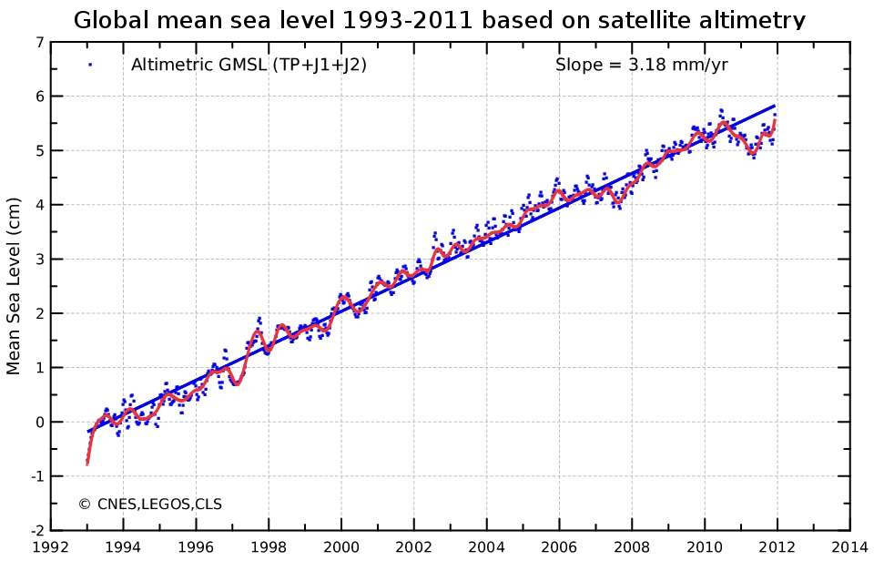
In the last two years two back-to-back La Niña have temporarily lowered sea level, but La Niña appears to have weakened in recent months and accordingly we would expect an uptick in sea level rise as conditions move closer to neutral. A quick look at AVISO confirms this, see Figure 1.

Figure 1 - The reference mean sea level since January 1993 (left) is calculated after removing the annual and semi-annual signals. A 2-month filter is applied to the blue points, while a 6-month filter is used on the red curve. By applying the postglacial rebound correction (-0.3 mm/year), the rise in mean sea level has thus been estimated as 3.18 mm/year. Image from AVISO.
Rather than focusing on the potholes, as the skeptics do, one needs to consider the broader picture. That means factoring in the speed bumps too. See figure 2.

Figure 2 - University of Colorado global mean sea level data with a 12-month running average, and short-term declines. This animation does not include the latest sea level updates indicated in figure 1.
What happens to global sea level rise over the short-term will depend on which aspect of ENSO develops in the tropical Pacific this year. Whatever the case may be, global sea level rise will continue over the long-term because of the accelerating melt of land-based ice and continued warming of the oceans.


 Arguments


So far that accelerating melt and warming hasn't caused sea level rise to accelerate. Here's Colorado University's data from their 2011 rel 4 plotted out with an Excel 2nd order polynomial trend line which shows slight deceleration:
...If ice melt has accelerated, and it has, then perhaps thermal expansion might have slowed in the last decade? Hansen (2011) has an interesting look at the thermal expansion aspect and his team's calculations show a rapid acceleration in sea level rise is likely this decade.
This paper?

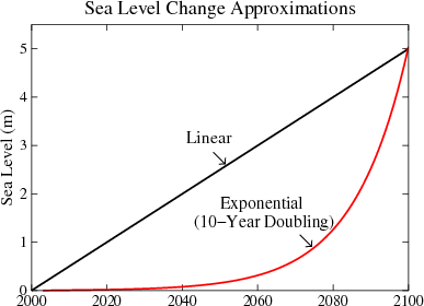
Paleoclimate Implications for Human-Made Climate Change I thought it showed modest acceleration in sea level rise this decade and doubled per decade until by 2100 it was going up hundreds of millimeters per year. See figure 7 on page 14
Fig. 7. Five-meter sea level change in 21st century under assumption of linear change (Alley, 2010) and exponential change (Hansen, 2007), the latter with a 10-year doubling time.
[DB] "Where does the data for your combined heat content graph come from."
The SkS graphic originates from Church et al 2011, and is derived from the original data used to make this graphic from the paper:
This depicts all the various components of our planet's energy budget. The dark purple is all the heat going into the upper ocean, the red is all the heat going into the deeper ocean and the green is all the heat going into land + atmosphere + ice. The other components are cooling due to volcanoes (light blue), cooling due to aerosols (grey), increased outgoing radiation due to a warmer earth (yellow).
So to isolate all the heat accumulating in our climate, just take the purple, red and green. The data was provided to SkS directly from one of the co-authors of the paper. The authors were then sent the final graph for approval.
So the SkS Total Heat Graph is based on peer-reviewed data and is an update of an earlier graph based on Murphy 2009, done by a different team but finding the same result.
[DB] Your source is 5 years out-of-date. Use the Search function to find posts referencing far more current materiel.