The physical realities of global warming
Posted on 26 November 2009 by John Cook
Global warming is happening before our very eyes. All over the world, from the Arctic to Antarctica, scientists are observing the impacts of climate change. In the three years since the IPCC Fourth Assessment Report (AR4) was drafted, hundreds of peer reviewed papers studying climate change have been published. A summary of the latest research has been compiled in The Copenhagen Diagnosis, released by the University of NSW and authored by 26 climate scientists. It's a resource heavy report, referencing hundreds of papers. Here are some of the highlights:
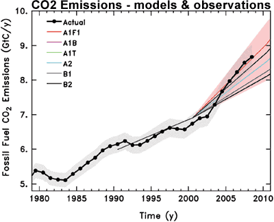
At a time when we need to be lowering our carbon footprint, global CO2 emissions have been sharply rising. In fact, the acceleration in fossil fuel CO2 emissions is tracking the worst case scenarios used by the IPCC AR4. Consequently, atmospheric CO2 is increasing ten times faster than any rate detected in ice core data over the last 22,000 years.

Figure 1: Observed global CO2 emissions from fossil fuel burning and cement production compared with IPCC emissions scenarios. The coloured area covers all scenarios used to project climate change by the IPCC.
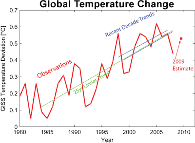
Over the past 25 years, global temperature has warmed at a rate of ~0.2°C per decade. Superimposed over this long term trend is short term variability. Most of these short-term variations are due to internal oscillations like El Niño Southern Oscillation, the 11-year solar cycle and volcanic eruptions. Over periods less than a decade, such short-term variations can outweigh the anthropogenic global warming trend. For example, El Niño events can change global temperature by up to 0.2°C over a few years. The solar cycle imposes warming or cooling of 0.1°C over five years. However, neither El Niño, solar activity or volcanic eruptions make a significant contribution to long-term climate trends. Consequently, over the past decade (1999-2008), the warming trend is 0.19°C per decade. consistent with the long term trend.

Figure 2: Global temperature according to NASA GISS data since 1980. The red line shows annual data, the red square shows the preliminary value for 2009, based on January-August. The green line shows the 25-year linear trend (0.19 °C per decade). The blue lines show the two most recent ten-year trends (0.18 °C per decade for 1998-2007, 0.19 per decade for 1999-2008).
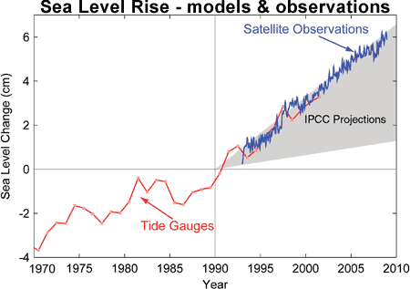
Satellite and tide-gauge measurements show that sea level rise is accelerating faster than expected. The average rate of rise for 1993-2008 as measured from satellite is 3.4 millimeters per year while the IPCC Third Assessment Report (TAR) projected a best estimate of 1.9 millimeters per year for the same period. Actual sea level rise is 80% higher than the median projection. Sea level is likely to rise much more by 2100 than the often-cited range of 18-59 centimeters from the IPCC AR4.

Figure 3: Sea level change. Tide gauge data are indicated in red and satellite data in blue. The grey band shows the projections of the IPCC Third Assessment report.
Summer-time melting of Arctic sea-ice has accelerated far beyond the expectations of climate models. The area of sea-ice melt during 2007-2009 was about 40% greater than the average prediction from IPCC AR4 climate models. The thickness of Arctic sea ice has also been on a steady decline over the last several decades. September sea ice thickness has been decreasing at a rate of 57 centimeters per decade since 1987.

Figure 4: Observed (red line) and modeled September Arctic sea ice extent in millions of square kilometers. Solid black line gives the average of 13 IPCC AR4 models while dashed black lines represent their range. The 2009 minimum has recently been calculated at 5.10 million km2, the third lowest year on record and still well below the IPCC worst case scenario.
Some more observations from the latest research:
- Recent studies have confirmed the observed trends of more hot extremes and fewer cold extremes.
- Rains have become more intense in already-rainy areas as atmospheric water vapor content increases. Recent changes have occurred faster than predicted by some climate models, raising the possibility that future changes will be more severe than predicted.
- Conversely, there have been observed increases in drought in some latitude bands. The intensification of the global hydrological cycle is expected to lead to further increases in very heavy precipitation in wet areas and increased drought in dry areas.
- Several studies since the IPCC AR4 have found more evidence for an increase in hurricane intensity over the past decades.
- There have been recent increases in the frequency and intensity of wildfires in regions with Mediterranean climates (e.g. Spain, Greece, southern California, south-east Australia) and further marked increases are expected.
- Rapid degradation and upward movement of the permafrost lower limit has continued on the Tibetan plateau. Observations in Europe have noted permafrost thawing and a substantial increase in the depth of the overlying layer.
- The contribution from shrinking glaciers to sea level rise in 2000 was about 0.8 millimeters per year. New estimates show that glacier mass loss has increased 50% and now contributes about 1.2 millimeters per year to global sea levels.
- There have been a number of recent studies reinforcing the conclusion that the rate of ice mass loss from the Greenland and Antarctic ice sheets are increasing. Recent observations have shown that changes in the rate of ice discharge can occur far more rapidly than previously suspected. Dynamic ice sheet uncertainties are largely one-sided. They can lead to a faster rate of sea-level rise but are unlikely to significantly slow the rate of rise.
- Observations also show deep-ocean warming is much more widespread in the Atlantic and Southern Oceans than previously appreciated.
There is a common theme emerging from the most recent peer reviewed research. When uncertainties expressed in the IPCC AR4 report are subsequently resolved, they point to a more rapidly changing and more sensitive climate than previously believed. Skeptics tend to characterise the IPCC as imposing an alarmist bias in their conclusions. The latest empirical data indicates the opposite is the case.


 Arguments


Courtesy of Tamino: Solid blue and red lines are trends from GISS and HadCRU data, dashed lines are IPCC projections included in the TAR.
How do we know the sun isn't driving the warming trend? Because over the past 30 years, the sun has shown a slight cooling trend. Because of this, there is a long list of peer reviewed studies concluding the sun has played a very minor role in global warming.