Climate Science Glossary

Term Lookup

Enter a term in the search box to find its definition.

Settings

Use the controls in the far right panel to increase or decrease the number of terms automatically displayed (or to completely turn that feature off).

Term Lookup

Settings


All IPCC definitions taken from Climate Change 2007: The Physical Science Basis. Working Group I Contribution to the Fourth Assessment Report of the Intergovernmental Panel on Climate Change, Annex I, Glossary, pp. 941-954. Cambridge University Press.

Home Arguments Software Resources Comments The Consensus Project Translations About Support

Bluesky Facebook LinkedIn Mastodon MeWe

Twitter YouTube RSS Posts RSS Comments Email Subscribe


Climate's changed before
It's the sun
It's not bad
There is no consensus
It's cooling
Models are unreliable
Temp record is unreliable
Animals and plants can adapt
It hasn't warmed since 1998
Antarctica is gaining ice
View All Arguments...


Username
Password
New? Register here
Forgot your password?

Latest Posts

Archives

Record high temperatures versus record lows

Posted on 19 November 2009 by John Cook

Since the mid 1970s, global temperatures have been warming at around 0.2°C per decade. However, weather imposes it's own dramatic ups and downs over the long term trend. So we expect to see record cold temperatures even during global warming. Nevertheless, who hasn't heard someone on a cold day mutter "what happened to global warming?!" Okay, I'll admit it, even I've been guilty of it. It's human nature to remember unusual events: record heat waves and freezing cold spells. Mentally calculating long term statistical trends doesn't come quite as easy as recalling that cold morning a few winters ago or that sweltering heat wave last summer. However, we can learn something about climate trends from those record hot and cold days.

Consider a record daily high to mean that temperatures were warmer on that day than on the same date throughout a weather station's history. As time passes, the number of record high and low temperatures will diminish. This is because as the years roll on and records accumulate, it becomes increasingly difficult to break a record. A new paper (Meehle 2009, see press release) examines the record highs and lows since 1950. Figure 1 shows the number of record high temperatures (red dots) and record low temperatures (blue dots). If temperatures weren't warming, we would expect the number of record highs and lows to be roughly equal. Instead, the highs and lows diverge over time with gradually more record highs than lows.
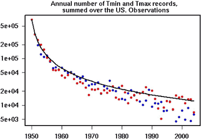

Figure 1: Annual numbers of record high maximum temperatures (red dots) and record low minimum temperatures (blue dots) averaged over the entire US region. Black line is the theoretical values assuming no global warming or cooling.

To examine this further, the ratio of record highs versus record lows were calculated for each year. Figure 2 shows the yearly ratio as black dots. The solid green line is the smoothed trend. During a period of global cooling in the 1960s, there were more record lows than highs. However, when the global warming period began in the 1970s, the ratio of highs to lows began to increase. Over the last decade, daily record high temperatures occurred twice as often as record lows.
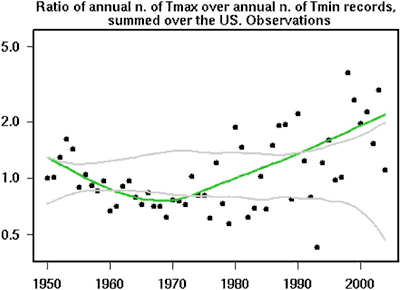

Figure 2: observations of the ratio of record highs to record lows each year (dots), solid line is a smoothed curve fit.

So we see that even during global warming, cold days are expected. However, there's a much greater chance of daily record highs instead of lows. This tendency towards hotter days is expected to increase as global warming continues into the 21st Century.

0 0

Printable Version  |  Link to this page

Comments

Comments 1 to 28:

  1. Another late night John! My father-in-law didn't believe in anthropogenic global warming, and we had a very animated and ineffective arguments about it. Now I'm told he has changed his mind! You might wonder, was it some new analysis or pedagogy or social attitude that got to him? Naw, it was hot where he lives last summer. I should tell him he's wrong to change his mind on that basis, but that probably won't do any good (we don't share any language in common, and I don't know how to mime the concept). I see Figure 1 and I first notice that the data appear to be distributed below the modeled expectation. Is there less stochasticity now (better measurements, for example), or is this just an artifact of the ln scale? Looks to be real to me. Also, is the number of stations constant throughout the study period? In Figure 2 there seems to be more interannual variation in later years (even excluding the obvious effect of Pinatubo). Perhaps when dealing with ratios, that's expected too, since it should be relatively easy to return to 1 or even less after a really hot year in the US. Or, hmmm, actually it would be interesting to remove the effect of Pinatubo from the trend, because that one cold year might really mute record cold temperatures going into the future. Sorry for the messy comment.
    0 0
  2. Failing to look closely enough before my last comment regarding Pinatubo, I now notice that Pinatubo in Figure 2 didn't result in a large number of new lows. It just caused very few new highs (blue dot still a ways below expectation, red dot the lowest in the sequence).
    0 0
  3. Steve: Just point your father-in-law to this site--it worked for me with my father!
    0 0
    Response: Skeptical Science helped convince your father-in-law? You've had better success than I. I've given up on my father-in-law as a lost cause. In fact, even my own father (also a skeptic) refuses to talk to me about global warming science (his argument is that he heard some guy on the radio say that the world was 5 degrees colder a few decades ago).
  4. Well, I've now followed the link to the news release and found that fewer record lows (rather than more record highs) was general and expected (because nighttime temperatures are expected to increase faster than daytime temperatures). I have one more observation about the data, though: I think a better way to present such things would be to show the percentage of new records that are highs. 50% would be even, twice as many highs as lows would be 67% (rather than requiring a log scale in Figure 2). PS -- thanks cbrock, I just need to translate these pages. Any interest in translating your work, John? (Or maybe the common skeptic arguments are actually different ones in other languages.)
    0 0
  5. There are three possibilities: 1) Global Climate stays the same. 2) Global Warming. 3) Ice Age. It was stated years ago that... "Nothing endures but change." http://en.wikiquote.org/wiki/Heraclitus If true, there are actually only two possibilities. And ironically, if we were heading for an ice age, the demand for burning wood and and fossil fuels would be on the increase.
    0 0
    Response: That Heraclitus quote is apt - climate has and always will change, with or without human intervention. This is because when the planet is in energy imbalance - when it's accumulating or losing heat - temperature changes. Currently, CO2 is imposing an energy imbalance due to the enhanced greenhouse effect. So past climate change actually provides evidence for our climate's sensitivity to CO2.
  6. mea culpa - formatting errors: I wrote two posts too quickly, and have messed up a blockquote here: http://www.skepticalscience.com/An-overview-of-Greenland-ice-trends.html post #31 and a bold text closure here: http://www.skepticalscience.com/An-overview-of-glacier-trends.html post #24 my very bad! Is there any way of resetting the formatting to the default at the end of each post so that careless numpty's like me don't keep messing up the formatting?
    0 0
    Response: Chris, I've manually fixed those two comments. There's probably some clever code I could write to automatically fix stuff like that but I'm too busy (and lazy) to dream that up at the moment so I'll just throw a bandaid on the problem for now :-)

    BTW, I've tried emailing you several times with no reply. Do you no longer use the o2.co.uk email address you signed up with or are you just ignoring me?
  7. Fascinating study, and well delivered - thanks. What would be especially interesting would be to see the data on record high maxima versus record low maxima, and particularly record high minima versus record low minima.
    0 0
  8. It would be interested to see a similar analysis for Australia. The heatwave and other temperature records of Victoria and South Australia are being blown away year after year. Something really screwy is happening. Now we are seeing a heatwave in Spring that exceeds the record from a few years ago for summer heat waves.
    0 0
    Response: It's funny you should mention that - Meehle 2009 refers to a similar study on record highs/lows being done for Australia. I scratched around for it but it appears to be not yet published - will add it to the It's Freaking Cold page when it comes out.
  9. Proposed new website: "Father in-law Science". Matt @7, do you mean you'd like to see record high daily minima and record low daily maxima? I think I agree -- let's look at nighttime and daytime temperatures separately.
    0 0
  10. Steve L @9, yes, that's what I meant. To me, comparing record high minima (night-time minimum temps) against record low minima - and, separately, record high vs record low maxima - would be much more significant than just high maxima vs low minima. Wonder if I can dig up the raw data and do that myself...
    0 0
  11. It's interesting and to some extent fun but exactly whats the point? Given that temperature isn't a random system is there anything to be gained from looking for randomness. As can be seen from the graph highs and low do diverge after the 1980s to suggest warming but they also diverge in the 1960-1970 but in the opposite direction suggesting cooling for that period, statisical significance for both period would be interesting. To add to that I wonder what happens when, following a cold snap (1970s), you look for randomness in the distribution of highs and lows? Common sense would suggest you'd see more highs. An alternative analysis might be to analyse the data from the begining of each period (warming and cooling) to look for trends within that period although this would have the disadvantage of shorter time course.
    0 0
  12. I think the point is that changes in local, extreme weather have different consequences than changes in regional, average weather, so looking at how extreme weather changes in response to climate change is valuable. It's important to compare models expressing what we think extreme weather will do to how extreme weather actually reacts. This might be one of the first papers to do this with a realistic null model (I don't know). In future, hopefully better alternative models can also be presented. Borrowing from your idea of looking at shorter periods, a model comparing rates of new records to rates anticipated for adaptation might be valuable.
    0 0
  13. Pico This maybe unrelated but there is certainly a link between El Nino and Eastern Australian weather. I've got a question on El Nino. Have they been more frequent since 1980? Does this graph from Santer suggest two El Nino in the 1980's and 4 in the 1990s? https://www.llnl.gov/str/JulAug02/gifs/Santer5.jpg
    0 0
    Response: There certainly is a link between ENSO and eastern Australia - I plan whether we go on a snow holiday based partly on whether we're in La Nina conditions (which leads to colder, wetter conditions at Perisher).
  14. 1) From the graph, it is apparent that as you move to the right, the red dots are hugging the black line as they should. At the same time, extreme cold becomes rarer and rarer over time. Most people (out there) think of Global Warming as a general rise in temperatures. What it really means is Milder Winters. This fact was apparent in an earlier post that pointed to a link containing historical data from Greenland. It showed milder winters, with summer temperatures generally unchanged. 2) While you cannot know by the red or blue dots what extreme temperatures are behind them, this may not be important. The graph is useful and portrays what is really going on (given sound interpretation). 3) As far as father in laws, maybe it would be interesting to see a plot of belief in global warming (on a scale of 1 to 10) vs age. My sense is that younger people would tend to be more concerned, since they are more likely to be affected in their lifetimes.
    0 0
  15. Just to show how easy it is to get side tracked I will throw in a data point that my father also doesn't seem to buy into global warming. We just don't discuss it anymore. While I won't give away his age, he remembers WWII quite well. My father-in-law doesn't believe in much these days RIP! Regards, John
    0 0
  16. John @15, to stay sidetracked (sorry John C.), my father is in the "extractive industries" field--a professor of petroleum accounting at a Texas university, but having a physics background--and is constantly bombarded with the usual Fred Singer quotes from his colleagues. The SkepticalScience site has really been great at supplying him with ready responses to these sorts of comments. He's learned a lot and has a much deeper understanding of the issues. So great thanks to John Cook for taking all the time and energy to sort through the science and distill complex findings into clear and succinct summaries that the general public can understand. And for maintaining a site that is free of political ranting! I've not found a better site for this, and I've looked quite a bit.
    0 0
  17. RSVP: 1, actually there are probably fewer blue dots in the summer too (the news release attributes the pattern to warmer nighttime temperatures). 3, agreed, but I think self-interest is only one of several factors involved (religiosity, propensity to listen to talk radio, generally being set in one's ways, etc). Nobody has either agreed or disagreed with me regarding whether ratios or percentages are a better way to summarize the information. I'm surprised because I thought that might be the most substantive thing I've written in a while.
    0 0
  18. One detail I noticed on the UCAR page: there´s a special box for journalists. This is great. Communication of scientists with the press shoul be smoothed as much as possible.
    0 0
  19. Interesting study, got Anthony Watts all steamed up. I have not looked into the specifics, but I was wondering if anyone has determined whether or not there has been a statistically significant shift in the probablility distribution function/s (PDF)for the min. and max. temperatures? It is my recollection that AGW is going to manifest itself (or rather already has) in the shift of the PDF of temperatures, especially the tails, rather than each day being +2C warmer, for example, as many people tend to think. Anyhow, a PDF analysis might be more robust and insightful than the data contained the figures here.
    0 0
  20. I think I can picture the probability function changes described by the study (based on 24 hour periods, each standardized to the mean for that day of the year) -- the tail toward lower temperatures has shortened while the tail toward higher temperatures has stayed the same [affecting the kurtosis] and the bulk of the data have shifted slightly toward higher temperatures [affecting the skew of the distribution]. I don't know if this is what you (@19) mean. You write "rather than each day being +2C warmer" suggests that you might be talking about variance among days of the year rather than changes on a given day of the year. That would be quite a different way of looking at the data.
    0 0
  21. SeveL, thanks. You described what I was picturing, although has the tail for the max. temps not also become longer? Maybe someone who has the raw data could generate the PDF for the temperature data. I could try to do so, but don't know where to source the data.
    0 0
  22. I don't have the data, but I'm guessing "no, the upper tail is getting shorter relative to the mean" from the fact that new record highs aren't yet exceeding the null expectation. Perhaps the distribution will continue to get less leptokurtic, but it's because the bulk of the temperatures is creeping up and eventually we'll see red dots higher than the line more and more often. I think this is interesting because the expectation of "more extreme weather" that comes with AGW might be interpreted as a flattening of the density function. I would be curious to learn whether or not the data as summarized above are actually relevant to the notion that weather will become more extreme. Is there a contradiction or, if not, what is the disconnect?
    0 0
  23. I'm talking to myself on this thread a lot; here I'm responding to my own question regarding a potential disconnect between model expectations of more extreme weather and the surface station record described above that shows, overall, less extreme temperatures. I've skimmed the draft Hergerl et al paper because it was a draft and because it is not new: http://www.env.duke.edu/people/faculty/hegerl/hegerlextremesresub.pdf There is probably better info out there now. I found the following enlightening, though: "daily station data are not readily comparable with daily model output." The model works on larger spatial scales and, despite what this sentence implies, longer temporal scales are also better for comparison (according to text shortly following the quotation). How poorly comparisons work will depend on how the shape of the distribution changes (can be read as how the extremes relate to the mean as the climate changes). The abstract summarizes how the mean and extremes are expected to change: "The estimated signal-to-noise ratio for changes in extreme temperature is nearly as large as for changes in mean temperature. Both models simulate extreme precipitation changes that are stronger than the corresponding changes in mean precipitation." I've glossed over a lot of detail here, and probably the issue deserves better investigation than I've given it. But I think a safe summary is that (1) station data don't make great comparisons to model outputs and (2) increases in extreme weather may be manifest more strongly in precipitation than in temperatures.
    0 0
  24. SteveL, thanks for the Hegerl paper. Yes, point values are not really/easily comparable grid tile data from models, especially AOGCMs b/c they have pretty large grid spacing (although the grid spacing is being reduced as computing power increases). This will translate into higher resolution, which will allow for better representation of ocean currents and moist convection etc.. What you say about precip may be true-- precip. is the integrator and net result of many physical processes. Unfortunately, measuring precip. accurately over long time periods even using an official gauge network is problematic. Fortunately, many national now have radar networks, and satellite microwave technology is improving, then there is TRMM of course (only to mid latitudes though). Anyhow, I am not aware of any papers out there which investigate **large-scale** trends in precip. (using the same data platform) the last 30 years. There are, of course, papers which discuss site-specific changes. There are also lightning detection networks (proxy for convective precip.), but reliable data for N. America only goes back to 1999. I'm presently using those lightning data to explore land-atmosphere feedbacks. Very interesting.
    0 0
  25. Albatross, thanks for the info. Do you recommend anywhere to look regarding background on lightning and land-atmosphere feedbacks?
    0 0
  26. Steve L, I have made an exhaustive search though the literature and have found only one paper which explores relationship between lighting activity and soil moisture (my interest) in Mongolia. This is a very new field. I can track the paper down if you like. Regarding changes in the rainfall, the IPCC update which was released today includes a couple of references to large-scale trends in precip. in the 20th century (e.g.., Zhang et al., 2007, Nature). Check it out at: http://www.copenhagendiagnosis.com/ PS; Also try this one for lightning land use interactions. Kilinc and Beringer 2007, J. Climate (AMS) There are more on this topic (land use lightning).
    0 0
    Moderator Response: [Daniel Bailey] An open-access copy of Zhang et al 2007 can be found here.
  27. Thanks for that Albatross. I've got a tinyurl for the Kilinc & Beringer paper: http://tinyurl.com/yeqsp5p Unfortunately I won't be able to look at it or the diagnosis any time soon (too many deadlines!).
    0 0
  28. mozart - See the above graph with declining numbers of highs and lows. The longer the data set, the fewer extrema you will expect to see later in the data set, as records are only set when either internal variation is high or when the midpoint shifts. The ratio of highs to lows over any time period is an indication of trends.
    0 0

You need to be logged in to post a comment. Login via the left margin or if you're new, register here.


The Consensus Project Website

THE ESCALATOR

(free to republish)


© Copyright 2024 John Cook
Home | Translations | About Us | Privacy | Contact Us