Dear Heartland, Stop using Arthur Robinson's Trick to Hide the Incline
Posted on 18 May 2012 by Mark Boslough
Climate change is debated in letters to the editor of hometown newspapers all over the world. In the Las Cruces, New Mexico, Sun-News, one reader recently cited "a 1996 paper by Kiegwin (sic) in Science which showed that, despite the present having a CO2 concentration of 388 PPM, the present temperature is cooler than the average of the last 3,000 years, and that it was considerably warmer than today during the Medieval Warm Period, the Roman Warm Period, and the Holocene climate Optimum.” A few months later another reader asserted that “Keigwin, Science, 1996, shows present temperatures aren’t much different from the 3,000 year mean.”
Did the Keigwin paper really say that? And how is it that two non-scientists from a mid-sized New Mexico city would be so confident that a scientific paper published a decade-and-a-half earlier supports their belief that the world was warmer during Medieval times?
First, let’s review Keigwin (1996). The title “The Little Ice Age and Medieval Warm Period in the Sargasso Sea” might provide the first clue that it isn’t about global temperatures, but about one location on Earth: the Sargasso Sea. What Keigwin did was to use oxygen isotope measurements in plankton skeletons from sediment cores as a proxy to reconstruct the sea surface temperature (SST) of the past 3000 years. The cores were collected in 1990, and were divided into 50- to 100-year segments. In the absence of mixing or bioturbation from below, the mid-point of the most recent 50-year thick sample, whose value would represent the most recent paleotemperature, would be 1965. In a perfect world, the bottom of the segment would date to 1940. However, sediments in the real world are never completely undisturbed. It is very likely that the most recent segment contained shells from the early 1900s or even from the previous century. That means the last paleotemperature is really an average that probably includes values from before automobiles and light bulbs were invented.
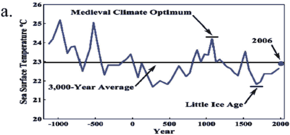
Keigwin published a graph, as Figure 4b (K4B), of his best estimate of the resulting time series.
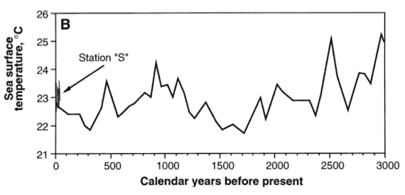
He also included several years of modern instrumental measurements at hydrographic station “S” in Bermuda, starting in 1954. The modern year-to-year temperatures fluctuate significantly, but the mean is well above the 23°C average of the entire proxy record.
It is unlikely that the Las Cruces letter-writers ever read this paper, or they would have known it wasn’t about global temperatures. It is highly cited in the contrarian literature as evidence against human-caused global warming, and turns up in many blogs and editorials without reference to the Sargasso Sea. How did this happen?
The misuse appears to have started in the late 1990s, when Arthur P. Robinson of the Oregon Institute for Science and Medicine (OISM) started the so-called “Oregon Petition” to collect signatures of people opposed to the Kyoto Protocol. With his son Zachary and two associates from the conservative George C. Marshall pressure group (Sallie Baliunas and Willie Soon), he self-published a paper called “Environmental Effects of Increased Atmospheric Carbon Dioxide” designed to look like a peer-reviewed article from the Proceedings of the National Academy of Sciences (US). It was mailed out with the petition to many thousands of engineers, dentists, veterinarians, and even some scientists. In January, 1998 it appeared in a periodical published by the Association of American Physicians and Surgeons (AAPS), a political advocacy organization with a stated mission to “fight socialized medicine and to fight the government takeover of medicine.” The executive director of AAPS is also member of Robinson’s OISM. In it was their Figure 2, a modified version of Keigwin’s K4B.

Robinson and coauthors made several changes in representation and labeling. First they inverted the axes so time runs from left to right, but they were unaware that when paleoclimate data are plotted “years before present” means “years before 1950” so their data is shifted by about 50 years. Second, they removed the data from hydrographic station “S” which showed that recent temperatures are above the long-term average. Third, they neglected to label it as being a record for the Sargasso Sea. Fourth, they called it a global temperature in the text, saying, “For the past 300 years, global temperatures have been gradually recovering. As shown in figure 2, they are still a little below the average for the past 3,000 years.”
This paper became the basis for statements in two influential Wall Street Journal opinion pieces. The first, in 1997, was by Robinson and his son Zachary, called “Science Has Spoken: Global Warming Is a Myth.” They stated,
During the past 3,000 years, there have been five extended periods when it was distinctly warmer than today. One of the two coldest periods, known as the Little Ice Age, occurred 300 years ago. Atmospheric temperatures have been rising from that low for the past 300 years, but remain below the 3,000-year average.
The second editorial, with son Noah, was called “Global Warming is 300-Year-Old News.” In that one, they stated that “Earth temperatures are now near the 3,000-year average and clearly not unusual.” Their Oregon Petition figure was re-drafted with different temperature units, but the time scale was still wrong, and the current thermometer measurements were still missing. Despite the misrepresentation in the text as “Earth temperatures” the graph this time was labeled “Temperature of the Sargasso Sea from 1000 BC to 1975 AD.” The source of the year 1975 as the endpoint is unclear and did not come from Keigwin’s paper.
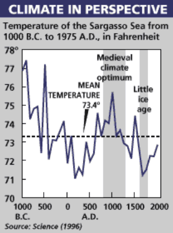
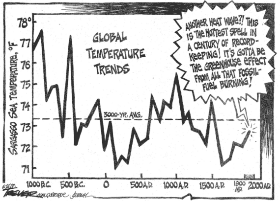
This Wall Street Journal version of the graph appears to have become the new “primary source” for those who argue that temperatures are actually lower now than they were in the past. Award winning editorial cartoonist John Trever redrew it for an ironic dig at climate scientists who claim otherwise (including—with true irony—Lloyd Keigwin, the original author of the figure).
In 2004, I was asked by my management to review the original sources of these claims, and I wrote several messages to Arthur Robinson asking for some clarifications. Because I was planning to write a report, I wanted to give him the courtesy of responding with any clarifications or corrections. Among other questions, I included the following,
I'm wondering what is your basis for the statement, "During the past 3,000 years, there have been five extended periods when it was distinctly warmer than today." (Robinson & Robinson, The Wall Street Journal (Dec. 4, 1997). I've seen this quoted by others (often without attribution) but it looks like you were the first to say it.
Robinson responded,
I note that the Sargaso (sic) Sea curve shows five earlier periods where the temperature was above the mean and therefore warmer than today. This is probably the source of the statement.
Significantly, business advocate Raymond Keating—in testimony to House Small Business Committee (June 4, 1998)—said, “During the past 3,000 years, there have been five extended periods when it was distinctly warmer than today.”
I proceeded to ask Robinson some more difficult questions,
I can see that your Figure 2 was taken directly from the 1996 Keigwin paper, but with the post-1954 instrumental "Station S" SST data removed. Was there a reason you took the directly measured temperature off? What method did you use to calculate the 23 C mean? Did you derive it from the original Keigwin data or was that simply an estimate to the nearest degree?
You incorrectly represented the graph as global temperature. You stated, "For the past 300 years, global temperatures have been gradually recovering (11). As shown in figure 2, they are still a little below the average for the past 3,000 years."
I plan to include these observations in my final writeup. If you care to respond, I would be happy to include your comments.
To which Robinson replied,
Regarding the world data. We clearly labeled this data location. Since virtually all other available dats (sic) from other locations (see Soon and Baliunas) is similar, providing this example was entirely ethical.
It is too bad your employers could not find an objective scientist for this task. I will not be providing any additional comments, since I am quite sure they would not be presented in their enirety (sic) to your employers, any more than will those I have already written. You are clearly devoted to lifting selected things from their context.
Do not waste your time with additional email. It will be shunted to the unopened file here.
AR
For the record, I provided all his responses to my management in their entirety.
The most recent chapter of this story began when the periodical of the AAPS re-published an edited and colorized version of the paper in 2007 under a different author rotation (Baliunas was removed, and son Zachary was replaced by son Noah). Perhaps because of my 2004 criticisms, an instrumental data point was added for year 2006, and the mean temperature was shifted.
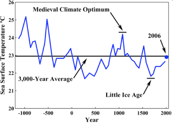
The paper explained the source of the 2006 temperature thusly, “A value of 0.25 °C, which is the change in Sargasso Sea temperature between 1975 and 2006, has been added to the 1975 data in order to provide a 2006 temperature value.”
Unable to reproduce this temperature with the data I had, I wrote to Willie Soon in 2010 and asked for the source of the data. He cordially responded and sent me the table, telling me,
…also about the most recent point at "2006"---sorry that I could not be more certain, but I am sure Noah has carefully included this updated SST series from station S that Dr. Keigwin sent me around July of 2007 (which as you can see from the file name was obtained by Dr. Ruth Curry of WHOI).
Graphing the Station S data with their data point for 2006 (blue) demonstrates that the 2006 is about a degree too low in Robinson et al. (2007).
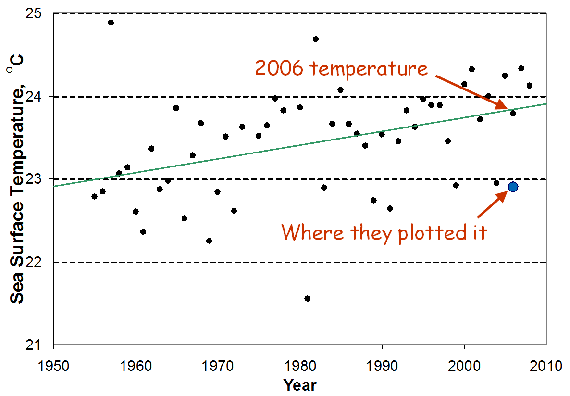
If they had plotted the data they had, the way they said they did, it would have looked like this:
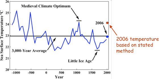
On Nov. 2, 2010, I presented this to a large audience at the Geological Society of America (GSA) meeting in Denver. Always wanting to give others the benefit of the doubt, I wrote to Noah Robinson several times at his OISM address. On Oct. 23, 2010 I wrote:
Willie & Noah,
Attached is a draft of a couple slides I plan to present, which strongly suggest that your team fabricated the 2006 data point to hide the increase in Sargasso Sea surface temperature.
You plotted your 2006 point too low by more than a degree C. If this was an honest arithmetic mistake or silly drafting error, now would be the time to explain it and correct it. If you let me know before my presentation, I will be happy to include your explanation.
Best regards,
Mark Boslough
I did not get a response.
The Heartland Institute, a fossil-fuel-funded political pressure group, reprinted a distorted version the latest OISM the graph in their advocacy report, “Nature, Not Human Activity, Rules the Climate” (S. Fred Singer, editor). This was published for an organization called the Nongovernmental International Panel on Climate Change (NIPCC), and was sent to American members of Congress and other policy makers.
In 2011, I submitted an abstract, coauthored by Lloyd Keigwin, to the Third Santa Fe Conference on Global and Regional Climate Change, so that we could present these findings. According to the conference summary, it was “to focus on climate change and variability from observational and modeling perspectives.” The chair of the conference, Petr Chylek is affiliated with one of the sponsors (Los Alamos National Laboratory) as well as the Heartland Institute (as a “Heartland Expert”). With many speakers affiliated with the Heartland Institute (it turned out to be at least nine) it seemed like a good opportunity to provide feedback. Unfortunately, Keigwin and I received a rejection letter from Chylek, who told us,
This Conference is not a suitable forum for type of presentations described in submitted abstract. We would accept a paper that spoke to the science, the measurements, the interpretation, but not simply an attempted refutation of someone else's assertions (especially when made in unpublished reports and blog site).
This was a puzzling rejection given that the “unpublished report” was the NIPCC document released by the Heartland Institute, which is widely cited by the many Heartland-affiliated speakers invited by Chylek.
Nevertheless, I was able to have a conversation with Fred Singer, the editor of the NIPCC report, about the Sargasso Sea graph. At first, he told me that I should take it up with Robinson, but ultimately he assured me that it would be corrected in the next edition of the NIPCC. He also revealed that he had been the one who had sent Keigwin’s paper to Robinson in the first place, back in the ‘90s.
In a final attempt to get my feedback directly to the Heartland Institute before writing this guest post, I offered in April, 2012 to give a presentation at their annual meeting in Chicago in May. My offer was rejected by Heartland’s Director of Communications, Jim Lakely, who told me in no uncertain terms, “you will not be getting an invitation to speak.”
I look forward to their response to this article.


 Arguments


 0
0  0
0 Your 1st diagram includes SST data from Station "S". These appear on my overlay as the squiggly line centered around 23°C, at approximately 1996. It is my understanding that this represents data from 1954 up to the time the paper was published in Keigwin (1996). These same (??) data appear as the black dots on the base diagram, beginning in 1954, extended up to the present. The green line presumably represents a linear best-fit (although this is not specified). Can you explain the apparent discrepancy between these two representations of the data?
Your 7th diagram indicates a "2006 temperature based on stated method", slightly higher than 24°C, but I didn't see where you state the method. This point differs from the "best fit" value indicated on the base diagram, although it does seem to fit the surrounding data from the base diagram.
Finally, you refer to the Heartland Institute as "a fossil-fuel-funded political pressure group". The recently leaked documents from Heartland indicating their funding sources did not appear to me to support this comment. Can you indicate what you base it on? Thanks.


Comments