Climate Science Glossary

Term Lookup

Enter a term in the search box to find its definition.

Settings

Use the controls in the far right panel to increase or decrease the number of terms automatically displayed (or to completely turn that feature off).

Term Lookup

Settings


All IPCC definitions taken from Climate Change 2007: The Physical Science Basis. Working Group I Contribution to the Fourth Assessment Report of the Intergovernmental Panel on Climate Change, Annex I, Glossary, pp. 941-954. Cambridge University Press.

Home Arguments Software Resources Comments The Consensus Project Translations About Support

Bluesky Facebook LinkedIn Mastodon MeWe

Twitter YouTube RSS Posts RSS Comments Email Subscribe


Climate's changed before
It's the sun
It's not bad
There is no consensus
It's cooling
Models are unreliable
Temp record is unreliable
Animals and plants can adapt
It hasn't warmed since 1998
Antarctica is gaining ice
View All Arguments...


Username
Password
New? Register here
Forgot your password?

Latest Posts

Archives

What's in a trend?

Posted on 13 July 2010 by muoncounter

Guest post by muoncounter

Over at a popular denialist site, folks are chatting about how hot it was during June.  But they reassure one another that it’s really OK: the trend in the latest UAH Lower Troposphere temperature anomaly data remains well below the nominal trend of 0.2C per decade.  And after all, the June 2010 anomaly was less than the 1998 peak, which suggests no warming at all!

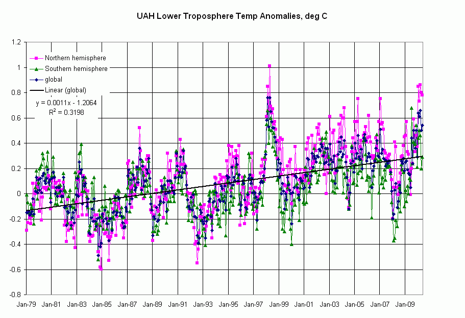
The UAH data are available in text form here.  At the bottom of each column in the text file, there’s a value given for ‘Trend’.  The graph below shows the data for global (dark blue), northern hemisphere (pink/purple) and southern hemisphere (dark green).  The value given for the Global Temperature Trend is 0.14 degC/decade, which is in good agreement with the slope of the best fit line shown.
Link to the full scale graphic

These monthly data are quite noisy, as indicated by this line’s appallingly low R^2 of 0.32.  We can quickly create an annual average, which is shown with annual minimum and maximum in the following graph.  
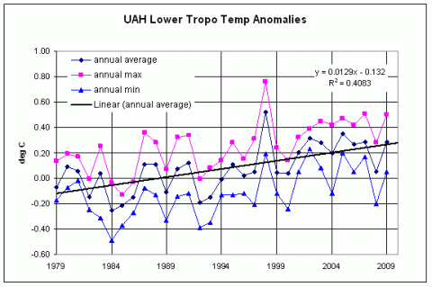

Same trend, but still noisy (if only 1998 hadn’t been so darned hot).  But with this trend, it will be 50 years before the temperature anomaly passes through a measly 1.0 degree C.  

During the same time period as the UAH temperature data, atmospheric CO2 (MLO, annualized) increased by approximately 50 ppm, representing a trend of 17 ppm/decade.  Doubling atmospheric CO2 will supposedly lead to a 3 degree C increase in global temperature, but at this rate, even that won’t happen for another 150 years or so.

It’s all good; we can sip another frozen margarita from the comfort of our inflatable pool chairs.
 
Side note:  In my prior life in the oil exploration business, we often played “trendology”:  If you didn’t know anything about a particular oil producing area, you could start by drawing lines between existing oil fields.  Sometimes this actually worked and you found a new field “on trend,” but in those days (the late 70s-early 80s), the trends told us that the price of oil would be heading towards $100/bbl by mid1986. In case you weren’t there, it bottomed around $12 that year.

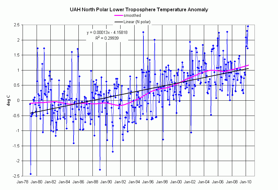
It is in the north polar data (where Official Trend value given in the UAH data file is an unhealthy 0.47 deg/decade), that a different picture emerges.

Link to full size graphic
Link to graph with plus/minus standard deviation overlays

The single best fit line shown, with another appallingly low R^2, matches that Official Trend.  The curve shown in pink, however, is a fit obtained by use of the LOESS utility for Excel, available free hereLOESS or LOWESS is a  locally-weighted fit utilizing subsets of the data to produce a smooth curve.  The smoothing strength is user-controlled.  Please note that I haven’t done any comparative smoothings; the pink curve was a first try.  Although I haven’t scrutinized the algorithm, it looks similar to what we called “adaptive fitting,” often used in the oil business to generate contour maps from sparse data.

What do we observe from the LOESS curve?  For the first 13 years in the data set, the curve is nearly flat.  Beginning in 1992 and running for approximately 12 years, there is a sustained slope representing an Alarming Trend of 0.9 deg/decade; after a two year flat spot (approx 2005-07), we’re back on nearly the same trend!  

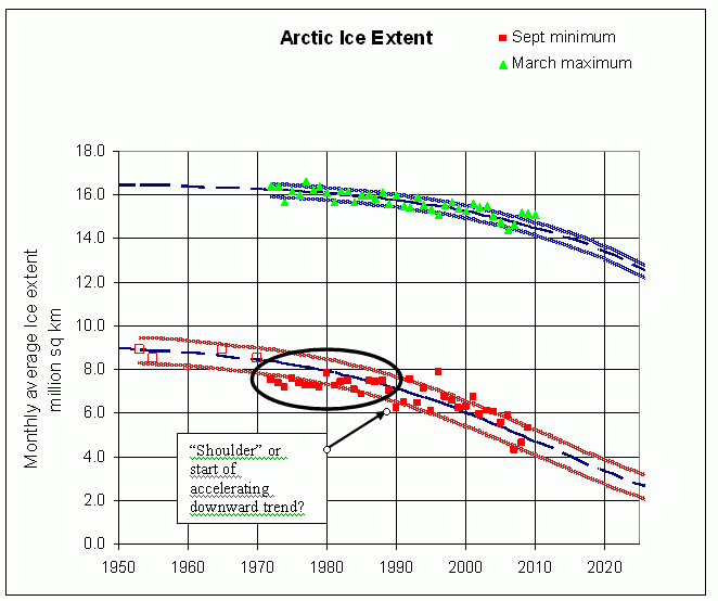
Seasonal Arctic sea ice extent data for the corresponding period are shown below; ignore the curves on this graph for a moment.  The minimum ice extent data points from the 1970s to 1990 (points inside the oval) are nearly flat; is the “shoulder” at 1990 the beginning of a real response to this Alarming Trend?  Even the deniers realize that there’s some rapid ice melt this year.


link to the full scale graphic

Is the Alarming Trend, 90% higher than the Official Trend, responsible for the accelerating arctic ice melt documented here and here?  These observations beg the following questions, which I pose to the community at large:  

  1. Why were the temperature anomalies (and the ice extent) so flat during the 70s and 80s?  

  2. What mechanism might have set the northern latitude temperatures on such an Alarming Trend from 1990 on?

  3. How do we get the people who report such things to stop using a single straight line trend to describe a complicated, long term data set?  

In case you doubt the importance of question 3, consider this:  In the UAH text file, a monthly data set lasting 31 years, there are approx 370 points for each column.  Try this experiment:  Project any column forward from its last point for the remainder of 2010 using an arbitrary value, say 0.1 deg/month (yes, you get a ridiculous value for December 2010, but this is an example).  Fit a straight line to the entire column, including your projection. The slope you get will not vary from the Official Trend by one significant figure; the data set is dominated by the 'inertia' of all those earlier points. 

To further illustrate how badly “Trend” misrepresents a data set:   Here is the GISS temperature anomaly, with what would be reported as its Official Trend (a paltry 0.06 deg/decade) and a LOESS smoothing (red curve).  The slope at the tail end of the LOESS curve is approximately 0.15 deg/decade, a reasonable match to the slope we obtained earlier from the UAH LT global data (green points in this comparison graph).  Lines of slope 0.15 deg/decade are overlain for reference.  
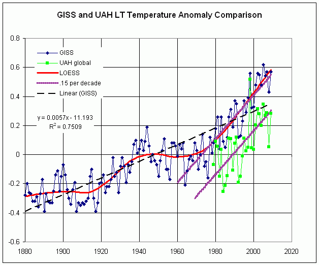


Link to the full scale graphic

Makes you feel good when two different datasets agree on the rate of global temperature increase; I guess there’s something to this global warming after all. 

0 0

Printable Version  |  Link to this page

Comments

Comments 1 to 24:

  1. One thing to note about that ice transition you stress in 1990 is that a big physical shift occurred in Arctic Ocean sea ice right at that time (1989), with a large "flush" of old thick ice, as explained in some detail here: http://dotearth.blogs.nytimes.com/2010/03/22/new-light-shed-on-north-pole-ice-trends/ As was the case in 2007, ice up there can change as much through motion as melting, Arctic scientists tell me.
    0 0
  2. heh, i might practise some intellectual dishonesty in my next (hobbyist) analysis and discount 1998, for it was clearly some 1/50 event considering El Nino. What it did show was that anomalous El Ninos may be stronger than anomalous La Ninas, the strongest of which should be also discounted from it ;-). One might get a clearer picture of the trend this way, analysing only ENSO neutral months. I've no doubt this has already been done but never published, as true scientists like to check their findings in more than one way.
    0 0
  3. That's an interesting idea, jyyh. I wonder what a chart of temperature anomalies would look like with all El Nino / La Nina periods removed? (apart from somewhat incomplete!) Other than that, this is an interesting post, muoncounter - thanks, it provides another perspective on trends.
    0 0
  4. Don't forget that the UAH dataset has been tweaked multiple times over the past months, in addition to other changes specifically for the channel 5 data. This brought the anomalies down. This was done right at the time that new records were set, probably a coincidence.
    0 0
  5. Petr Chylek recently published on the seesaw effect on the poles temp caused by the AMO. He detrends the arctic and antarctic temp records and shows these are in an anti-phase. He then compares these detrend temp records with the AMO index and shows arctic detrended temp is correlated with the AMO (antarctic anti-correlated). In it he suggests that two thirds of the recent arctic warming is due to this shift in the climate patterns of the earth. Maybe one third GHG. Specific to your 3 questions 1) 1970-1980 represent the point when the AMO index was at it's lowest and just beginning to rise. 2) 1990 is the point at which the detrend arctic and antarctic temp records cross which suggests a point when the extra warming from shift in climate regimes rather than increases in GHG really kicked in. Post 1990 warming is the sum of GHG and AMO effects. 3) [cynicism on] straight lines allow for simple singular explanations for trends. Complicated trends demand complicated explanations [cynicism off]
    0 0
  6. In reference to Andy Revkin's point about ice export circa 1990... in short, a 'tipping point' was passed. The large block of decades old ice along the northern edge of the Canadian archipelago and Greenland broke up and started to drift out of the arctic. Prior to that this had been a massive block which endured year after year and served as a 'plug' forcing most of the younger / thinner ice to remain in the arctic basin each year. Warming got severe enough to break up the plug and now we're seeing accelerated ice loss. Even without further warming we'd see the arctic continue to decline because that solid plug is gone and won't come back until temperatures drop below where they were circa 1990 and stay there.
    0 0
  7. #1: "a big physical shift occurred in Arctic Ocean sea ice right at that time (1989), with a large "flush" of old thick ice" Exactly the type of thing I was looking for! Thanks. #2, #3: I don't like removing months here and there. Rather, the ninos/ninas appear as short term events, which (IMO) need to get filtered out to see long term behavior. One thing I did, but did not include here, is a graph of the global data with the straight line trend subtracted out. There is a very distinctive sawtooth pattern with a 4-6 year period and that annoying spike in '98. But these are removed by the curve fit, which is not unlike a moving average. #4: See the last graph. Tweaked or not, UAH and GISS show the same overall pattern for the last 30 years. Or is that what you mean by 'tweaked'? #5: I looked at UAH's South polar record; it's basically flat (with even a slight downward look). Nowhere else but in the Arctic does one see such numbers as the Official Trend (0.47) or the Alarming Trend (0.9). HR, the Antarctic down/Arctic up is highly asymmetric. Must be more to it than a 180 phase shift. Are you suggesting some sort of heat flow from south pole to north pole, which seems anti-thermodynamic? As for <CYNICISM></CYNICISM> (why isn't that an HTML tag?), sure. It seems to be a human tendency to see lines in everything, even when they may or not be there. I once had to explain to an oil company executive why straight lines on a map were not really straight over long distances because, err, the earth isn't flat. Have you ever shown anyone a 'right triangle' on a globe, consisting of 2 longitudes and a latitude? Easy picture to draw, but what about those 2 90 degree angles? But the UAH data are posted by a science group at a university; why can't they assume their audience is college educated and can handle the mathematical equivalent of 'big words'? By providing a single 'trend', are they not creating a false impression? Especially among the "Details? We don't need any stinking details!" crowd.
    0 0
  8. #6, CBD: "a massive block which endured year after year and served as a 'plug' forcing most of the younger / thinner ice to remain in the arctic basin each year. Warming got severe enough to break up the plug" Non-geologists don't seem to realize that ice events are discontinuous. Ice dams form and hold ice or water back until a semi-catastrophic break occurs. The regime after that break may be totally different from what it was beforehand. Yet another reason why a single 'trend' isn't just misleading, its incorrect.
    0 0
  9. #7 should have read
    As for " ", why isn't that an HTML tag?
    but apparently the text interpreter thought it is!
    0 0
    Response: Browsers turn anything with the < > format into HTML tags and they don't appear. The only way around it is to use < instead of <. I did that for your comment so the CYNICISM tags now appear
  10. muoncounter The asymmetry is there because of the GHG trend. Once this trend is removed from the arctic and antarctic the symmetry looks good. Have a look at the paper if you can get passed the paywall. I'm not exactly why you're picking on UAH for using single trend lines. it seems like SOP for climate science.
    0 0
  11. It's SOP because climate scientists know that thirty years is about what is necessary to declare a climatic trend. People looking at shorter time intervals can find interesting phenomena (and a lot of scatter), but you can't say much about the global climate trends looking at a few months or years.
    0 0
  12. #10: "I'm not exactly why you're picking on UAH for using single trend lines" Its not so much 'picking on', as it is citing UAH as a specific example. I saw the blogpost about this past June's temperatures, which mentioned UAH specifically and used their straight line trend as a standard. Prior to reading that, I've seen straight line fits all over, but mostly disregarded them. #11: "but you can't say much about the global climate trends looking at a few months or years." All too true. However, when you see a pattern that persists on a 15 year time scale abruptly change, you have to wonder whats going on.
    0 0
  13. I guess I'm not seeing the relationship between these ocean oscillations and the UAH temperatures. Here's a graph of AMO and SOI straight off the PSD data selection plotter. Here are UAH N hemi ocean LT temps with a smooth curve extracted in the same manner as the polar data in this article. Similarly, I found a long term trend in the AMO time series. Here are UAH S hemi ocean LT temps with the same curve fit and a long term trend extracted from the SOI. The two ocean oscillations are certainly out of phase (most of the time); they reach their respective extrema in the late 80's and their long term trends do indeed cross over from time to time. But when the AMO started down, the N hemi LT temps kept going up. And when the SOI started up, the S hemi LT temps also went up. Where's the connection?
    0 0
  14. #13 You read the paper? Mail John, he has a copy. These graphes whole hemispheres? Chylek is looking at only high latitudes, poles.
    0 0
  15. What I don't get is why the Denialists rely so heavily on UAH data. I've read at least one paper that suggests that Spencer hasn't corrected properly for diurnal drift, which slices a good 0.02 degrees per decade off the trend. If you look at the data from RSS, you get a trend of +0.16 degrees per decade for 1979-2010 (June), & a +0.19 degrees per decade trend for 1990-2010 (June). The other thing though, is that none of these results (whether RSS or UAH) can properly account for the role that this decade's deep solar minimum has played on the trends. With Solar Activity picking up again this decade, I think it's fair to say that the trend will probably climb to +0.18/decade (or higher) for a 1979-2019 graph.
    0 0
  16. #7: By "tweaked", I was referring to the new versions of the UAH data (5.3 etc) that conveniently dropped the anomalies so they would not beat the 1998 data.
    0 0
  17. #16 "conveniently dropped the anomalies" answers #15 "why the Denialists rely so heavily on UAH" And Dr. Spencer? He can look at this graph and not conclude that the 30 trend is up. But then, he uses a 13 month average, despite being a self-proclaimed 'climatologist.'
    0 0
  18. Here's a comparison of UAH and RSS for what would be considered the global LT temperature anomaly. Despite UAH appearing to be noisier, there doesn't seem to be lots of difference. The slope of the straight line shown equates to 0.16 deg/decade, as Marcus states above (#15). Linear trend of RSS' North polar data (actually N60-N82.5 lat) gives a slope of 0.34 deg/decade. Like it or not, in the data the deniers often cite, the North pole is getting hotter faster. To state otherwise is to ignore the evidence. Not an interpretation of the evidence, but the actual evidence. No hype, no hysteria. "Just the facts, ma'am."
    0 0
  19. Humanity Rules, John or Muoncounter: I would like to read the Petr Chylek paper that HR speaks of in this comment section. Like Muoncounter I have never seen a good explanation why the two poles appear to have temperature trends going in different directions and this sounds like an explanation I have not heard before. Maybe John can post some portions on the web (unless that violates copyright laws or something like that). Many thanks in advance!
    0 0
  20. garythompson, just a caution about Chylek ... one of his recent papers is pretty much the ultimate example of erroneous results created by inappropriate selection of individual data points (see here and here). Problems with one paper don't necessarily carry over into others. But I would probably be a bit more careful when reading a new paper by Chylek, given that history.
    0 0
  21. All trends on irregulat tine series are misleading as they conceal periodic behaviour, some of which have long periods. The Pacific Decadal oscillation, for instance, has a period of about 60 years, so the last warm period in tbhe Arctic was around 1940, Therr is every indication that the cool period is now upon us.
    0 0
  22. #21 "every indication that the cool period is now upon us." What would those indications be?
    0 0
  23. Hang on, I misread that. 1940 + 60 = 2000. This! is the first complete decade of a cooling period? Personally I'd be really pleased if this was right. But I do hope the last few summers here are not representative of a "cooling period".
    0 0
  24. Then #21 should say "every indication that the cool period is now should be upon us. As was pointed out here two years ago, the PDO lacks any long term information about global temperature rise. #22: "I do hope the last few summers here are not representative of a "cooling period"." Same here. If this is cool, hot will be really ugly.
    0 0

You need to be logged in to post a comment. Login via the left margin or if you're new, register here.


The Consensus Project Website

THE ESCALATOR

(free to republish)


© Copyright 2024 John Cook
Home | Translations | About Us | Privacy | Contact Us