Climate Science Glossary

Term Lookup

Enter a term in the search box to find its definition.

Settings

Use the controls in the far right panel to increase or decrease the number of terms automatically displayed (or to completely turn that feature off).

Term Lookup

Settings


All IPCC definitions taken from Climate Change 2007: The Physical Science Basis. Working Group I Contribution to the Fourth Assessment Report of the Intergovernmental Panel on Climate Change, Annex I, Glossary, pp. 941-954. Cambridge University Press.

Home Arguments Software Resources Comments The Consensus Project Translations About Support

Bluesky Facebook LinkedIn Mastodon MeWe

Twitter YouTube RSS Posts RSS Comments Email Subscribe


Climate's changed before
It's the sun
It's not bad
There is no consensus
It's cooling
Models are unreliable
Temp record is unreliable
Animals and plants can adapt
It hasn't warmed since 1998
Antarctica is gaining ice
View All Arguments...


Username
Password
New? Register here
Forgot your password?

Latest Posts

Archives

Global cooling - Is global warming still happening?

What the science says...

Select a level... Basic Intermediate

All the indicators show that global warming is still happening.

Climate Myth...

It's cooling

"In fact global warming has stopped and a cooling is beginning. No climate model has predicted a cooling of the Earth – quite the contrary. And this means that the projections of future climate are unreliable." (source: Henrik Svensmark)

At a glance

Earth's surface, oceans and atmosphere are all warming due to our greenhouse gas emissions, but at different rates. Some places are also warming much faster than others: parts of the Arctic for example. That variability is partly because other phenomena act to offset or enhance warming at times. A good example are the effects of La Nina and El Nino, an irregular variation in winds and sea surface temperatures over the tropical eastern Pacific Ocean that can influence temperatures and rainfall patterns right around the world.

El Nino causes even warmer years whereas La Nina tends to peg temperatures back to an extent. Thus 2023 – an El Nino year - was the warmest year on record, according to the USA-based National Oceanic and Atmospheric Administration, but other recent years have not been far behind – 2016 and 2019 are in second and third place respectively. The worrying thing is that 2019 only saw a mild El Nino. And even with a La Nina featuring, 2021 and 2022 were, respectively, still the seventh and sixth hottest years on record.

The year 1998 featured a massive El Nino and consequent temperature spike that was a strong outlier, well above the steady upward trend. That spike and the subsequent return to a more “normal” warming pattern led to claims in the popular media that global warming had “paused” or had even stopped. This was a typical misinformation tactic that, as usual, time has proved wrong. As things currently stand, the top ten warmest years have all been since 2010 and 1998 is nowhere to be seen any more. By modern standards, it simply wasn't warm enough.

Please use this form to provide feedback about this new "At a glance" section. Read a more technical version below or dig deeper via the tabs above!


Further details

In the years following 1998, at the time the hottest year on record, there was a concerted misinformation campaign to convince the public that global warming had variously slowed down, stopped or even that we were entering a period of cooling. Of course, we now know that such claims were nowhere near correct. In today's top ten ranking of warmest years, the year 1998 is nowhere to be seen. It simply wasn't warm enough. So let's take a look at how the claims came about, because they reveal insights into the methodology of those who design and spread misinformation.

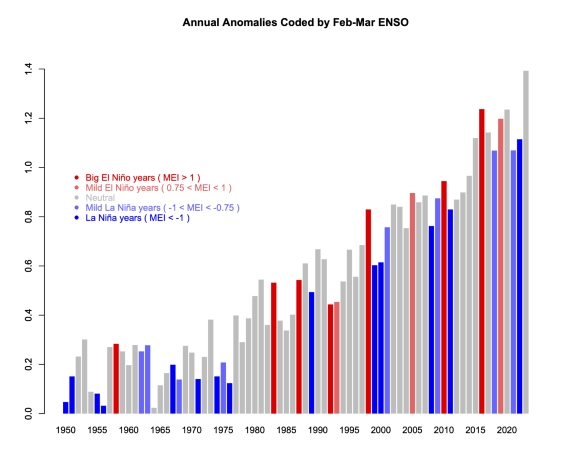
The entire planet continues to accumulate heat due to the energy imbalance created through our greenhouse gas emissions. Earth's atmosphere is warming. Oceans are accumulating energy. Land absorbs energy and ice absorbs heat to melt. Year to year ups and downs in these things are simply noise, reflecting variations in how that heat is moved around the planet and what other influences are at work, such as the irregular El Nino Southern Oscillation (ENSO) that can nudge the global temperature one way or another by up to 0.3C. That's why 1998 was such a warm outlier: it coincided with a very strong El Nino. El Nino conditions always warm things up whereas La Nina conditions cool things down (figure 1).
GISTEMP-ENSO-coded-plot from RealClimate

Figure 1: GISTEMP anomalies to end-2023 (with respect to late 19th Century), coded for ENSO state in the early spring - red is El Nino, blue La Nina. 2023 is in grey because that El Nino did not develop until later in the year. Graphic courtesy of Realclimate.

Climatologists routinely use multi-decadal blocks of time when presenting temperature trends for a very good reason. Such blocks allow you to stand back and look at the bigger picture. Due to the noise, taking a much shorter time-span – say just five or ten years – allows you to say anything you like about trends, depending on the particular block you pick.

For example, if you picked a short run of 5-10 years ending in 1998, you could have – if you were so inclined – said, “look how fast it's warming!” Likewise, taking a number of years starting with 1998, you could have made the equally invalid claim that global warming had stopped. And of course, that claim was made, vociferously, in the early-mid 2000s. It was a classic example of cherry-picking: the manifestly unscientific practice of choosing the data that supports the argument one is paid to make on behalf of those who sponsor misinformation campaigns. Once you know about such tricks, you can challenge them yourself. You can ask someone why they showed such a short temperature record when showing a much longer one is the normal practice.

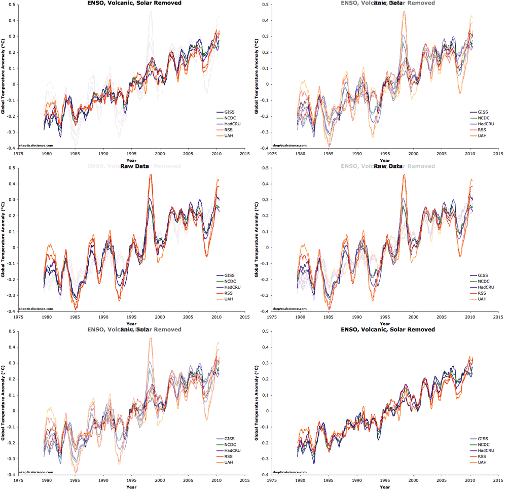
It is difficult but technically possible to filter out the noise described above from temperature datasets. In the paper Foster and Rahmstorf (2011) the authors used the statistical technique of multiple linear regression to filter out the effects of ENSO, solar and volcanic activity (Figure 2). They found that the underlying global surface and lower atmosphere warming trends have in fact remained steady in recent years. There's still noise in there but nowhere near as much. We were still warming all along.

before/after filtering

Figure 2: Five datasets of global surface temperature and lower troposphere temperature are shown before and after removing the short-term effects of the El Niño Southern Oscillation (ENSO), solar variability, and volcanic aerosols.  A 12-month running average was applied to each dataset.

Last updated on 4 June 2024 by John Mason. View Archives

Printable Version  |  Offline PDF Version  |  Link to this page

Argument Feedback

Please use this form to let us know about suggested updates to this rebuttal.

Related Arguments

Further reading

Update

On 21 January 2012, 'the skeptic argument' was revised to correct a minor formatting error.

Denial101x video

Here is a related video lecture from Denial101x - Making sense of climate science denial

Comments

Prev  1  2  3  4  5  6  7  8  9  10  11  12  13  14  Next

Comments 176 to 200 out of 338:

  1. NETDR writes: "I contend that we are at the start of a 20 to 30 year cooling cycle" I very much hope you are right; sadly your reasoning is very shaky. Looking at time series data and detecting a pattern does not mean that the pattern inquestion has any physical basis, but without a physical basis there is no good reason to think that the pattern will continue intop the future. In the case of the cycles linked to PDO, the problem is that there have been changes in other forcings, so how can you tell that the cycle is real rather than being the result of changes in other forcings that have coincided to form what appears to be a cycle and a bit of an oscillation? You can't tell by statistical means which is which (as correllation does not imply cuasation), you can only tell the difference via physics. So, has anyone produced a physical model that reproduces the observed cycle as a result of PDO, rather than as a result of known changes in the other forcings, such as solr forcing? I think you will find the answer to that question is "no", simply becuase once you include physics into the argument it quickly becomes apparent that PDO can have caused little of the observed variation.
  2. 11th warmest year on record, but 1st warmest comparable la nina year on record according to NOAA...hmm? Does this mean anything?
  3. Below is a cogent argument showing that, whilst warming is happening in the long-run, the gradient is decreasing and a maximum is likely by 2200, being only about 1 degree C above current levels. You will need to study what is being said here rather carefully before commenting ... The most informative plot I have seen compares gradients derived from 30 year trends calculated on a moving basis every month. This is not a plot of temperatures ...
    I have added the yellow trend line which shows a decrease in the gradient over the 100+ year period. No one can call this cherry picking - it's nearly all the data we have. The reason for the decline in gradient is that the ~1000 year natural trend (evident in other data) is roughly sinusoidal and is approaching a maximum within 200 years. The decline should increase a little so the trend itself is cyclic and should pass through zero when that maximum occurs, for which temperatures look like being about 0.8 to 1.0 degree higher than at present.
    Response: [RH] Fixed image width.
  4. Climate-Change-Theory... Really? A trend of the trends? I don't know if I could define that as "cogent."
  5. So would you also say that the derivative and second derivative of a function tell you nothing about the original function? You would be in error if you did, and I suggest there are strong parallels with my argument. About 100 years ago sea surface temperatures were increasing at a rate of about 0.6 deg.C per decade, whereas now the yellow trend line shows they are only increasing at a rate of about 0.5 deg.C per decade. This I suggest is also supported by the fact that the second maximum gradient is lower than the first, meaning the world saw faster warming in the past when carbon dioxide levels were lower.
  6. Correction: Those rates should have an extra 0 of course, namely 0.06 deg.C per decade and 0.05 deg.C per decade. There is no way any logical extrapolation would show significantly greater rates of increase over the next century, so nothing in all the historical sea surface temperature data since 1900 gives any indication of a rise of more than about 0.5 degrees C in the trend by 2100. There could of course be random noise (or a natural 60 year cycle) causing temporary values above the trend, but the trend looks like increasing by only 0.4 to 0.5 degrees C by the year 2100. There are no grounds for assuming any increase in the rate of increase in temperatures based on this data. There is no anthropogenic component related to post-WWII industrialisation.
  7. Basically I am predicting that slight warming will continue for 100 to 200 years (maybe one degree (1 deg.C) higher in the trend by 2200) but natural cyclic cooling will then prevail for the following 500 years or so because of apparent natural cycles with about 1,000 year periodicity. Whatever you might think or say about whether the "Little Ice Age" or the "Medieval Warming Period" were worldwide phenomena, neither is the current warming period uniformly worldwide. (It was slightly warmer in the Arctic, for example, in the 1940's.) But there can be no doubt that worldwide mean temperatures were warmish in the 12th century and coolish in the 17th century. When we see that long-term natural trend rates are only of the order of 0.5 deg.C per century, the scenario of alternate natural rises and falls of the order of 2 to 2.5 deg.C over periods of 500 years is far from implausible. The data from which that "hockey stick" was invented came from land based tree ring data. Land surfaces contain only about 1/15th of the thermal energy (wrongly called "heat") that is in the oceans. Hence sea surface temperatures are a far better indication of what's happening. Actual temperature measurements in islands like Northern Ireland could be indicative of sea surface trends and these show a linear trend since 1792 - also increasing by about 0.6 deg.C per century. So there is clear evidence that rates of the order of 0.6 deg.C per century have been the norm since the Little Ice Age and have not increased at all due to industrialisation.
  8. Doug Cotton (aka Climate Change Theory), the theory you are proposing here has no physical basis. Further, it requires very large changes in ocean heat content, and hence the total energy stored at the surface of the Earth with no change of energy in or out. Ergo it contradicts the conservation of energy. If you want us to overthrow one of the most fundamental laws of science, your going to have to show us more than a single cycle in some cherry picked data. And contrary to your claim, the Sea Surface Temperature data is not all the data there is. Last time I looked, the Earth's surface included both continents and an Arctic Ice Cap, inclusion of which would definitely change the trend line of the thirty year trends you show. (HadSST is not the only sea surface temperature product either.)
  9. Tom: I suggest that weighting of land v. ocean should be in proportion to thermal energy content - ie roughly 1:15 so if you wish to throw in 1/15th weighting of land temperatures on top of sea surface I'm happy with that, but it can't make much difference. I am not proposing a theory when I am merely using a logical statistical and mathematical approach to analysing all sea surface data since 1900 and saying there is no evidence of any increase in the rate of increase about 100 years ago compared with current rates. Whichever way you look at the data, there is only a rise of the order of 0.05 to 0.06 deg.C per decade on average since 1900. Nothing suggests that an extrapolation to 2100 should exhibit a faster rate of increase in the underlying trend. If you produce any other analysis of that sea surface data since 1900 which shows a sound reason for a rise of significantly more than, say, 0.6 deg.C over the next 88 or 89 years until the year 2100 I will take my hat off to you if I can't fault your logic. Go for it! Here is the source of the original plot.
  10. Doug Cotton, if you want measure trends in temperature there is no reason to weight land temperatures differently from sea surface temperatures. Consequently there was no reason for you to exclude a third of the Earth's surface from your supposedly "logical and mathematical approach". Nor was there any reason to exclude 21% of the data in time. HadISST1 commences in 1871, not 1900. Including the data from 1871 to 1899 shows the pattern you claim to have detected in a single cycle does not hold outside the period you show: Indeed, there was no reason to not show the Hadley Marine Air Temperature data (HadMAT) which extends back to 1856: Doing so shows sixty years of declining sea temperatures terminating at the start of your "logical and mathematical approach". As sixty years is the duration of one cycle that you have purportedly detected, a sixty year period of declining sea temperatures resoundingly falsifies your model as a predictor of past, and hence presumably future sea surface temperatures. Perhaps it is time you stopped plagiarizing Bob Tisdale by giving him blame for this analysis (there is no credit about it), and started relying on analysts who do not cherry pick their data. Tamino came up for a name for this sort of statistical analysis that ignores data and ignores physics - mathturbation. I do not particularly like the term, but in this case it definitely applies. (Source for HadISST and HadMAT graphs: Rayner et al, 2003)
  11. Tom C, Your analysis of Cotton's copious mistakes is spot on. However, tamino may have come up with many great things, but that particular term originated with economists. This definition predates tamino's 2011 usage by some 5 years. Note these attributes of those who indulge: ...a combination of intellectual laziness and mistaken arrogance ... 'Nuff said.
  12. Climate-Change-Theory @ 178... What your chart tells us is that, except for one very brief period, the trend has been positive, and often strongly positive. And the trend is still at the high end. Looking at the trend of the trend tells you what? Zero, as far as I can tell.
  13. Climate Change Theory...There is an evident 1000 year cycle in glacial advance and retreat in the data from several locations around the world. This data also shows a net positive trend in glacial mass (two steps forward and one step back sort-of)over the last 8000 years or so. However, most of the 8000 years worth of slow glacial advance that has occurred has been erased in just a few decades. Something (aka anthropogenic CO2) is working against the natural forcing and winning. It appears that your 1000 year cycle has been supercharged. I would post charts and links, but I am not sure how to do this with my limited computer skills.
  14. Roy Spencer today reported that the temperature is -0.09 C below (?) what he does not tell is that in 2010 the line 0 was about 0.1 degree lower then it is now http://friendsofginandtonic.org/files/5a90411e58ea05ba14e986929b1074d4-1.html, you move up the baseline and then you tell the earth is cooling....
  15. If you are interested in an interesting analogy I discovered that contrasts a medium-term decline against a long-term trend (using sports), check out this post: http://ow.ly/9u8GZ If one were to believe the latest trend, it would imply that we believe athletes are getting fatter and slower. Check it out and tell me what you think.
  16. I'm not sure if this is the correct thread for these questions. I'm interested in why the rate of warming in the Northern Hemisphere is faster than the rate of warming in the Southern Hemisphere. Is it due to the following factors: a. The greater proportion of land to water surface in the North. b. The fast-spinning ring of air over the Arctic which affects the jet stream that helps drive the movement of winter storms. c. The localised effect of positive feedbacks such as Arctic amplification. Are these factors correct? Are there any other factors influencing this phenomenon?
  17. muoncounter@167: And now, 2012 (to date) is the hottest year on record. Science marches ever forward...;=/...and puts another nail in the denialista's insistence that there's "been no warming since 2001." Sigh....
  18. @192: "And now, 2012 (to date) is the hottest year on record." Not globally. I think you mean for the USA it's the warmest so far. Globally it will make the top ten, but won't approach the record. That of course doesn't mean that warming has stopped- it hasn't.
  19. And now we have not warming line repeated at the Daily Mail..again. Mail
  20. It's the Daily double, and we're in jeopardy.
  21. Hi, Maybe this is the best thread here for this question. I found elsewhere on the net a plot of temperature versus year since 1850, attributed to SKS. I have determined that it is an average of 11 data sets...HadCrut, Giss, NOAA, RSS, UAH, NCEPRI, NCEPCFSR,NCEPTCR,ERA-40,ERA-interim. Only on the graph published someplace in SKS, however, is also fitted a red curve to the averaged data with an R squared given. Does anyone know what function this fit is to? Perhaps a best fit logarithm? I don't know how to find the graph on SKS in any of the many threads here, but hopefully someone else will know the answer. Thanks, CuriousD.
  22. curiousd - Do you mean this one? I don't know who generated it... [Source - found by using the SkS search for "graphics" and looking at a few links, primarily SkS Climate Graphics] If so, the various temperature records are simply aligned to a common baseline as stated in the graph, and the dark line is the average (again, as stated in the graph). If you know of a graph with an additional overlaid fit, please give the URL and context, as vague references are less than useful.
  23. What do you guys make of this? http://wattsupwiththat.com/2013/03/11/is-ocean-heat-content-data-all-its-stacked-up-to-be/

  24. Scliu, you're more likely to get a response if you ask a specific question.

    Also, given the source, (Bob Tisdale) it's pretty obvious what people will make of it. "Tisdale at it again, after being repeatedly shown to be wrong".

    Here's a link. http://wottsupwiththatblog.wordpress.com/2013/05/07/a-challenge-from-bob/

  25. scliu94 - only in the mind of a climate science contrarian can the ocean heat data be unreliable so as to be unable to tell us the oceans are warming, yet reliable enough to confirm that the warming is natural!!   

    An insurmountable hurdle for contrarians is that the largest natural component for warming the oceans - the sun- has seen a decline in radiation output over the last 3 decades, which should have seen a cooling of the oceans. Instead the oceans the oceans have warmed substantially - as they should when increased concentrations of greenhouse gases trap more heat in the oceans.

Prev  1  2  3  4  5  6  7  8  9  10  11  12  13  14  Next

Post a Comment

Political, off-topic or ad hominem comments will be deleted. Comments Policy...

You need to be logged in to post a comment. Login via the left margin or if you're new, register here.

Link to this page


The Consensus Project Website

THE ESCALATOR

(free to republish)


© Copyright 2025 John Cook
Home | Translations | About Us | Privacy | Contact Us