Climate Science Glossary

Term Lookup

Enter a term in the search box to find its definition.

Settings

Use the controls in the far right panel to increase or decrease the number of terms automatically displayed (or to completely turn that feature off).

Term Lookup

Settings


All IPCC definitions taken from Climate Change 2007: The Physical Science Basis. Working Group I Contribution to the Fourth Assessment Report of the Intergovernmental Panel on Climate Change, Annex I, Glossary, pp. 941-954. Cambridge University Press.

Home Arguments Software Resources Comments The Consensus Project Translations About Support

Bluesky Facebook LinkedIn Mastodon MeWe

Twitter YouTube RSS Posts RSS Comments Email Subscribe


Climate's changed before
It's the sun
It's not bad
There is no consensus
It's cooling
Models are unreliable
Temp record is unreliable
Animals and plants can adapt
It hasn't warmed since 1998
Antarctica is gaining ice
View All Arguments...


Username
Password
New? Register here
Forgot your password?

Latest Posts

Archives

HadCRUT3: Cool or Uncool?

Posted on 28 March 2012 by Kevin C

The UK Meteorological office have for many years published estimates of the global mean surface temperature record from 1850. Over the last decade it has been noted that this record has shown little or no warming. The Skeptical Science trend calculator shows that the difference between the HadCRUT3v trend and the IPCC forecast over the past 15 years is statistically significant at the 95% level. What is going on?

Foster and Rahmstorf (2011) have shown that two natural cycles - the El Nino Southern Oscillation (ENSO), and the solar cycle - have contributed temporarily to this apparent slowdown in global warming. But the slowdown is much more obvious in the HadCRUT3v data. Why?

The clues lie in one basic statistical principle, and two features of the data.

The statistical principle: Sampling a stratified population

Suppose you want to determine some statistic on a large dataset, say the average height of the children of a given age. You could simply measure everyone. But that would be impractical. So normally you would measure the heights of a representative sample group. If the group is large enough, the average height of the sample group will give a good estimate of the average height of age group as a whole.

Or will it? Suppose three quarters of your sample group are girls. Girls make up approximately half of the population as a whole. But girls in the chosen age group are on average shorter than boys. If girls make up three quarters of your sample group, then the average height of the sample group (the 'sample mean') will be lower than the average for the population as a whole (the true 'population mean'). The sample group is not representative of the population, and as a result produces a biased estimate.
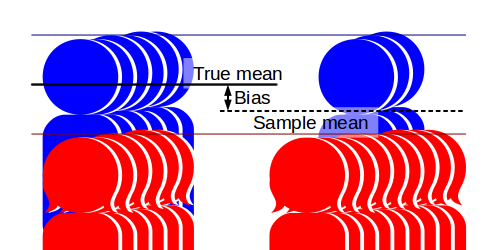
Sampling bias estimating average height trend

The problem is that the population is stratified - it is divided into groups with different statistics. A representative sample from this population must be both 'big enough', and contain appropriate proportions of the different strata - in this case girls and boys.

Now consider a more complex case. Samples are to be taken a year apart to determine the rate at which the children are growing taller. The first sample consists of 50% boys and 50% girls. The second sample, a year later, has about 25% boys and 75% girls. The first sample is unbiased, the second is biased low. The resulting trend may erroneously suggest that the children are growing shorter!
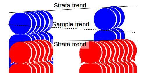
Sampling bias estimating average height trend

Note that there are two problems in estimating the trend: Firstly we are undersampling the faster growing strata, and secondly the proportion of the data coming from the taller group is declining. Both add a downward bias to the estimated trend.

Two pieces of data concerning HadCRUT3

Land/ocean temperatures

Land surface temperatures have been increasing more quickly than sea surface temperatures, as would be expected given the higher heat capacity of water. The following figure shows the area-average temperature anomalies from CRUTEM3 and HadSST2:
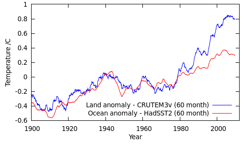
Land/ocean temperatures in the HADCRUT3v data

(Alternatively, look at this figure from GISTEMP.)

Land/ocean coverage

Land coverage in the HadCRUT3v record has been declining over the past 50 years. The following figure shows the proportion of the HadCRUT3v global sample drawn from land measurements. The actual proportion of the Earth's surface covered by land is about 29%.
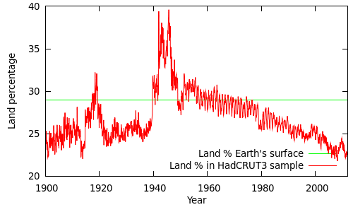
Land/ocean coverage in the HADCRUT3v data

(The spikes during the world wars are due to poor SST - sea surface temperature - coverage during these periods. You can get a reasonable estimate of this graph based on the coverage values given on alternative lines of the CRUTEM3 and HadSST2 data files, however the values themselves are slightly peculiar: The land and ocean coverage exceed the fractions of the surface covered by land and ocean, and in some cases add up to more than 100%. This is due to the coarse 5 degree grid, and the fact that coastal cells are treated as both 100% land and 100% ocean. The figure above is a more accurate estimate based on the gridded datasets and a high-resolution land mask.)

Putting it together

The proportion of land readings in the HadCRUT3v sample has been dropping since the 1960s, and has dropped from ~25% to less than 23% since 1995. Over the same period the land temperature anomalies have been increasing faster than the sea surface temperature anomalies, with the greatest differences occurring since 2000.

What does this mean for the temperature record?

The temperature estimated from the unrepresentative sample will be an average of the temperatures from the land strata and the ocean strata (Tland and Tocean), weighted by the proportion of the Earth's surface covered by data from each strata (Pland and Pocean):

Tbiased = Pland Tland + Pocean Tocean

However, this is a biased estimate: Not only is it subject to normal sampling errors, it is biased by the fact that the proportions of land and ocean data in the sample are different from the proportions in the real data. An unbiased estimate would use the true land and ocean proportions:

Tunbiased = 0.29 Tland + 0.71 Tocean

where 0.29 and 0.71 are the actual global land and ocean fractions.

We can calculate the bias from the difference between the biased and unbiased estimates:

Δbias = Tbiased - Tunbiased = Tland (Pland - 0.29) + Tocean (Pocean - 0.71)

= (Tland - Tocean) x (Pland - 0.29)

The bias in the HadCRUT3v data due to the unrepresentative land/ocean sampling can be calculated by this equation, and is shown in the following figure (as a 60 month moving average):
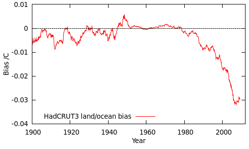
Land/ocean bias in the HADCRUT3v data

Until 1980 the bias is small, because the land and ocean temperatures do not differ significantly. After 1980, the difference between the land and ocean temperatures becomes significant, and at the same time the sampling of the land and ocean strata becomes increasing unrepresentative, amplifying the bias. (This is analogous to boys growing faster than girls at the same time as the proportion of boys in the sample is dropping.)

What impact does this have on the temperature trends? If HadCRUT3v is biased over recent years, it looks as though it is biased low.  However before drawing a firm conclusion we need to look for other sources of bias; this will be subject of the next post in the series.

Note: While we can estimate the bias by careful statistics, the ideal solution to poor sampling is the one that Hadley and CRU have adopted - improve the data coverage. That of course involves a lot more work.

Acknowledgements

Thanks to Tom Curtis both for helping with this article, and for suggestions which inspired the original analysis.

0 0

Printable Version  |  Link to this page

Comments

Comments 1 to 33:

  1. Once again, a great job of explaining for the scientifically challenged.
    0 0
  2. Nice job explaining the problem of making sure that a sample represents the population. Pretty simple coverage here, for sure, but there are entire courses on avoiding sampling bias. "How do you know your random sample is really random?" and so forth; so, good for this venue. Question regarding: "...as would be expected given the higher heat capacity of water." I'm thinking that the temperature difference would have more to do with the fact that water tends to circulate to depth more than land does; so, you get the same energy distributed over more mass. On land, there is less "buffering" because the surface warms, and it takes a long time for the energy to equilibrate to much depth. Water cp ~= 4.2 (J/(g·K) Silicate rock ~= 0.75 (J/(g·K) but rock is about 3 times more dense; so, the difference per volume is about 2x. So, yeah, a given volume of water has about twice the heat capacity. But, I'm still thinking it has more to do with circulation because if you put rocks in a bucket of water, they all come to the same temperature in not much time. "Land coverage in the HadCRUT3v record has been declining over the past 50 years." Really? I could see them making use of a different set of stations, for various reasons, but I would expect them to grid it out so that the actual land surface area coverage did not decrease. Oh, I think I get it. They like to pretend that areas with poor coverage do not exist (at least for the calculations) and the sea surface coverage has been increasing relative to land surface. Ah, alarm bells just went off on my sampling bias detector. Double counting the coastal cells does not really improve the situation either. Nice bit of showing that stratified populations need to be sampled independently, their means calculated independently, and then trend and other analysis performed.
    0 0
  3. Chris: Yes, you are right about circulation being a critical factor in the slow warming of the oceans; i.e. you have to heat a lot more water because it keeps changing over. HadCRUT3 uses a fixed 5 degree grid. That also means that the high latitude cells are smaller than the equatorial cells, so you actually need a higher density of stations at high latitudes to achieve the same coverage. The common anomaly method used in CRUTEM3 also means that they lose stations as they go away from the baseline period (1961-1990).
    0 0
  4. Hmm, that spike in land percentage around WWII happens to coincide with the hump in the temperature record. I suspect the hump is a little exaggerated. Relative to GISTEMP, it is. Thanks Kevin, Now I'm thinking about the 5 degree grid. When it comes to the global averaging, and 5 degree cells are not all the some size, the math to weigh a fixed surface area size equally becomes complicated. IMO, you'd have to weigh surface area equally if you are talking about a global surface temperature average.
    0 0
  5. I need to move on to other things, but it seems to me that deciding on a grid model, any grid model, presents its own challenges and shortcomings. I'm thinking that it should be possible to use an alternate method. I have one in mind where each station contributes a measurement that is weighted according to the distance from the station. Not sure how to explain the math, but I visualise it as a globe with a calculated height above it (false surface map/tent) where the height above the 'sphere' represents the temperature (or temperature anomaly). How much any station contributes its measurement to the temperature value any given point on the surface is a function of how close it is to that point, and how much other stations are also contributing their measurements to that point. Total weights for all stations at any give point is always scaled to 1. Once you have the contour of the surface defined, you can integrate over it any way you like, grid it out, whatever. Sounds complicated, but it would not be that difficult to program.
    0 0
  6. WRT my #4, something is not quite right. I'd expect the WWII temperature hump to be more pronounced in the land than the sea, but that is not the case.
    0 0
  7. I believe the mid-century 'hump' has been reduced in HadCRUT4, being primarily due to inconsistent sea surface temperature measurement methods at the time, which they have now adjusted for.
    0 0
  8. From the article: "Until 1980 the bias is small, because the land and ocean temperatures do not differ significantly. After 1980, the difference between the land and ocean temperatures becomes significant ... " Haven't land and ocean temperatures always been significantly different by around 7.5°C? What am I missing? Here's what NOAA says: Land Surface Mean Temp. 1901 to 2000 (°C) 8.5 Sea Surface Mean Temp. 1901 to 2000 (°C) 16.1 Source scroll down half way. Here's a graph I made some time ago that plots out the difference in trend between the two: Here's one I made about the same time that plots just the difference.
    0 0
  9. Dana (#7), I suspect you are talking about the difference between the methods used by US ships versus those used by British ships. http://www.nature.com/news/2008/080528/full/453569a.html Another form of bias introduced, this time by measurement method, rather than calculation method. I wonder how many will cry foul about the changes made at HADCRUT4 without really bothering to check on why the changes were made.
    0 0
  10. I see "Stephen McIntyre" posts a comment at the Nature site. It's good to be as accurate as possible, but let's not make a mountain out of a molehill; the larger upward trend is not changed much.
    0 0
  11. Steve (#8), I think you are taking those numbers from a graph showing monthly averages aggregated over the period from 1901-2000. No way to see if the difference is constant over the entire period, just given those numbers. Your graphs seem to show a divergence becoming more pronounced about 1980, but that is just the old eye-ometer.
    0 0
  12. Chris G - "I'm thinking that it should be possible to use an alternate method. I have one in mind where each station contributes a measurement that is weighted according to the distance from the station." What you are describing is the GISS method, as described in Hansen and Lebedeff 1987, where the measurement weighting is driven by the observed correlation of temperature anomaly with distance. Each measurement within a certain radius of a point (up to 1200km) is weighted by the distance correlation when calculating an estimate at that location.
    0 0
  13. A bias of 0.03°C - that doesn't seem to very much. Is that enough to explain why global warming seems to have stopped?
    0 0
    Moderator Response:

    [DB] "Is that enough to explain why global warming seems to have stopped?"

    Non sequiter. Please see the following post: http://www.skepticalscience.com/Breaking_News_The_Earth_is_Warming_Still_A_LOT.html

  14. Chris: Yes, the grid cells are weighted by area. An improved method, used by GISS, involves allowing the number of cells to vary by latitude to keep roughly constant area. It's pretty simple in practice. As well as GISS, you might want to take a look at what Nick Stokes has done in TempLS. He's looked at weighting each station by the unique area around it and loads of other nice stuff, some of which anticipated the ideas in BEST. Steve Case: Sorry, I'm talking about anomalies exclusively in the article. I was trying to remember to put the word anomaly in everywhere, despite the repetition, but missed some. Since the temperatures are always converted to anomalies before averaging, the difference in the absolute values disappears. Martin: The land/ocean bias is not enough on its own to explain the difference between HadCRUT3 and, say, GISTEMP. There is another major source of bias in HadCRUT3 as well - you have probably read about it elsewhere. Once we've looked at that I think you will have your answer. I started with the land/ocean bias because it is obvious and introduces the concepts.
    0 0
  15. Thanks KR, I came up with the basis of that algorithm when working on how to automate the detection of clusters of points on a grid; they jump out to a human eye - not so much to a computer. Coincidentally that was about the same time that Hansen published that paper. Not sure whether to be pleased to have come up with a similar solution, or embarrassed that I was unaware that was what GISS has been doing for so long. Guess I just figured they knew what they were doing and someone would have pointed out otherwise. Kevin, Thanks, I'll have a look. Yeah, complicated only if you think of it as trying to convert unequal grid cells to grid cells of equal size; not at all complicated if you simply calculate the surface area of the grid, and weight the grid that by compared to total surface area. Oh well, comment in haste...
    0 0
  16. Very clear explanation, thanks.
    0 0
  17. Chris G Yep, circulation in the ocean is the big difference factor compared to land. Any fluid movement - natural convection, currents etc is a far more efficient transporter of heat than Conduction in a solid such as rock. wrt area weighting of station data, GISTemp uses a system much as you describe so that multiple stations in a region contribute a weighted average to that region. The regions are still gridded squares but they use realtively small sub-grids and allow stations from out-side those sub-grids to contribute to the weighting. Then the average sub-grids to produce larger grid-cells. Your comment about @5 about treating the temperature data as a surface with sample points is much the way I think of it. Map the Earths spherical surface onto a 2D grid. Then each met station is a point on that grid. And the height is the temperature (or better temperature anomaly) at that point. What you end up with is like a wonky bed-of-nails. Then lay a flexible sheet over the 'nails' and it adapts to the conrours created by the height of the nails. I'm sure disciplines like Topology would have some interesting math that could be applied to this. An important think to consider is the question of how 'flexible' the 'sheet' is. A really flexible sheet (imagine it as being like cling wrap) would drap down around the 'nails' so your profile would still look overly spiky. Too rigid a sheet might not flex anough and miss some of the nails. The 'rigidity' of the sheet is essentially an aspect of the climate that determines what level of sampling density we need to adequately determine the true contour. Just how much does climate vary from location to location and hence how close together do the nails need to be. Here the difference between the nails being Temperatures or Temperature Anomalies really matters. With working with temperatures there are local factors that mean relatively close locations can have very different temperatures, local changes in altitude being the most significant. So if we work with temperatures for our nails the 'sheet' is effectively very flexible and we need a high station density. However if we work with Temperature Anomalies, how much each station has changed compared to a baseline average of itself, then the variability between nearby stations is much less, and we can meaningfully work with fewer stations further apart - the sheet is stiffer. This idea really ties a lot of people up in knots and is the underlying driver for much of the 'Dying of the Thermometers', 'Its bad stations' type memes that have had so much traction. Most people can't get their heads around the difference between working with Temperatures and Temperature Anomalies. And Joe Public probably assumes that the calculations are done using Temperatures. I did a 4 part series on this nearly a year ago that goes through a lot of this.
    0 0
  18. GISTemp offers an interesting graphing facility that lets you look at land, ocean and combined data by year and latitude. This is SST's with a 3 year averaging. This does not include the adjustments made by Hadley recently that iis attempting to correct for different methods of sampling surface temps by ships in the past and the effect of changing proportions of ships using each method. This is most clearly seen during WWII with August 1945 having been identified as a point where a significant change in the mix of nations sampling SST'2 occurred. And the 'hump' in the 40's is reasonably defined and short duration. This is one of the issues the new Hadley SST series, which is one part of the upcoming HADCruT4 release In contrast the early 20th century warming on land (again 3 year averaged) is a much gentler 'hump' over more years. And when we look at where the warming happened, it wasn't global. It was mainly high Northern latitudes. This was happening at the same time as station coverage was increasing (grey areas don't have adequate coverage). So interestingly this warming in substantially the Arctic was occurring at the same time as station coverage was in flux - we didn't have truely global coverage till the late 50's. Could the addition of new Arctic stations at a time when there was still no coverage in the Antarctic have introduced a bias in the record during this period. There are theories that suggest there is an oscillation between the Arctic & Antarctic with a roughly 1/2 century period. If Antarctica was colder at the same time the Arctic was warming, we wouldn't see it.
    0 0
  19. Chris G wrote:
      Your graphs seem to show a divergence becoming more pronounced about 1980, but that is just the old eye-ometer.

    My eye-ometer sees the same thing you do. The question is, will the sea suface temperatures catch up? Kevin C Wrote:

      Since the temperatures are always converted to anomalies before averaging, the difference in the absolute values disappears.

    Considering how heat flows through the system, sun => surface => atmosphere => out, the difference between the surface and the atmosphere is important and ought not be ignored. As the difference between the two becomes less, there should be less net heat transfer and the ocean surface ought to warm. That difference has narrowed by about (7.75°C - 7.5°C = 0.25°C) over the last 160 years and as Chris's eyometer points out much of that is in the last 30 years. I'm thinking that the 0.25°C is probably the signal from increasing CO2. If you plot out the difference using anomalies you get this one: I doubt that the sigmoid shape is due to randomness and it shows the 0.25°C increase very nicely. It also shows that the eye-ometer increase onward from 1980 discussed above isn't all that unusual.

    0 0
  20. Here's the anomaly difference using the HadCRUT3 datasets: And here's the anomaly difference using the NCDC datasets: In both the recent divergence looks pretty significant. Oh, I see the difference, you are starting in 1880. So lets go back even further, to 1850: Now that's interesting. It looks like we have a big cooling event covering the period 1880-1900. Given the 60 month smooth, it would have to start around 1883. May I present an alternative hypothesis: What we are seeing is land and ocean temperatures tracking very consistently (taking into account El Nino effects and additional noise due to poor coverage of the early data), but with an exceptional cooling event triggered around 1883, and an exception warming phenomena taking hold in the 1970s.
    0 0
  21. Kevin C @20, would you do the same analysis, but separately for the Northern Hemisphere and Southern Hemisphere?
    0 0
  22. Glen, We have similar thoughts; though, I think you might be thinking of the sheet as having mass, and therefore an attraction to the sphere, which would give the overall surface a low bias. Think of it as only having an attraction to the measured values (anomalies). Rigidity and stretch matter a lot; if you have a low point entirely surrounded by higher points in close proximity, do you use the measurement at that point as the elevation of the sheet (nearby stations are weighted 0), or do you use some relative weighting based on proximity? Reverse the situation, suppose there is a high point surrounded by low points? They have to be treated the same or a bias is introduced. (Anybody confused about anomalies should read Glen's posts, but, loosely, an anomaly is a difference between a measurement and a mean of some set of measurements. Using anomalies clarifies between warming and cooling immediately at any locale; positive is warmer, negative is cooler. That removes all sorts of problems; including temperature differences between stations that are nearby in lat and long, but separated by altitude.) I did not have time to more than skim the Hansen and Lebedeff paper, just enough to see that the algorithms were indeed essentially the same, and that they had worked out (fleshed in) weight relationships by distance, based on correlations between stations, that were still nebulous in my mind. However, pretty sure that the result is that a value on the sheet is not necessarily identical to a value of a station at the same point. Flexibility of the sheet is logically equivalent to the decline in correlation between stations with distance, which was reported in the paper. A rapid decline in correlation would indicate physics that created a more flexible sheet metaphor.
    0 0
  23. Simpler: Think of the sheet as a piece of mylar with a positive charge, and the measured anomalies as negatively charged points - no nails or other mechanical suspension.
    0 0
  24. Chris: Here is a nice overview of the family of methods of which the GISS approach is a special case: Kernel smoothers. The GISTEMP kernel function is a simple cone - the 2-d version of a triangular tent function. To contrast, the alternative approach would be to devise a parametric form for the global temperature field (say spherical harmonics), and determine the best set of parameters to fit the parametric form to the data. I don't think anyone's done that, although Nick Stokes fits spherical harmonics to his final result for presentation. I'd go further down the kernel route than GISS and advocate BEST's krigging method, because it gives uncertainty estimates as well as values at every point. Although I think in the final result they use the post-hoc bootstrap estmates for the error rather than the ab-initio krigging values. But in practice I expect that the GISTEMP method is a pretty good approximation to the BEST method. All of these methods give better coverage than the simple grid approach, because according to the data the 5 degree boxes are significantly smaller than the correlation distance of the temperatures, at least in the longitude direction.
    0 0
  25. Kevin, In TempLS V2, the spherical harmonics are embedded in the spatial linear model. I've described the maths here,, starting in the section headed "Spatial Dependence". It's true that the end effect probably isn't that different to fitting the spatial functions separately afterwards. I agree that the Gistemp method is probably not much different in its outcome to fancier methods.
    0 0
  26. The equation Δbias = Tbiased - Tunbiased = Tland (Pland - 0.29) + Tocean (Pocean - 0.71) = (Tland - Tocean) x (Pland - 0.29) appears near the end of the article. The last line of this equation is correct only if Pland + Pocean = 1. However, the sentence below states: "The land and ocean coverage exceed the fractions of the surface covered by land and ocean, and in some cases add up to more than 100%." Doesn't this mean that Pland + Pocean doesn't necessarily equal 1?
    0 0
  27. Kevin C #77801 I get pretty much the same curve you get for (CRUTEM3 - HADSST2) 1850 - 2010. I used the NCDC data because the sigmoid shape of the curve was so pronounced. But that same sigmoid shape is there with the CRU/HAD data. It's just not as pretty. You wrote: It looks like we have a big cooling event covering the period 1880-1900. Given the 60 month smooth, it would have to start around 1883. I don't know what to make of the sigmoid shape of the curve. I was interested in the trend when I set out to make the graph. I found out that the several degree gap between the warm ocean and the cooler atmosphere has narrowed by about 0.25°C over the last 160 years. The sigmoid shaped curve that appeared shows us that at times the gap widens. Take a look at the 50 year period from 1920 to 1970. I'm not offering up any theories and in my wonderings around the net I haven't seen any from any one else.
    0 0
  28. I don't think that the land minus ocean century scale trend has any particular meaning. I would have guessed that during a warming phase the difference should increase due to the slower response of the ocean. While this could qualitatively explain the increase from the '70s, that was not the case during the warming phase of the first half of the last century. Admittedly oversimplifying the picture, the difference between the two warming phases is the cause of the forcing, i.e the sun in one case and CO2 in the other. This in turn seems to point to the different wavelengths of the radiation involved, visible in the former and infrared in the latter. Apart from the albedo, land absorbs both (roughly) equally well. In the oceans, instead, IR radiation is absorbed at the surface and heat is spread through mixing while visible light directly spreads its energy throughout about 100 m. Is this relevant? I don't know, but if I were to research it I'd start here.
    0 0
  29. Steve: I don't know what to make of the sigmoid shape of the curve. Sorry, I thought I'd made it obvious. The shape of the HadCRUT difference curve is explained very well by just 2 known effects, and the process Riccardo explains above. Only very steep changes in forcing are anough to drag the land temperatures far away from the SSTs. All the features of the HadCRUT difference curve can therefore be explained by Krakatoa and the subsequent volcanoes (look at the stratospheric aerosol loadings on this plot) in 1880-1900, and the greenhouse warming overwhelming tropo aerosols post 1970. Looking for unexplained sinusoids without taking out the effect that we already know about is liable to give misleading results.
    0 0
  30. emosca11: Sorry, I wan't very clear. Pland and Pocean are defined such that they sum to 1, because they are the fraction of the sample taken from land and ocean respectively. The raw fractions of the Earth's surface will add up to less than 1, due to coverage. If we call these Fland and Focean, then Pland = Fland/(Fland+Focean) and Pocean=Focean/(Fland+Focean). If you try and reproduce my graph using just the coverage numbers from the HadCRUT distributed files, you will find that those numbers can go greater than one. That is the gridding issue which I describe in the article.
    0 0
  31. Ricardo @28, Science of Doom has an extensive discussion of the difference of the ocean's response to heating by solar radiation and back radiation (substituting for the greenhouse effect). He gets down to the nitty-gritty in the fourth post in his series where he reports on a model analyzing the two cases: In each case, the reported value is the average daily temperature for that layer in the model. The reason for the difference in the value of the forcing is that DLR operates 24/7, while solar is only present for approximately 12 hours of each day, with much reduced strengths in morning and evening. The values are chosen so that the total additional energy supplied is the same. SOD comments:
    "Now because the 4 year runs recorded almost identical values for solar vs DLR forcing, and because the results had not quite stabilized, I then did the 15 year run and also recorded the temperature to the 4 decimal places shown. This isn’t because the results are this accurate – this is to see what differences, if any, exist between the two different scenarios. The important results are: DLR increases cause temperature increases at all levels in the ocean Equivalent amounts of daily energy into the ocean from solar and DLR cause almost exactly the same temperature increase at each level of the ocean – even though the DLR is absorbed in the first few microns and the solar energy in the first few meters The slight difference in temperature may be a result of “real physics” or may be an artifact of the model"
    As the slight differences amount to hundreds of a degree or less after fifteen years, I think we can agree that they are inconsequential, at least as an explanation of the change in the difference in the land and ocean temperature anomalies. Personally I think there is a simpler explanation. If global temperatures changed due to a temperature oscillation in the ocean, there would be no lag in ocean temperatures (by definition) and virtually no lag in land temperatures due to the low thermal mass involved (in relative terms). In contrast, a forced change will result in a change in the difference as the land, with its low thermal mass responds faster. A negative forcing will result in the difference in the anomalies falling, while a positive forcing will result in it rising. Looking at the plots above, it becomes apparent that there was a positive forcing from approximately 1890-1920, a weak negative forcing from 1930-1970, and a positive forcing significantly stronger than any previous sustained forcing on the record from 1970 to the present. The analysis is complicated in that a period of no forcing will result in the difference in the anomalies relaxing back to zero. Further, this analysis is qualitative rather than quantitative, and necessarily so without detailed model work. Never-the-less I would consider the information above prima facie evidence that the mid century temperature peak was at least in part non-forced. I base this claim on the fact that the difference in the anomalies is declining at the time of that peak. However, this is no comfort for the "it's all oceanic oscillations" crowd for the recent warming is clearly associated with a very strong positive forcing. As noted before, it is stronger than any forcing shown elsewhere on the record except for the brief excursions due to major volcanic events. An important additional caveat is that temperature records prior to 1950 are incomplete, and particularly so prior to 1880 so that prior to those dates noise is a significant factor. Also, of course, HadCRUT3 is now obsolete, and its flaws will also constitute noise on the record.
    0 0
  32. Tom we know that natural forcings, including solar, are able to explain much of the temperature change from about 1900 to 1950. We also know that the first about 100 m of ocean are well mixed on a yearly time scale, so I do not expect to see any difference in a 150 m ocean slab like in the SoD exercise. My speculation was about some other complex effect involving ocean circulation. Here is where our explanations meet.
    0 0
  33. Tom Curftis #31 Wrote

    … Science of Doom has an extensive discussion of the difference of the ocean's response to heating by solar radiation and back radiation …

    I suppose this will be considered nit picking, but back radiation from the cooler atmosphere doesn’t do any heating of the ocean. It does slow the cooling of the ocean by canceling out part of the spectrum, but it’s the sun that does the actual heating and reestablishment of equilibrium. Yes, the effect is the same and it’s perhaps just semantics, but claiming that back radiation heats the ocean leads to erroneous thinking.

    0 0
    Moderator Response: [DB] Your statement about back radiation is off-topic on this thread. Any who wish to respond to it please do so on a more appropriate thread. Thank you.

You need to be logged in to post a comment. Login via the left margin or if you're new, register here.


The Consensus Project Website

THE ESCALATOR

(free to republish)


© Copyright 2024 John Cook
Home | Translations | About Us | Privacy | Contact Us