Thorough, not thoroughly fabricated: The truth about global temperature data
Posted on 22 January 2016 by Guest Author
This is a re-post by Scott K. Johnson from Ars Technica
“In June, NOAA employees altered temperature data to get politically correct results.”
At least, that's what Congressman Lamar Smith (R-Tex.) alleged in a Washington Post letter to the editor last November. The op-ed was part of Smith's months-long campaign against NOAA climate scientists. Specifically, Smith was unhappy after an update to NOAA’s global surface temperature dataset slightly increased the short-term warming trend since 1998. And being a man of action, Smith proceeded to give an anti-climate change stump speech at the Heartland Institute conference, request access to NOAA's data (which was already publicly available), and subpoena NOAA scientists for their e-mails.
Smith isn't the only politician who questions NOAA's results and integrity. During a recent hearing of the Senate Subcommittee on Space, Science, and Competitiveness, Senator Ted Cruz (R-Tex.) leveled similar accusations against the entire scientific endeavor of tracking Earth’s temperature.
“I would note if you systematically add, adjust the numbers upwards for more recent temperatures, wouldn’t that, by definition, produce a dataset that proves your global warming theory is correct? And the more you add, the more warming you can find, and you don’t have to actually bother looking at what the thermometer says, you just add whatever number you want.”
There are entire blogs dedicated to uncovering the conspiracy to alter the globe's temperature. The premise is as follows—through supposed “adjustments,” nefarious scientists manipulate raw temperature measurements to create (or at least inflate) the warming trend. People who subscribe to such theories argue that the raw data is the true measurement; they treat the term “adjusted” like a synonym for “fudged.”
Peter Thorne, a scientist at Maynooth University in Ireland who has worked with all sorts of global temperature datasets over his career, disagrees. “Find me a scientist who’s involved in making measurements who says the original measurements are perfect, as are. It doesn’t exist,” he told Ars. “It’s beyond a doubt that we have to—have to—do some analysis. We can’t just take the data as a given.”
Speaking of data, the latest datasets are in and 2015 is (as expected) officially the hottest year on record. It's the first year to hit 1°C above levels of the late 1800s. And to upend the inevitable backlash that news will receive (*spoiler alert*), using all the raw data without performing any analysis would actually produce the appearance of more warming since the start of records in the late 1800s.
We're just taking the temperature—how hard can it be?
So how do scientists build datasets that track the temperature of the entire globe? That story is defined by problems. On land, our data comes from weather stations, and there’s a reason they are called weather stations rather than climate stations. They were built, operated, and maintained only to monitor daily weather, not to track gradual trends over decades. Lots of changes that can muck up the long-term record, like moving the weather station or swapping out its instruments, were made without hesitation in the past. Such actions simply didn’t matter for weather measurements.
The impacts of those changes are mixed in with the climate signal you’re after. And knowing that, it’s hard to argue that you shouldn’t work to remove the non-climatic factors. In fact, removing these sorts of background influences is a common task in science. As an incredibly simple example, chemists subtract the mass of the dish when measuring out material. For a more complicated one, we can look at water levels in groundwater wells. Automatic measurements are frequently collected using a pressure sensor suspended below the water level. Because the sensor feels changes in atmospheric pressure as well as water level, a second device near the top of the well just measures atmospheric pressure so daily weather changes can be subtracted out.
If you don't make these sorts of adjustments, you’d simply be stuck using a record you know is wrong.
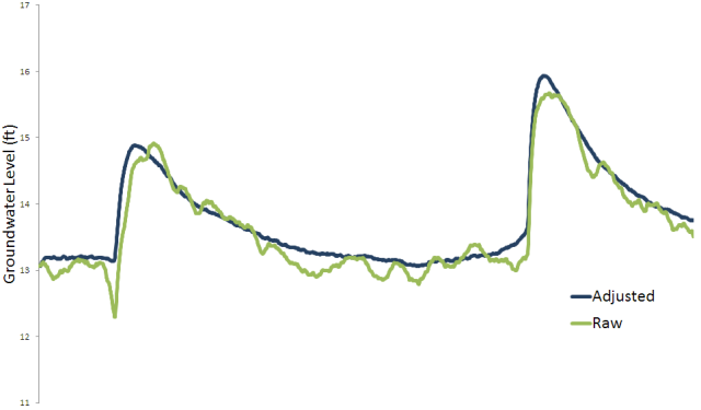
Enlarge / A couple months of data from a groundwater well. Scott K. Johnson
Some weather station changes are pretty straight-forward. The desire for weather information at new airports around the 1940s led to station moves. Some of these stations had been set up on the roofs of post office buildings and later found themselves in an open environment on the edge of town. Looking at the temperature records, you might see a sudden and consistent drop in temperatures by a couple of degrees.
Equipment has changed, too, like the installation of a housing to shield thermometers from sunshine or the switch from mercury thermometers to electronic ones. By running them side-by-side, scientists have learned that the two types of thermometers record slightly different low and high temperatures. And because the electronic thermometers necessitated running electricity to the station, some of the stations were moved closer to buildings at the same time.
And while the impact isn’t immediately obvious, changing the time of day that the weather station data is recorded is actually a big deal. Most weather stations didn’t automatically log measurements, especially in the days of mercury thermometers. Instead, special thermometers were designed to mark the minimum and maximum temperatures that were reached. When someone checked the station to note those measurements, they reset the markers.
Imagine that you reset the thermometer at 4:00pm on a hot summer afternoon. The maximum marker is going to immediately return to its previous temperature. Even if the following day is considerably cooler, you will return to see the same high temperature on the thermometer—yesterday’s warmth is accidentally going to be double-counted. The same goes for minimum temperatures recorded in the morning.
As far as long-term trends are concerned, luckily this doesn’t really matter, provided you always check the station at the same time of day. But if you switch from a routine of evening measurements to morning measurements, for example, you’ll suddenly be less likely to double-count high temperatures, but much more likely to double-count low temperatures. This is known as “time of observation bias.”
In most of the world, the effect of all these non-climatic factors is neutral. Changes that raised temperatures have been balanced by changes that lowered them. The US, however, is different. Here, weather stations are run by volunteers who report to the National Weather Service. Compared to other countries, the US has more stations but less uniformity among those stations.
At times, guidelines for the volunteers in the US have changed, with new equipment or procedures gradually spreading through the network of stations. Around 1960, the guidelines changed from late afternoon observations to morning observations. That kicked in over time (many stations didn’t change until a new volunteer took over) and there’s a substantial cooling bias over that time period as a result. In the 1980s, the National Weather Service asked volunteers to switch to electronic thermometers, adding another cooling bias. So in the US, accounting for non-climatic factors ends up increasing the warming trend over the raw data—which we know is wrong.

Enlarge / In the US, a couple systematic changes to weather stations caused a cooling bias—most notably the time of observation bias corrected in the blue line. Zeke Hausfather/Berkeley Earth
Noise-canceling
When weather station data comes with good operation notes, you can find out when changes were made and apply an appropriate correction. Because those notes are pretty good for US stations, NOAA actually does this for time of observation changes. In general however, that’s not possible elsewhere around the world.
Instead, scientists rely on a process called “homogenization.” The premise is simple: if the behavior of one station suddenly (or gradually) departs from all its neighbors, something is wrong. Long-term trends won’t differ between two points just 50 miles apart, and they don’t change suddenly.
A number of groups have their own software algorithms for homogenization. One basic method is to chart the cumulative differences between two nearby stations. That catches not only sudden jumps but gradual drifts as well—whatever their cause. That jump or drift can then be subtracted from the oddball station, producing a consistent record.
NOAA, NASA, the UK Met Office, and the Japanese Meteorological Agency all produce surface temperature datasets using independent methods, but there is also some overlap in data sources or techniques. So motivated by skepticism of human-caused global warming, University of California, Berkeley physicist Richard Muller organized a well-publicized project to create his own dataset, built from the ground up. This “Berkeley Earth” team chose to handle homogenization a little differently.
Rather than make adjustments, they simply split records containing sudden jumps into multiple records. Records that gradually drifted away from neighbors were just given low weights in the final averaging. But despite a number of methodological differences and a larger database of stations, their resultslooked just like everybody else’s.
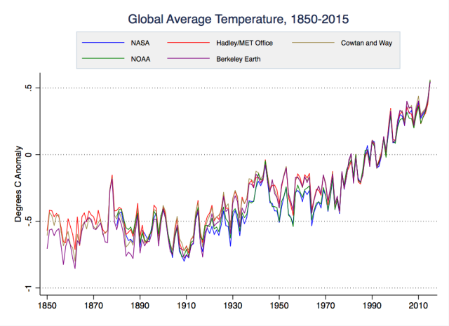
Enlarge Zeke Hausfather/Berkeley Earth
One station issue that has long been a favorite of those who reject climate science relates to the fact that cityscapes tend to heat up in the sun more than rural landscapes do. Just as moving a weather station from the post office building to an airport creates a cooling bias, a city growing up around a station can create a gradual warming bias.
Evaluating this “urban heat island” effect was also on Berkeley Earth’s to-do list. They found (as othershave) that it had no effect on their estimates of global temperatures. Zeke Hausfather, now a research scientist on the Berkeley Earth team, led a separate 2013 study examining this question. That study split about 10,000 US stations into urban and rural ones, examining their warming trends separately. “There was some difference in the raw data,” Hausfather told Ars. “But once you do [the homogenization], there’s no difference between urban and rural stations.”
As another check, they homogenized all the stations using only the rural ones as the comparisons. “We used the rural stations to adjust the urban stations, but the urban stations themselves were not used to adjust anything,” Hausfather said. “We got pretty much the exact same result as if we used all stations, urban and rural, which is a very strong indication that these adjustments are good at picking up these divergent signals, and the network itself is sufficiently rural that it’s not being swamped by urban signals.”
Another way to test the homogenization process, specifically, is to feed it virtual datasets. That gives you the advantage of knowing exactly what the final answer should look like if the algorithms work reliably.
One of those studies was done by Peter Thorne and a pair of NOAA colleagues. “I visited [NOAA] in 2008 and I said, ‘Right—tell me where your stations are, tell me when they observe, tell me nothing else.’ And I went and got five different climate model runs [and] sub-sampled them in space and time at the same locations,” Thorne told Ars. “Then I added in a whole bunch of data issues that I knew about, but they didn’t. And they ran it on their algorithms.”
And did the algorithms root out these manually inserted, non-climatic distractions?
“In the world where I hadn’t entered any changes, it returned virtually zero adjustments,” Thorne said. “Then you get increasingly hard, up to something where you have clustering of breaks [in records] that are mainly small, and they have pervasive [net warm or cool] biases. And the further along that spectrum you go, the more [the algorithm] starts to fall down. The way it falls down is it doesn’t adjust enough. So it takes you in the right direction, but it doesn’t take you far enough.”
In other words, homogenization did its job, cleaning up the data to reveal the (known, because it was virtual) climate trend. It didn’t inflate the trend by only adjusting things in one direction. And when the problems were small and hard to detect, the homogenization process erred on the conservative side.
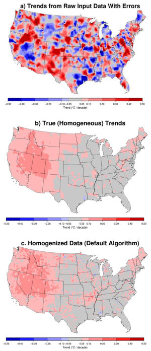
Enlarge / An example of the virtual data cleaned up in homogenization tests. Williams et al./Journal of Geophysical Research: Atmospheres
Fetch me thermometer, ye scurvy blaggard!
While land weather stations have taken most of the political abuse, Earth is mainly a blue planet. Since the ocean covers over two-thirds of the planet’s surface, marine temperature records are kind of important to the global average. Unfortunately, pulling together those measurements makes the land datasets look like microwave dinners.
“You have several orders of magnitude increase in difficulty of the problem,” Peter Thorne said. “Almost every single measurement is moving, measurements are undertaken under national fleet guidance—so the UK fleet of ships are taking different approaches to the US, to the Japanese, to the Russians, to the Australians, etcetera.”
While we measure air temperature a few feet above the surface on land, we measure the temperature of the water at the sea surface. Air temperature measurements have also been made on ships (though there are perhaps one-tenth as many), but since the deck of the ship heats up in the sun much more than the ocean, they don’t mean much.
The issue requiring correction here is the method used to make the measurements. Back in the day, a wooden bucket was tossed overboard, hauled back up, and a thermometer was popped inside. Once that bucket leaves the water, evaporation begins to cool it. Wooden buckets were replaced by canvas ones, allowing even more evaporation, and differences in deck heights meant that some buckets spent more time out of the water than others.
During World War II, a huge change-over took place as naval vessels swarmed the seas. Water temperature measurements were now made by thermometers in the engine cooling water intake pipe. That intake obviously led to a hot engine, raising the measured temperatures a bit. What’s more, ships of different sizes drew water from slightly different depths beneath the surface.
In the last few decades, dedicated scientific buoys have proliferated. While that has added a ton of high-quality data, it’s still yet another type of measurement that has to be reconciled with all the others.
The changes around World War II led to some very significant adjustments to the raw marine data. And that means they have a big impact on the calculated global warming trend over the past century. “The single biggest effect in the climate record is the change from the buckets to the engine room intakes, and the engine room intakes are of the order of 0.6 degrees Celsius warmer than the buckets,” Thorne said. “So if we didn’t correct for that effect, we would be saying that global warming was about 0.4 degrees Celsius per century warmer than it has been."
"There’s your big dirty secret," he continued. "The only adjustment that makes a damn bit of difference on the global mean surface temperature record is an adjustment to pre-1940 sea surface temperature data that actually raises the values, and therefore reduces the [warming] trend.”
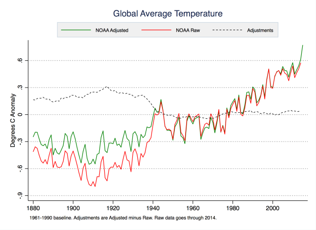
Enlarge / Looking at the raw and adjusted global temperatures, you can see that the adjustments actually reduce the total amount of warming. Zeke Hausfather/Berkeley Earth
There are more differences between the methods used to create sea surface temperature datasets than there are on land, as groups have come up with their own ways of tackling the substantial challenges involved. The UK Met Office simply takes all the measurements collected within each grid box on the map for each month and adds relevant corrections for different types of measurements.
NOAA, on the other hand, uses air temperature measurements taken at night (when solar heating of the ship’s deck isn’t a problem) as a guide for corrections. NOAA also interpolates to fill in portions of the ocean without measurements that month, taking advantage of the fact that temperatures in the middle of the ocean are pretty consistent across considerable distances.
Despite these technical differences, the resulting global ocean temperature series are quite similar. But that doesn’t mean there isn’t still room for sharpening up these estimates. “We need more groups looking at them,” Thorne said. “The National Oceanography Centre in Southampton have a fairly substantial project going on to try and create a new estimate, there’s the [Japanese Meteorological Agency] estimate… But these sea surface temperature products are where the real uncertainty is.”
Talking about temperature datasets more generally, Thorne noted, “There are fundamental problems here over funding bodies saying, ‘Well, someone’s done it, why do you need to do it again?’ But the whole foundation of science is replication and verification. It’s not an audit. An audit gets you nowhere. You need to attack the problem in a different way, that is an equally plausible way of doing it, and see whether you get the same answer or not.”
So… try it from space?
If we wanted to avoid issues with wooden buckets and volunteers scribbling in notebooks, we do have satellites whizzing around the planet and making temperature measurements. Although satellite records can obviously only go back a few decades, they are the go-to source for climate contrarians, because they show a slower warming trend in recent years than our surface records do.
Senator Ted Cruz brought it up several times during his recent Senate committee hearing. “According to the satellite data, there has been no significant global warming for the past 18 years,” he noted. Congressman Lamar Smith has referred to the satellite data as “the gold standard” while making similar claims.
Ars asked Carl Mears, who works on the Remote Sensing Systems (RSS) satellite dataset Senator Cruz was pointing to, how he feels about those statements. “Well, I guess I’m annoyed because I feel that they’re misusing the data,” he said. “They’re picking a specific time period that generates the conclusions that they would like be true. If you look at a longer time period, you get a very different conclusion.”
As far as gold standards go, these satellite measurements also have their own quirks and biases that have to be studied and adjusted for. Being on a satellite does not make a thing magic.
Over a dozen different satellites have provided measurements since 1978 (not all at the same time.) Each used a device that measures microwave radiation emitted by the Earth’s surface and by gases in the atmosphere. Like a burner on a stove, Mears said, the atmosphere glows. “But it’s not hot enough to glow in the visible—it glows in the infrared and the microwave region of the electromagnetic spectrum.”
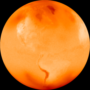
Enlarge / This is what the planet looks like to the satellites on a July day. Carl Mears
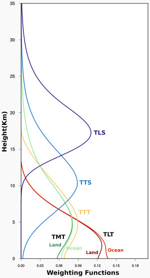
“Depending on exactly what frequency you measure, the instrument sees different distances into the atmosphere,” Mears continued. Precisely at a frequency of microwave radiation emitted by oxygen, you’ll just see the stratosphere (where the ozone layer lives). But turn the knob just a bit, and you can tune in the troposphere—the 10 kilometers or so between the surface and the stratosphere. So what you get is an average temperature from that thick layer, which means these measurements are not interchangeable with weather stations six feet off the ground or the temperature of the sea surface. However, the satellites do get you upper air measurements otherwise only accessible to weather balloons, and they do it globally.
You can also use some sorcery to try to produce a satellite measurement more representative of thelower half of the troposphere—a technique pioneered by the University of Alabama in Huntsville (UAH) group that runs the other major satellite dataset. The instrument on the satellites turns side-to-side as it scans the Earth, but only the measurements facing straight downward are normally used. By combining those measurements with angled measurements pointed at the same spot during earlier or later passes, this technique extrapolates temperature downward a bit. (The UAH group is, however, about to switch to a new technique.)
“That particular calculation adds additional uncertainty—partly because you’re subtracting two large numbers to get a smaller number, which always leads to uncertainty, and you’re never measuring exactly the same place on the Earth at the same time,” Mears said. “It’s not an ideal situation.”
Same story, different names
As with the surface temperature datasets, there’s more to revealing the climate trend than just printing out the satellite measurements. There are two key corrections that have to be applied.
The first involves calibrating the instrument to keep the measurements from drifting over time. The satellite frequently takes a peek at deep space, getting a reading of the (well-known) Cosmic Microwave Background Radiation left over from the Big Bang—an almost absolutely frigid temperature of 2.7 kelvins. Then the instrument takes a microwave reading of a special block on the satellite itself that has a bunch of actual thermometers tracking its temperature, which varies as the satellite passes into and out of sunlight.
If the instrument had a simple linear sensitivity to temperature, you could just draw a straight line through those two known points and precisely work out the temperature of any other object. Unfortunately, there’s a slight curve to the sensitivity, and there are a number of slightly curved lines that can pass through two points. Use the wrong curved line, and the changing temperature of the calibration target on the satellite will influence your measurements. To figure out which curved line to use for each satellite, you have to carefully compare its measurements with those made by other satellites operating at the same time.
The second correction is the most important, and it has also caused significant confusion over the years. The satellites orbit the Earth from pole to pole, passing over each location at the same time of day each time. But many of the satellites don’t quite nail this rhythm and are progressively falling a little more behind schedule each day. Since temperature changes over the course of the day, your measurements for that location would slowly change over time even if every day were the same temperature. It’s as if you started checking the temperature at your house at 5:00pm each day but after a few years ended up checking at 7:00pm instead.
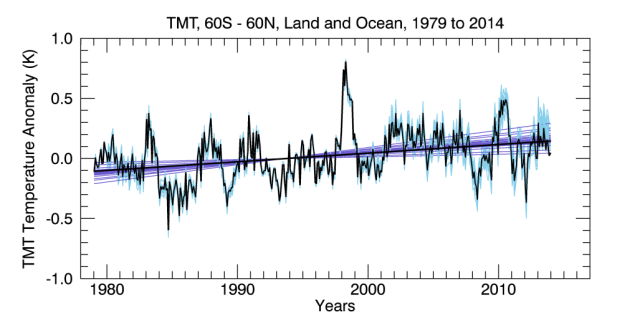
Enlarge / Mears generated a number of versions of the mid-troposphere data using a range of possible time-of-day corrections (light blue lines) to analyze uncertainty. Carl Mears/RSS
This problem is a terrifically tough nut to crack, and updates to techniques have routinely produced significantly different looking datasets—particularly for the UAH group. Its initial version actually showed a cooling trend through the mid-1990s. After a 1998 paper found that the gradual lowering of the satellites’ orbits was introducing a false cooling influence, UAH’s revisions accidentally broke its time-of-day correction, creating a new source of false cooling. That wasn’t figured out until Mears and a colleague published a 2005 paper. And just last year, another paper laid out evidence that insufficient corrections are still having a cooling influence on the data.
With that said, both satellite records do show slightly smaller warming trends for the troposphere than our surface records show, which is unexpected. “If you include the uncertainty analysis,” Mears explained, “I think that the data aren’t really good enough to say that it either is or isn’t following what you expect.”
The “no warming in 18 years” claims simply stem from the fact that the warm El Niño conditions around 1998 stand out very strongly in the satellite record, producing a cherry ripe for picking. “Of course if you start riding your bike from the top of a hill, you’re gonna go downhill for a while,” Mears said. By starting in 1998 rather than, say, any year previous, you can draw a flat line to the present. (Since the current El Niño is just as strong, we should see a similar hill appear in the satellite data as that warmth moves poleward from the tropics.)
“Some of the interannual wiggles are bigger in RSS, and since 1998 or something like that, we’re showing less [warming] than the surface datasets. I suspect that’s at least partly due to a problem in our dataset, probably having to do with the [time-of-day] correction. It could be an error in the surface datasets, but the evidence suggests that they’re more reliable than the satellite datasets,” Mears said.
Despite the political rhetoric championing satellite records as a challenge to the reality of human-caused climate change, they actually confirm that reality. “We’ve done numerous papers with Ben Santer from [Lawrence Livermore National Laboratory], where he’s compared the patterns that we see to the patterns that the climate models predict, and we’ve shown that without including greenhouse gas changes in the climate models, you cannot get the amount of warming that we see,” Mears noted.
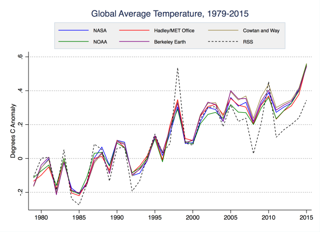
Enlarge / Compare the RSS satellite temperature dataset (dashed black line) with surface records. Zeke Hausfather/Berkeley Earth
The NOAA conspiracy
So what happened that prompted Congressman Lamar Smith to accuse NOAA scientists of manipulating data and rushing to get it released?


 Arguments




If you go to the doctor and he takes your temperature and it is 60°F you don't ask him to call the mortuary, you take another reading.
For a scientist to pretend that data readings are all correct, and to ignore known errors, would be dishonest - malpractice.
You make the observations and then you correct them as best you can.
I assume Cruz is lying.
He is an accomplished debater. He made a name for himself starting at Princeton in 1992 when he won the Top Speaker award for them at the North American Debating Championship. When he went to Harvard Law one of his professors, Alan Dershowitz (a political liberal) said, "Cruz was off-the-charts brilliant". As Texas Solicitor General Cruz argued many cases before the US Supreme Court, winning more than he lost.
Because his argument against doing anything about climate change because it isn't happening is so weak, the first thought that comes to my mind is he is lying. Its just another debate to him. Top flight debaters can argue black is white, or white is black. It doesn't matter. He hasn't got much to work with in this climate debate, but he's giving it a shot.
He is cynically attempting to vacuum up the votes of people who actually believe NOAA, NASA, etc., just fabricate whatever it takes to contribute their bit to efforts of the global conspiracy of climate scientists who are all busy fabricating what they can so they can destroy the US economy or make their lawn die or whatever it is that they fear.
Cruz is either lying, or being misleading. He's intelligent enough to know using 1998 as a start point in the data isn't valid science.
This is particularly frustrating coming form Cruz, who sets himself up as a strong Christian with impeccable moral values, or at least aspirations to impeccable vales.
Its time the world stopped making excuses for people like Cruz. They should be utterly condemned for what the way they are acting, like utter charletans. Where's the media holding these people to account? Nobody has the intelligence or courage to do it, apart from a few websites like this one.
Not all climate sceptics are insidious people obviously, however the world is being held to ransom by a few fanatical climate sceptics. These people are towards the outside of the bell curve in terms of beliefs. Some of them may have some sort of personality disorder.
The satellite record shows 2015 was the third hottest year, according to UAH. However there is also a delay before el nino events show up fully in the satellite record. The 1997 - 1998 el nino didn't show up until mid 1998. Last years el nino may be the same, and wont fully show up until this year.
nigelj,
More important points about the Satellite record are:
People like Cruz who try to make claims based on the satellite data are likely to understand the above points. They deliberately do not want to more fully inform others of what they are aware of (typical debate, legal, political and economic tactics)
Not fully sharing your knowledge and understanding with others can give you a competitive advantage. Especially if scientific investigation for political marketing purposes indicates that a significant portion of the population are willing to be easily impressed by misleading marketing claims or outright lies.
The power of being able to 'create impressions' began trumping the significance of the 'actual substance' of an issue in the late 1880s (Pointed out by Susan Cain in "Quiet: The Power of Introverts in a World That Can't Stop Talking"). That is obviously something that needs to change (contrary to desires to prolong or expand many developed damaging and unsustainable 'popular profitable pursuits of perceptions of prosperity').
They are not climate skeptics. They are climate-change deniers.
DS
"Not fully sharing your knowledge and understanding with others can give you a competitive advantage. "
One of the creative ways to lie
"Tell the Truth. But Not All Of It"
Robert Heinlein
And yeah, Susan Cain's book is awesome.
Scott Johnson, I don't know if you're reading the comments here, but this post is just about the most helpful one I've ever seen at SkS. And that's saying a great deal.
Glenn
Is Cruz declining to tell all of the truth or is he just denying the truth?
There are two possibilities:
(1) Cruz knows that global warming is a threat.
(2) Cruz does not want to know that global warming is a threat.
What do you call someone of the first type — psychopath?
What do you call someone of the second type — a victim of a special form of insanity?
(2) is simply cognitive bias and frankly I think everyone suffers from it to a certain degree (I do). Fortunately, the scientific method as it has evolved, and when practised as a community gives us a way to break from the biases. Getting someone to accept a proposition that is conflict with their values and/or identity is close to mission impossible.
Scaddenp @ 9 , please . . . do tell the dreadful secret of your cognitive bias ~ unless it involves something actually illegal, of course !
No, I don't think we can excuz Cruz, on the grounds that no-one else is absolutely perfect. There are shades of grey in many concepts, to be sure . . . and especially on the spectrum between undoubted sanity and undoubted insanity. Slightly off-white and almost pitch-black, may well be on the same spectrum ~ but there is a huge qualitative difference, that amounts to a recognizable difference of category.
Digby's possibility (1) is something that features on a dimension at right angles to the sane/insane spectrum. And that is: the moral dimension. There we are treading more on the territory of religion & ethics.
But you could equally argue that "cognitive bias" [ possibility No. 2 ] also has a moral dimension of good/evil, when the bias is extreme.
Cruz is trained as a lawyer - his job is to advocate for his client, without regard for the truth. If he gets a murderer acquitted, he has done his job regardless of whether the suspect was actually guilty or not. Sometimes lawyers don't do well in a field like science, where the goal is to find out the truth, regardless of any potential impacts it may have.
I find it amusing when deniers insist that the raw data are more accurate than the corrected data, while also insisting that raw data are inaccurate and must be adjusted for urban heat island effect, poor station siting, and other factors that might conceivably raise the temperature.