WYSIWYG Comments Feature
Posted on 3 February 2013 by Bob Lacatena
Skeptical Science has modernized the comments system (with many thanks to Paul D), by adding a what-you-see-is-what-you-get (WYSIWYG) comment facility. Now, no one should feel tempted to violate the comments policy by using all-caps... because you can easily bold and italicize and do other things (within reason).

For most people, use should be straightforward. The main things that you can do are obvious, and are like any computer editor you've encountered elsewhere.
There are some cool features, though...
The Basics
The Basic tab, the one you start with, has the most obvious and useful tools:
- A button to bold selected text.
- A button to italicize selected text.
- A button to underline selected text.
- A button to strikethrough selected text.
- A button to subscript selected text like this.
- A button to superscript selected text like this.
- A button to create bulleted lists (like this one).
- A button to create numbered lists.
- Buttons to indent and outdent paragraphs.
- A button to quote text
[Please use this, but sparingly, when quoting a portion of another user's comments.]
Insert
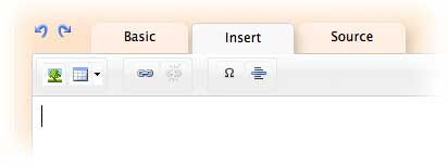
Under the insert tab you can add images, links, tables, and special characters such as Δ and €. This feature, combined with superscripts and subscripts, is particularly useful in forming equations — such as the Stefan-Boltzmann Law, Je=σT4, or a one-box climate model such as c[∂T/∂t] = -λT + F(t). Subscripts are also useful in molecular formulas (such as CO2).
To add a link, select the text you want linked, click the link button, and enter the URL. To break a link, click anywhere in the linked text, and click the un-link button to remove the link (or click the link button to change the URL).

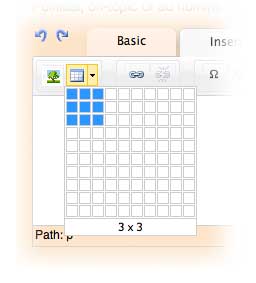
You can insert a table by clicking the table icon and entering the table size, or by clicking on the disclosure triangle and draggining to select your table size.
[It's up to the bold to figure out the other aspects of managing tables.]
Images
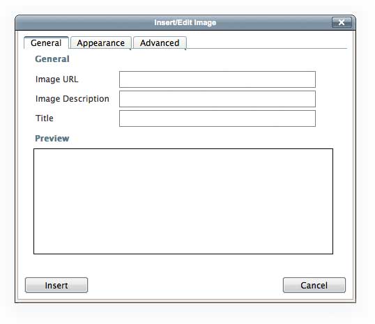
Inserting images requires some special attention. When you click the image button, a dialog will come up.

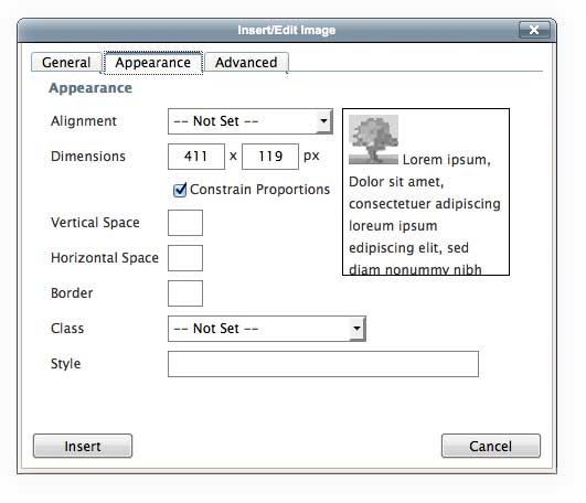
Enter the URL of the image you wish to embed, and then please click on the Appearance tab. This will show a dialog where you can check the width of the image. If the image is wider than 450 pixels, please enter 450 so that the image will shrink to fit well into the comments columns.

Click "Insert" and you're done.
Source
The bold and knowledgable can still tweak their comments by directly editing the HTML, using the Source tab. Again... if you want to do that, then you certainly don't need help here. And if you don't know what any of that means, you'd be best off leaving the Source tab alone. WYSIWYG was invented so that you don't need a Source tab.
Undo and Redo
There are undo and redo buttons (the blue swirly arrows to the left of the tabs).
Keyboard Shortcuts
Your common keyboard shortcuts for bold and italics, among other things, should work, too.
Preview
There is no preview. You don't need one anymore. What you see is what you get.
Happy Hunting Commenting!


 Arguments


Thanks Bob Sphaerica! It's easy as . . .
In-tag style, too -- nice.
Thanks for this, it is appreciated.
I did have a glitch with a link I inserted using the Link button, then tried to edit using the Source tab: every time I returned to the Basic tab, my hand-coded changes were removed (yes, my change was valid code). In the end, I had to use the Unlink button, then switch to Source and insert the link through HTML, which worked fine. Just a petty teething trouble that most people would never notice.
Other terrific new features will be rolled out Real Soon Now. Sophisticated AI will parse your comments as you type, making it easy and fun to avoid making embarrassing errors in public.
Further to my comment @ 2 above, I have been able to replicate the behaviour:
Moral seems to be "don't mess with the HTML created automatically by the editor and, in fact, don't even look at it using the 'Source' tab". I have not yet determined if creating an entire post, using the 'Source' editor alone, works properly.
I discovered this, by creating a post using 'Basic' and 'Insert', then being interested to see the HTML generated. Just looking at the source seems to be the bringer of plagues upon my coding.
I have not looked at the source of this comment, so I hope it posts OK.
Hey! it seems makes one can use sub and sup tags simultaneously, if one doesn't have anything substantial to say. bolding italics test
[Ðø hjumän fingõÿpÿint is mässiv].
where did those colors come from?
The problem seems to be with the source editor and the way it interacts with scratchpad memory.
Also, try this: highlight the name of the person making a comment and middle-click to type it into the 'Basic' editor. You will notice that what is pasted is a hyperlink to the person's name, not just the text of the name as it used to do.
Now, click on the 'Source' tab and look at the HTML: on my system, the HTML is OK at this stage.
Now, click back on the 'Basic' tab. The editor pane on my system now shows an icon indicating there is malformed HTML and clicking on 'Source' now shows the HTML is, indeed, screwed up.
Moral 1: don't look at the 'Source' pane. Ever.
Moral 2: don't highlight a commenter's name and try to save yourself some typing by middle-clicking into the editor pane, as you will end up with a kinda-correct hyperlink to the person's name, instead of just plain text.
When the "sophisticated AI" is added, will this include DWIM and DWIW! buttons?
Both my last two comments arose because I was trying to reply to doug_bostrom @ 3, with the comment that I laughed at his cartoon and it reminded me of one that was circulating years ago, with the same Micrsosoft paper-clip saying "I see you are trying to write a suicide note: would you like to start the suicide note wizard?"
This comment entirely typed into the 'Source' editor, lower pane and it looks good in the rendered pane, so I hope it posts OK. If it does, the moral might be to either use the Source editor alone, or the WYSIWYG editor alone, but don't try mixing methods.
Hope these comments help someone else noticing this problem. (I'm a retired programmer: I can't help it if I have a fetish for finding bugs ... <grin>)
If I want to be bold I'ld try
a few
indents
to see
where they
go ...
But I think I'll take a low road, while you take a high road.
But coming to the source, I find no problem, whether in italics or underlined.
To Doug Hutcheson, the above was just a test, and no doubt very testing. The initial section was done by wysiwyg, while the line including the italics and underline was added in source. One thing I did which you may have neglected was to start and finish the line in source with <p> and </p> respectively. Also, to get tidy html code with wysiwyg, it is probably better to type your message, and then format afterwards rather than formating as you go. Not sure about the other problems you mention.
Though I've only scratched the surface of it so far, this is the best comments interface I've seen on the www.
Only one point. I use Firefox which has a very useful real-time spellchecker add-on that works whenever I make a comment on a site—except it no longer seems to work when using this interface.
Doug, to help me resolve the issue:
Doug,
Tried repeating your problem here following your instructions and couldn't replicate. I inserted a link then looked at the code and it looked fine. Switched to basic and back to source and nothing had changed.
Wonder if the actual link string has something in it that was a problem?
Question: Everythime I move to a different SkS page I get a Windows7 prompt to "open or save sks_comments.mv4 (682 KB) from skepticalscience.com". If I try to "open" the file, the computer acts its trying to open a program that it doesn't have an application for (like opening a worksheet.xls file w/o having Microsoft Excel program installed). This just started happending right when this WYSIWYG change went into effect.
Does anyone know what this sks_comments.mv4 is all about???? What should I do with it since I can't 'install' it and I can't get rid of it????
As I'd like to try the brand new gift, I could make a try at the .mv4 miracle [sauerj] as well. From time to time I get a really annoying mess of "A plugin is needed to display content" messages from Firefox when reading an article or from the home page of SkS. This article itself is a perfect example for this phenomenon due to embedding the example slide show. As in the other example given in ref., the cause is absolutely always one "param" of the "object" tag: "quicktime". The videos/slide shows are well formed mpeg4 but the param "quicktime" results in a fail to display since no "Quicktime" is installed. Most (Win) users will avoid installing "Quicktime" unless permanently needed. But it may be a useful codec for the rest of the world(? tablets, cell phones...), though I doubt that seriously. There are some "Quicktime Alternate" floating around - but I think it'd be better to change the "param" to "video/mp4".
The 'mv4' is the video demo file at the top of this article.
It's an Apple version of mp4.
Paul D@16:
The origin may well be an "Apple" product - the result is a wellformed mpeg4. When downloading the file and changing the extension to something like ".m4v" or even ".mpg" e.g. WinMediaPlayer will happily display it.
ajki
Sphaerica has changed if to .mp4
Now we can behave like secretaries with a new DTP package...
Also noticed that "keep me logged in" option doesn't appear keep me logged in, maybe cookie not working or expiring too soon?
Would it be possible to issue a redirect after post, so the back button doesn't offer to repost a message? I guess I'll find out when I post this and go back!
Are youtube links automatically formatted to embed? Here's a test:
http://www.youtube.com/watch?v=GetB-xs9D_A
Thanks guys! The ".mp4" worked. When I open the file, it now 'runs' the movie. I notice I put a ton of typos in my note (embarassing). Some sites let the writer edit his/her entry. Is that even possible here? Or, am I asking for the moon? To all the team: Keep up the good work. This site is building a legacy for the years to come; it's one clear voice crying in the wilderness!
Re-testing insertion of above link: http://www.youtube.com/watch?v=GetB-xs9D_A. Wow! This IS a lot easier!
Some sites let the writer edit his/her entry. Is that even possible here? Or, am I asking for the moon?
The obvious problem with this idea is that unscrupulous posters can edit their posts wholesale, changing the entire content, thus making it look like any subsequent replies are stupid or meaningless. I guess it might work if the edits were moderated, but I think the moderators have enough to do already ...
[DB] "but I think the moderators have enough to do already"
Yes
Now every time I load a SKS page I get a prompt to download a comments file which I have to cancel and it keeps popping up when ever another page is loaded so have to now keep clicking again and again to cancel.
It even pops up when I posted the above comment.
Phil, Good point! Never thought of that. I retract my request. ... Thanks, sauerj
Peter,
Can you clarify your problem? Does it happen on every page, or only this post? What are the details behind the download prompt? The behavior you're describing sounds very, very strange.
Sphaerica @ 12, I can no longer make the editor misbehave in the same way (tears hair, gnashes teeth, throws things at monitor).
I still have a problem using the middle button to type highlighted text into the Basic, or Insert, editor field: instead of typing the highlighted text, the middle button appears to paste whatever is currently in scratchpad memory.
If I explicitly use Edit/Copy to copy the highlighted text to memory, then Edit/Paste to paste it into the editor, everything seems to work fine, so I will use that route in future and train myself to not use the errant middle button.
Thanks for taking the time to respond. I will just crawl back under my rock ...
Peter, this happened to me. I'd reinstalled everything a while back following a rebuild but hadn't gotten round to downloading and installing Quick Time Player. Having just done so, the issue is resolved. Hope that helps.
super - Thank you all !
Oddly enough, under the latest version of Google Chrome - Going to SkepticalScience.com, or this page, positions the browser to show the movie illustrating the editor at the top of the page. Not the top of the page itself, but scrolled down a fair bit. FireFox does not show this behavior.
This occurs even after clearing the browser cache - it's not due to old data. Chrome just seems to like the movie :)
On firefox 18 under Linux I'm getting a popup for the movie every time I visit the SkS homepage - it's really annoying. A simple fix would be to put the image before the break and movie after. (Or just move the movie to youtube).
Doug H
In Windows 7 I think using the middle button to click on a link, opens a new tab with the page in IE8.
I don't think the middle-button in Windows XP has a specific function does it?
You have to use something like MS IntelliPoint to assign a function or action to it.
For what it's worth the "bold" command in Basic mode publishes the way SkS handles the html strong tag.
If it could be revamped without too much effort, would it be possible to change it to publish the way SkS handles the html b tag? IMO the strong tag is disproportionately visually dominating, even taking into consideration that one is bolding the text to draw special attention to it or for special emphasis.
Updated Comments Policy... link is now contains somewhat outdated:
HTML Tips section.
Especially, follow this advice link at the end of the page is really obsolete now.
I propose to rid of this relly obsolete stuff and also remove/reduce the
HTML Tips
section and place the link to this page instead.
Paul D @ 31 I must admit to not having used Micro$oft Window$ for a long time, so I cannot comment on mouse gesture assignments. I am using Linux (Fedora 17) with a BlueTooth mouse having a central wheel and the default mouse behaviour in a web page under Firefox 18 is quite interesting:
Left and right buttons as you would expect.
Wheel forward and backward scrolls the page, as you would expect.
Pushing the wheel to the left is the same as clicking the browser Back button.
Pushing the wheel to the right is the same as clicking the browser Forward button.
Following your idea, I have just tried pressing the mouse wheel (ie: the middle button) while over a hyperlink and, as you said, the link opens in a new tab (thanks for the tip!).
On iOS/safari, the edit box does not scroll when you go back to edit a post, sometimes. But not consistently (I'm failing to reproduce right now). It also seems to interact poorly with the autocorrect: it's offering corrections for words I deleted.
I've noticed the same with some bb forums.
An option to have a dumb editor for "smart"phones and other dumb browsers would be ideal.
Sphaerica, I can reliably reproduce the problem I was having, as detailed above.
Look at the HTML source of my comment here for an example.