Climate Science Glossary

Term Lookup

Enter a term in the search box to find its definition.

Settings

Use the controls in the far right panel to increase or decrease the number of terms automatically displayed (or to completely turn that feature off).

Term Lookup

Settings


All IPCC definitions taken from Climate Change 2007: The Physical Science Basis. Working Group I Contribution to the Fourth Assessment Report of the Intergovernmental Panel on Climate Change, Annex I, Glossary, pp. 941-954. Cambridge University Press.

Home Arguments Software Resources Comments The Consensus Project Translations About Support

Bluesky Facebook LinkedIn Mastodon MeWe

Twitter YouTube RSS Posts RSS Comments Email Subscribe


Climate's changed before
It's the sun
It's not bad
There is no consensus
It's cooling
Models are unreliable
Temp record is unreliable
Animals and plants can adapt
It hasn't warmed since 1998
Antarctica is gaining ice
View All Arguments...


Username
Password
New? Register here
Forgot your password?

Latest Posts

Archives

Maximum and minimum monthly records in global temperature databases

Posted on 15 March 2011 by shoyemore

The worldwide success of books like The Guinness Book of Records is an example of human fascination with record-breaking – the smallest, fastest, farthest, the first etc. The frequency and size of records can tell us something about the underlying process. For example, the world mile record was broken on average once every 3 years between 1913 and 1999, by about 1 second per record. The shift in dominance of middle distance running from the Anglophone countries to Africa has meant the record has only been broken once since 1993.

This post describes a method of recording and graphically presenting successive annual counts of record-breaking months by temperature, e.g. the warmest or the coldest since records were kept, over more than one database. The rate of appearance of record-breaking (warmest or coldest) months intuitively provides a signal of climate change complementary to the usual temperature data. See the “Further Reading” section at the end of the post.

Such data of maximum or minimum records are quite useful as they might, for example, provide evidence of a warming (or cooling) climate, when the temperature data is apparently static over short periods. As we will see, such is what has occurred in the 2000s.

Steps to follow:

(1)    Download monthly climate data into a spreadsheet, either the raw data or the temperature anomaly. For easier manipulation, re-arrange the data with successive years in rows underneath each other, and the months in 12 columns, from January to December.

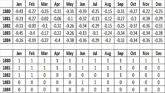
(2)    Create a second matrix of rank numbers. In Excel, the RANK function will return the ranking of each monthly temperature datum since the first datum was recorded i.e. the top month in the column. Consult the Excel Help to tell you how to use RANK to find the minimum records, which you can do in a separate worksheet. The IF function can be used to set all ranks, other than the one of interest, to 0. Figure 1 shows the result for the first four years, using GISS data for an example.

(3)    In a further column to the right, simply add the number of record months in each year.

(4)    If using more than one database, an average is taken. If, for 1960, the GISS database shows 1 new record month,  the NOAA database shows 0, and the HADCRUT database shows 1, it is counted as average = 0.66 for 1960, and entered into a score of average yearly record months, which you can keep in another column.

(5)    You now have two columns, each of the average maximum and minimum records in each year. You can use two further columns to create running totals of each, and a further column to find the difference between the two running totals.
Matrix

 Figure 1: Conversion of GISS temperature anomaly into a binary indicator of maximum monthly records for first four years.

We intuitively expect that, in a period of warming, there should be more maximum monthly records than minimum, and vice versa in a period of cooling. If we assume that the frequency and duration of warming and cooling periods even out in the long run (natural variation), the running totals of maximum and minimum records should be approximately equal. The differences obtained by subtracting one running total from the other should centre on zero like a sine wave. Figure 2 shows the annual differences in cumulative sums of average new maximum and minimum records in 3 databases (GISS, HADCRUT and NOAA from 1880 to 2010).

differs

 Figure 2: Annual differences in cumulative sums of Average Annual Maximum and Minimum Monthly Records. As an example, in 1911 there was an excess of 30 minimum monthly records over maximum, counting since 1880.

Comments:

  • There is an “early measurement effect” because all the first year’s monthly temperature measurements will all be both maximum and minimum records. Subsequent months will modify the records so that it will take a few years for the annual counts to settle down. Since the effect influences both maximum and minimum records, Figure 2 is, on the average, free of this effect.
  • In Figure 2, the early decades show perhaps a 20-year period of cooling. After 1920, a mid-century warming commences, and this looks like natural variation (a half-sine wave) up to about 1940.
  • Then a period of stasis ensues (for 12 years) until the excess of maximum over minimum records starts again with an accelerating increase up to 2010.
  • Figure 2 resembles charts of the temperature anomaly – but it has a different origin than subtracting the temperature observation from a chosen baseline. It is more “granular” than (for example) a LOESS smoother. However, it misses mid-century cooling, which did not generate any cold monthly records.
  • It is difficult to reconcile Figure 2 with the expectation of a long term average of 0, if the record months are occurring randomly and in equal proportions. The mathematics to prove this is a bit tougher, so we will not go into that level of detail.

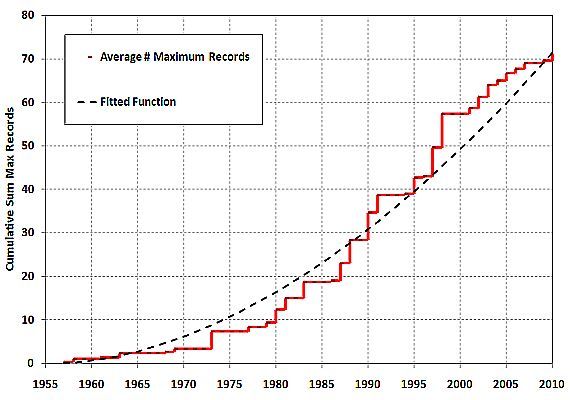
 Figure 3 is a chart of the running total of new annual maximum monthly records, starting with the 1955 value set to 0. Note is a non-linear, increasing trend – for each 10 year division, more records are occurring.
Maxim

Figure 3: Cumulative Change in Annual Average Maximum Monthly Records since 1956. The 1955 value is set = 0.

Comments:

  • It is possible to fit a function to the curve and use the model to predict the rate of occurrence of future new records. The mathematics of the curve fitting will not be described.
  • The rates are estimated from the fitted function, for different decades, in new maximum monthly records (r) per year:
    • 1960-1970            0.56r/yr
    • 1970-1980            0.94r/yr
    • 1981-1990            1.27r/yr
    • 1991-2000            1.56r/yr
    • 2001-2010            1.81r/yr
  • To understand the previous table better, in the decade 1960-1970, new maximum monthly records occurred on average about once every 21 months (=12 x 1/0.56). In the decade 2001-2010, they occurred on average every 7 months (=12x1/1.81).
  • Since the incremental increase in temperature for each new record reflects the temperature rise, the average temperature rate can be estimated from the temperature data. Let ?T=Average Temperature Rise over all maxima. Then Temperature Rate = ?T x Rate of Occurrence of Records.
  • Plugging in ?T=0.011C (estimated from the temperature record), the following values are estimated for temperature increase in degrees C per decade:
    • 1960-1970            0.07C/decade
    • 1970-1980            0.10C/decade
    • 1981-1990            0.14C/decade
    • 1991-2000            0.17C/decade
    • 2001-2010            0.20C/decade
  • Predictions for the next decade (assuming continuance of current conditions):
    • 2020 Rate = 2.33r/yr
    • 2020 Rate of Temperature Increase = 0.26C/decade
    • The probability of 2011 not having a new record month is 0.09

This basic, and even crude, analysis confirms the model of temperature rise given by mainstream climate science.  That is no surprise. However, it can be expanded to incorporate natural variation (factors like ENSO and volcanic eruptions) using methods like logistic regression, which is more robust than ordinary least squares. The advantage of this method is that the mathematics of a noisy temperature process has been replaced by the mathematics of a simple stochastic process. Stochastic processes are well understood and used in many situations like monitoring time between crashes of a computer system (in software reliability engineering) or time between events (in health survival analysis).

This analysis undermines, yet again, many of the simplistic contrarian models e.g. that natural variability is driving warming, or that the earth has been cooling in the period 1998-2002. As Professor Richard Lindzen said: “Temperature is always rising and falling”. However, that implies an equalization of maximum and minimum monthly records over a long period. The numbers of minimum monthly records in these global temperature databases has not even been close to numbers of monthly maxima for some time.  The last such sequence in these databases ended in 1917, almost one-hundred years ago. The current rate of occurrence of minimum records is 0 per year, and the rate for maximum records is consistently outstripping that of minima by almost 2 per year, and rising.

Further Reading:

How often can we expect a record event? Benestad(2003)

Record-breaking temperatures reveal a warming climate. Wergen(2010)

Detection Probability of Trends in Rare Events: Theory and Application to Heavy Precipitation in the Alpine Region. Frei(2001)

0 0

Printable Version  |  Link to this page

Comments

1  2  Next

Comments 1 to 50 out of 60:

  1. OK, I've read through this twice now. I don't have the skills, but I would happily supply as much coffee, pizza, scones or biccies as demanded by someone who does while they do a bit more work on this. It looks like a candidate (which could very well not pan out as I naively expect) for one of those barely hidden human fingerprint indicators. The jump in average atmospheric temperature the first half of 20thC is always 'explained' as due to variations in solar and volcanic activity. This looks very much as though someone was lifting the trampoline under the obvious jumping so that, when particular causes for the jumps dissipated, we were left with a new baseline rather than the one we started with. Someone's name might just start with 'C'. Though much of that C would likely have come by way of releases from soil during the extended period of worst farming practices ever known to man rather than from industrial releases.
    0 0
  2. Thank you for an interesting article - Figure 2 certainly tells a story! As does Figure 3, actually - while it certainly hasn't been cooling since 1998, the rate of warming has certainly slowed down. In fact, it looks to me like a warming trend that is modulated by other oscillations. What this means is that if it doesn't start to cool shortly (and not many climate scientists are expecting that), we'll probably see the warm phase of that oscillation kick in, and the warming rate will meet or exceed rates during the 80s and 90s. Another couple of decades of that rate of warming will put us well into uncharted territory, w.r.t. global temperatures. It will make it a lot more difficult to deny that global warming is a serious problem, though being a few decades down the track, it will also be considerably more difficult to fix the problem. I'd love to perform a similar analysis done on individual station records around the world, but that would require access to all the data from all the stations, and a lot more time than I can spare!
    0 0
  3. Great analysis, but be prepared for the pro-pollution camp to hijack the analysis - and say it "shows" global warming just about coming to a halt. From 1980 to 1998, the jump is almost 60 maximums. Since then ... 11. Take the fitted curve away, and there's a lazy S-slope. What it needs is an energetic gopher to do the decline in minimums and tower chart it, like the US example:- http://blogs.ajc.com/jay-bookman-blog/files/2010/01/temps_2med.jpg
    0 0
  4. Thanks for this analysis, I won't go in to details now but just note that the if the 'lazy S-slope' levels out at 70 that only means the acceleration (or the speed of?, didn't read the article in detail yet...) of warming is at maximum.
    0 0
  5. #3, owl905, As colleagues of mine often say "the data are what the data are!". At least no one can argue it shows global cooling. A slowdown in the rate of warming in the last decade (at least up to 2008) is certainly arguable, but I think that is "cold comfort" for the global coolists.
    0 0
  6. sorry my bad, that was the cumulative sum... not some index of the relation max vs. min... that's what may happen if one just glances graphs in a hurry.
    0 0
  7. This is an interesting diversification in the way we communicate climate science - thanks. I talked about this a bit on another thread, and would love to hear more from people like Mike Hulme who understand the sociology, but here's my initial take. I'm seeing three developing strands of communication: 1. Traditional argument from authority. That's what SKS does normally with references into the literature. Effective for people who have a high regard for (non-climate) science. Arguments from authority become much less effective for post-modern audiences. There is a danger here that we are teaching a wrong methodology: giving people the idea that any argument supported by a citation is right. Then all they have to do is find a counter citation, and they've shown that they are right or at least that the science isn't settled. 2. 'Journey narratives'. Stories of the form 'This is the journey I made and here is what I discovered'. Personalises the material for non-technical audiences. The most powerful form is the conversion narrative: 'I was a denier and then I looked at the data'. The latter is open to abuse of course - false conversion narratives. A lot of TV science documentaries adopt this form. The recent BBC4 'Meet the climate skeptics' about Monkton was a good example - and one in which the conversion narrative was present but didn't convince everyone. 3. 'You can test it for yourself'. This post, and the recent 'quick and dirty instrument temperature record' post are good examples. Personalises the material for technical readers. People are much more likely to believe, and to disseminate things they've found out for themselves. Lots of people will also be convinced by the argument being made in this form without testing for themselves. Monkton abuses this form by telling people they can check for themselves knowing that they will not. 'The Da Vinci Code' owes some of it's awful success to this - telling people they can check it for themselves. That's my half-baked untrained observations. But I still think we could learn a lot by lay-targeted presentations by people who understand the sociology.
    0 0
  8. #7, Good, thoughtful post but I have to admit that anything tagged "postmodern" makes me feel queasy. Chris Mooney had a good post on this recently. Climate Denial is not Postmodern If fact I doubt if postmodern said anything new or profound about science. But if you want to believe that climate science is a male-dominated power narrative, I can't stop you. For example, how is a paper from a scientist (male or female) with data and equations an " argument from authority"? The fact is that scientists were oblivious to the postmodern "science wars" going on around them. Those wars were debates, fought mainly by philosophers and post-Marxist literary "critical theorists". Scientists kept doing science as practised by Einstein, Feynmann and Darwin ... and I hope that is what they keep doing.
    0 0
  9. Before you start crunching numbers you should ascertion the field resolution of the weather station therometers. In the earlier records of US weather stations, this is 1 deg F. Since 1979 in Canada, this is 0.5 deg C. Any results you calculate has to be rounded to the nearest whole degree for US data and the nearest half degree for Canadian data. Secondly you must check _all_ data for mistakes. For example, here are the monthly mean temperatures for Feb 1900-1909 for Utah, which I obtained from NOAA's "Climate at a Glance" website: 31.6, 30.4, 33.5, 16.0?, 33.6, 29.9, 33.1, 39.8?, 30.5, 28.8 The 16.0 entry is a mistake and should be 36.0. The 39.8 entry looks too big and probably should be 29.8. Errors, like enemies, accumulate and they come back to kick you in the butt. For the Feb temp data, I found 11 mistakes for the interval 1895 to 2010. Calculation of Weather Noise. I propose the following formula for computing "weather noise": WN = AD - RT where WN = weather noise, AD =classical average deviation from the mean, and RT = resolution of therometer. For the Feb temp data, Tmean = 31 +/- 3 deg F Since AD = 3 and FT = 1, WN = 2 The main drawbacks of the procedure for computing weather noise is that it is site and time dependent. Nevertheless, it is method for obtaining an estimate of natural variability for a locality. I see a lot of climate data where a few tenths of a degree C are deemed significant. This is nonsense. Unless you have at least ca 0.5 deg C change or difference, you are probably looking at noise. BTW: I posted my proposal for computing weather noise at WUWT, RC, Climate etc, SOD, and Brigg's site. And I got _no_ comments. [snipped] What do you guys say about my proposal for computing noise?
    0 0
  10. #8 Actually, that's a very helpful link, which I agree with. There's a couple of important distinctions to be made though. Philosophical postmodernism and sociological postmodernism are two very different animals. (As different from each other as either are from architectural postmodernism). The former is a bizarre ivory tower phenomena with almost no connection to reality, the latter is a shorthand for gradual shifts in the worldview of the man in the street - something concrete and measurable. The criticisms you level are against the former, whereas the use in my post and Mooney's are the latter. Mooney's point about social-postmodernism (maybe we should call it postmodernity) is that it doubts the existance of absolute truth. On this basis he argues that the serious deniers are not postmodern - they think they have the truth. And he is exactly right in that. But they are just one constituency. The man-in-the-street is a different constituency - he hasn't read a load of contrarian papers or blogs. But he may well have an increasing distrust of science, an increasing distrust of claims about truth, and an increasing distrust of the opinions of 'experts' of any kind. All of these are relevant to the problem of science communication. And when dealing with this constituency, a 'journey narrative' is probably going to be rather more effective than other kinds of communication. I think that's all roughly right, although again I reiterate this is not my discipline.
    0 0
  11. Kevin #9 In my untrained opinion, your analysis manages to invert the concepts entirely: - Reference to papers with adequate evidence and mathematical analysis are turned into "argument of authority". I wonder what a reference to texts without such detail would be. - Technical (with maths and physics) and non-technical texts alike are implied to be misleading. Of course, on neither case there was an explanation why the contents of the texts were misleading, just a vague insinuation of its possibility. I often see this kind of analysis from people from a social science background. Some of them try to draw conclusions as if they could bypass the (arid, boring) physical understanding of the phenomenon. If you don't want to be mislead, you just can't. You must either understand what goes on and draw your own conclusions, or trust the judgment of someone else. On this latter case, you'd have to choose if you prefer trusting NOAA, JMA, MetOffice, Max Planck Institute (among many others) on issues related to physics and climate, or you feel safer trusting Monckton, Heartland Institutes and the likes for such things.
    0 0
  12. Sorry, Kevin C #9 became #7 now.
    0 0
  13. Alexandre #11: I'm a physical scientist. I agree with you on all of this. We are failing to communicate somewhere along the line. What I've learned from dabbling in sociology and science communication is that you simply can't assume that the man in the street thinks the same way we do. He doesn't. When I point to a paper which contains a reasoned argument from evidence, then the man in the street can't tell the difference from Monkton pointing to a paper and misrepresenting it, or Monkton pointing to a paper by Soon or Lindzen. If he tries to read the papers, he can't understand them. He doesn't know how to pick among experts. The 'balanced reporting' trend in media coverage means he constantly sees expert contradicting one another. So he concludes that expertise is meaningless. So he goes with his feelings. To appeal to a source he can't understand just looks to him like an attempt to pull the wool over his eyes. Do you see the sort of problem I'm getting at?
    0 0
  14. Kevin C, Yes, I understand and have to agree. I have experienced this myself. But the only way to onvercome this (IMO) is to explain the basics to the audience. Then they can see it for themselves (within limits). I'd love to hear alternative suggestions.
    0 0
  15. OT - Help! How do I get to see images from imageshack? All the graphs on this post appear to me as a frozen frog with the imageshack link. I tried to register there, but it did not work.
    0 0
  16. Well, I think that's what I've trying to point to. But it needs input from science communications experts and sociologists, because I'm constantly speaking beyond my expertise! But to turn what I was saying into something more concrete: Firstly SKS is brilliant. It is already in my view the best tool on the web for addressing people who regard themselves as scientific (even if they are contrarian on this one issue). It also provides invaluable resources for those of us who engage with such people. But maybe we need other things to complement it in order to address other groups. These will do some of the things many bloggers are already doing, but in a more systematic and findable way. Maybe 'citizenscience.com', focussing totally on experiments you can do for yourself with hardware or with downloaded data. Maybe 'climatestories.com', collecting the experiences of people who have visited glaciers, had to change their gardening habits, sailed round the pole etc. This is all pipe-dreaming of course. I don't have time to make it happen, and the people here are already doing more than their share. -- One other note: I think people are being thrown by my comment on the invalid methodology of citing papers. I'll try and expand to prevent further confusion. It is invalid methodology to go to the literature and find a paper that says 'antarctic ice grows in this model because of precipitation frechening the surface layer reducing overturning blah blah blah', and therefore assume that is what is happening. The valid methodology would be to search forward and back for citations of that paper, see what other people are saying, see if people are making observations to check the models, see if other hypotheses have been advanced and/or tested. Or, if you are lucky, find a good review by someone who has done all of that for you. On this basis you can then attempt to draw some sort of conclusion on whether the question is settled and how strong the supporting evidence is. That's the methodological problem I'm getting at. If we give the impression that citing a paper is enough, we are implying that every paper is right. That's a huge misrepresentation. That does impact how things are done at SKS. I don't have an answer on that one, sorry! OK, I've derailed this thread for long enough...
    0 0
  17. "Maybe 'climatestories.com', collecting the experiences of people who have visited glaciers, had to change their gardening habits, sailed round the pole etc." or maybe call it "anecdotalevidence.com"... your other idea was good though.
    0 0
  18. #15 Alexandre, You should not need to get a login for imageshack. That is were the images are stored and they should be displayed here like charts in other blogposts, which I assume you can read. I and other readers seem to see the charts - suggest you e-mail John with your problem.
    0 0
  19. I think as scientists we beat ourselves up too much. Science is a fairly clearly defined endeavour, and in the 80s there was a spate of courses in science communications and science journalism that was supposed to explain it to the man in the street. The real dereliction has been in what we can loosely call "the media" where hard-pressed editors gave up on science as a discipline and started reporting it as if it was politics or (in Stephen Schneider's words) a contact sport, not about truth but about winners and losers. Bottom line, it sold better in the "market", but it has been a disaster from teh point of view of rational decision-making and the political process. Eli Rabett had a good post on this. Churnalism
    0 0
  20. Kevin C Yes, maybe some input from professional communicators would help here. From personal experience, no level of communication (basic, advanced, etc) totally rules out dismissive attitutes from people who were already prone to do so. Explaining the basics really helps, but that leaves you with the problem of getting enough of people's attention to do the proper teaching. Providing context (like the recent SkS guide) also helps, even with people that did not learn the basics. I'd also add that getting there first also makes a difference. One thing is trying to teach the basics of atmospheric physics to someone that never thought of it before. Another, much more tricky thing is to try and teach someone that had already "learned" it through denialists. For these, even the concept of temperature itself may have become suspiscious. So maybe the thing to do would just be more of what we have already been doing...
    0 0
  21. Shoyemore Thanks. For some reason that is not all clear to me, the frog is gone and now I see the graphs. If the problem comes back, I'll resort to John as you suggested.
    0 0
  22. h pierce, I don't think you are demonstrating a good grasp of statistics. First of all, the whole point of using statistics is when you know there is variance, or error terms, and you want to make a judgment of how likely the differences between groups or the pattern you are seeing is solely a result of the error terms. There is commonly a great assumption that error terms are neutral, and it can get tricky if there is a bias. However, a bias over the last 150 years has yet to be demonstrated to my knowledge. Watts came up with his proposed bias in thermometer readings over time, but I haven't seen that he has ever published (peer-reviewed) his results regarding the urbanization and paint change study I heard he was working on. Error terms don't accumulate in how they affect the mean or the variance; one bad reading out of a 100 remains one bad reading out of 100 whether there are 100 readings or 100,000. Re: "I see a lot of climate data where a few tenths of a degree C are deemed significant. This is nonsense. Unless you have at least ca 0.5 deg C change or difference, you are probably looking at noise." Sorry, but what you just said is nonsense. For instance, say I have two dice; one is true, and the other is not. Each die will only give me integers between 1 and 6. Yet, given a thousand rolls, if the mean of one is 3.49 and the mean of the other is 3.41, I could tell you with near certainty that the second one is not rolling true and is different from the first. There are thousands of thermometers each taking at least a couple of readings a day for decades; a few tenths of a degree difference is easily distinguishable from noise. Besides, there is nothing categorically different between a difference of 0.3, which you reject, and a difference of 0.5, which you accept, except the confidence level or number of readings required to reach that confidence level. Not that climate researchers always get the statistics right, but if they don't, it is a pretty good bet that some other researcher will look at the same data and call them out.
    0 0
  23. The implications of the data above are not easy to fully comprehend. On the one hand, if you overlay a number of wave forms, of various shapes and sizes, but with no overall trend, you would expect the rate of the incidence of new records to decrease over time. That part is clear enough. The cumulative graph would show an always positive slope, but where the rate of change of the rate of change was decreasing. Intuition tells me that it will be an asymptotic curve, but it might be logarithmic. I'm thinking there will be an asymptote because over time the range of possible values will be more and more thoroughly sampled. I'm trying to imagine what the graph would look like it there is some positive, linear trend, and also what it would look like with some positive, non-linear trend, either with positive second derivative or negative; so that I could overlay that with what the data look like, but it is not clear to me. In any case, there will not be an asymptote because the range of possible values is changing.
    0 0
  24. "However, it misses mid-century cooling, which did not generate any cold monthly records." That's very interesting. I'm trying to decide if it means anything. For instance, on the surface, it would mean that the cooling seen during that time was a result of lower high temperatures not associated with lower lows. What would cause that? Perhaps a reduction of energy loss forcing coupled with a slightly stronger reduction of energy gained. That would fit with an increase of GHG effect along with a slightly stronger aerosol effect, but that isn't the only possibility. IDK, but it might be easier to come to grips with Figure 2 if there were something like a bar graph coded for blue minimum records and red maximum records summed by decade. That might be kind of a bridge between totals for the interval and cumulative total.
    0 0
  25. Chris G. And we come full circle to my initial point. This looks like a promising start to an analysis which teases out more information than just the simple global average temperature. You often see denialist arguments along the lines of "There's no such thing as average temperature" followed by "It doesn't mean anything 'real' anyway". This approach looks to give us 'balancing' mechanisms. It's not just warmer or cooler. It's the discrepancy between record highs staying much the same while record lows increase or decrease. Or record highs are changing while record lows are not. And thereby gain some clues about what climate mechanisms are worthy of closer examination in some periods rather than others. In the end it may come down to something quite simple like industrial aerosols can suppress maximum temperatures but have little to no effect on rising (and therefore reducing record lows) minimum temperatures driven by another forcing, like GHGs. Or we may gain some other really new and surprising insight. A really useful tool, methinks.
    0 0
  26. H Pierce at #9 while the error issues and statistical issues you raised are important the way you have raised them is to general to be answered properly. However you seem to be forgetting that the whole point of taking average values is to reduce the errors regardless of the source of the error. Your weather noise idea appears to be wrong since it says that calculating an average can never produce an average temperature value with accuracy and resolution less than 0.5C. This is not true. On the other hand I do worry about manual measurements by poorly trained technicians introducing biases due bad rounding techniques. Your solution is a partial answer to that but I don't believe that it is adequate.
    0 0
  27. Adelady, On the other hand, it could be completely uninteresting. The cumulative total of the Tmaxrecord - Tminrecord graph being flat tells us that they were equal during this period. The statement that there were no new monthly records, combined with the flatness of the graph indicate that there were no new monthly highs either. Which might be as simple as saying that the mean was traversing ground already covered, and variance about the mean was not greater than previously experienced. It would have been easier to see this if there were a graph of subtotals by interval.
    0 0
  28. LazyTeen, Nah. Unless you proposing that technicians have become less well trained over time, AND that the poorly trained ones are more likely to round up than down, then this is no cause for a systemic bias. Besides, satellite data show a compatible, positive trend in agreement with the thermometer data. So, you are worried that there is a systemic operator error bias that happens to coincide with a satellite bias, that happens to coincide with early springs, melting ice, etc. That falls off of the things I think are likely enough to worry about list.
    0 0
  29. Chris G., The temperatures in the mid century period were not "record", but there was a handful of second-warmest and third-warmest months, as if a warming period had been "damped" in some way. The "cooling" was not reflected in any coldest-month records. This may reflect a warming period somehow modified by the presence of aerosols - the months' temperatures were in the upper rather than the lower range. I am considering how this might be converted into a rate estimate via some formal Bayesian way. Fig 2 is in industrial and healthcare monitoring knows as a "Cusum" chart which is demonstrated to be the type of chart most sensitive to a process change. As you see it dates the advent of late-century warming to 1957 - earlier than any other method. I am not over-emphasising that, as it still needs some investigation. Adelady, I think you get it. Lot of work still to be done. Thanks.
    0 0
  30. In the "figures" only appear drawings of a frog inside an ice cube: with below written: "Domain unregistered, To view, register at: bit.ly/imageshack-domain" What is wrong with the figures? I hope the glitch is solved soon.
    0 0
    Moderator Response: [DB] An issue with imageshack (the host of the images). I'll see if I can effect a workaround. Fixed.
  31. Regarding the mid-century "cooling" - can someone point me to a paper that discusses the aerosol load created by human activities in that period? Just off the top of my head, I can think of the following abnormal aerosol sources: - damaged caused by WW2, including large numbers of fires as cities / towns / industries were bombed; - increased industrial activity during WW2 (the 'War Effort' effect), possibly with decreased attention to pollution control; - increased industrial activity during the post-war period; - aerosols produced by atmospheric nuclear testing (from 1945 until the partial test ban treaty in 1963, although Wikipedia tells me the French continued atmospheric tests until 1974, the Chinese until 1980). It seems to me that those sources could (would?) have produced extremely high amounts of aerosols, some of which (particularly the nuke tests) would have been pushed into the stratosphere. If the effects of those have been quantified, is there need for any other factor to explain the mid-century cooling? The data in the post above that suggests there was no increase in cold records suggests it was mainly an impact on daytime maximum temperatures, with greenhouse gases keeping night / winter temperatures close to average, which would be consistent with aerosol effects.
    0 0
    Moderator Response: See the Argument "It cooled mid-century," in the Advanced tabbed page.
  32. Bern, never overlook the truly dreadful agricultural practices of the time. The dustbowls of the 30s and 40s in USA, Australia and USSR were created by idiotic plough-every-chance-you-get approaches. More agricultural land was opened up - cleared and flattened to bare exposed soil - during this period. And many farmers continued with practices they'd become used to right into the late 50s and 60s. The changed advice from central agricultural authorities took a lot of time to percolate through the industry. I remember a 1960s school textbook telling me that it was necessary to plough =several= times before seeding because that promoted "capillary action" to bring water to the surface where it was needed. These practices created enormous dust clouds because the ruined, powdery soil blew away every time it was exposed to anything more than a gentle breeze. That effect was declining but not eliminated during the period you're concerned about. My suspicion is that the decline in proportion of farmers using these methods was offset by the large expanses of farmland being cleared. So the total dust produced didn't change as quickly as it might have. An agricultural historian would be a handy person to have right now.
    0 0
  33. An interesting analysis along this same line is to look back 10 years or 12 years and see how many of those years are records. For example, the IPCC AR4 noted that "Eleven of the last twelve years (1995–2006) rank among the 12 warmest years in the instrumental record of global surface temperature(since 1850." Below are charts that show how things would have appeared looking at the previous 10 or 12 years. See update 13 of Congenital Climate Abnormalities
    0 0
  34. Shoyemore, the author says at #29 "The temperatures in the mid century period were not "record", but there was a handful of second-warmest and third-warmest months, as if a warming period had been "damped" in some way." and "Fig 2 is in industrial and healthcare monitoring knows as a "Cusum" chart which is demonstrated to be the type of chart most sensitive to a process change. As you see it dates the advent of late-century warming to 1957 - earlier than any other method." Would it be possible for you to show what the Cumsum plot would look like for earlier periods, such as 1910 to 1950? It would be interesting to see how it dates the advent of warming in the first half of the 20th century.
    0 0
  35. ATTN: Chris Thank you for your response! An organic chemist, I isolate, identify and synthesize insect pheromones, and I don't know much about or use stats. However I do make measurements and know the rules re significant figures. Chris says: There are thousands of thermometers each taking at least a couple of readings a day for decades; a few tenths of a degree difference is easily distinguishable from noise. If the resolution of the therometer is +/- 1 deg F and data is recored to the nearest whole degree, then any mean computed from that data is rounded to the last signicant figure of the measurement. This is what I have taught Chem 101 lab students for years Your claim that "a few tenths of degree difference is easily distinquishable from noise" is obtained by voo-doo statistics and nobody really believes this. If you want to _know_ temperature to +/- 0.1 deg C, you use a therometer that has that resolution and is properly calibrated. What is your opinion of my proposal for computing "weather noise"
    0 0
    Moderator Response: You need to augment your knowledge of the rules re significant figures, with knowledge of the law of large numbers, which increases accuracy as the sample size grows.
  36. #34 Charlie A, Figure 2 is the cusum plot, with expected centering and expected symmetry about 0. This is actually what happens 1880 to 1940s, giving rise to the suspicion that what was going on back then was natural variation.
    0 0
  37. From Peru #30, Alexandre #15 had the same problem but it went away. Try refreshing the page. Not sure what the cause is. I must be the only one using imageshack to store my charts.
    0 0
  38. h pierce #35 I would suggest that you consider what we mean when we say that in the UK the average family had 2.4 children in 1964 and now has 1.9. By your reasoning and using your non voodoo statistics this is wrong since we cannot measure a 1/10 of a child. Implicit in discussions of global temperature changes is the term 'average' so when you see temperature I suggest you stop thinking of individual measurements and think of thousands. Have look at the wikipedia page on sampling.
    0 0
  39. I don't think the three references are applicable (although they are a related topic). The first paper had a dead link, but I found a paper by Benestad in 2004 http://regclim.met.no/results/Benestad_GPC2004.pdf that may be similar. The datasets in the papers have a lot more points to derive a statistical trend. When you used only one GAT series (one reading per month) instead of many readings per month used in the papers, your result has less statistical signifigance and reflects some global biases such as ENSO popping records at a higher rate in the 90's. OTOH, the benefit of using GAT is that UHIE has been accounted for.
    0 0
  40. Eric (skeptic), #39, Yes ... but ... this method is used in a variety of situations in healthcare and industrial monitoring. It has a rich literature in reliability engineering and survival analysis. For example, a study on asthma in a collection of sufferers may only collect the datum "onset of attack", rather than patient peak flow measurement. Monitoring of computer systems may collect the datum "alarm recorded" rather than voltage or current, or the error count rather than the errors. Analysis of these "time to event" data is quite complex .. Rigdon & Basu Statistical Methods for the Reliability of Repairable Systems is a good introduction. It would be wrong to assume that a discrete count measurement has a lesser statistical significance than a measurement on a continuous scale. It is true that the references approach the counting of records from a different viewpoint, but I found no references with an approach like this one.
    0 0
  41. The number of maximum or minimum temperatures may or may not indicate warming or cooling. As such, the amount of warming or cooling is not quantified by such data. Without this quantification of warming/cooling, no conclusion should be drawn from just the number of the max or min only data without the duration added in in some form of units. In other words, you certainly can have three times the number of max warming vs cooling, but cooling can still be occurring due to their longer duration.
    0 0
  42. Henry justice, Apologies, you will have to explain what you mean by "duration" in your post. Do you mean time between records?
    0 0
  43. Shoyemore, thanks for the reply. I think the approach of counting discrete events (ratio of record high over record lows) in a time series is valid, expected values are going to be higher according to your curve and you made a prediction that can be tested. But the way I look at the data prediction is simply that more events is better than fewer for making higher confidence predictions. Let's say there are 20 temperature measurement stations in New England and we count that the number of new monthly record maximums for 2010 is 50 per year and rising according to some fitted curve. Now let's say we just used one station, Boston, and counted 2 new monthly record maxes for 2010. Pick a different station away from the ocean, say Hartford, and there are 3 new monthly record maxes for 2010. Both are similar to the 50 new records for a total of 20 stations, but quite different from each other. The curve might be different for those 2 stations. None of the numbers are invalid, however a better statistical confidence is possible with from the 50 events per year, 20 station data versus 2 or 3 events per year for one station
    0 0
  44. #36 Shoyemore "Figure 2 is the cusum plot, with expected centering and expected symmetry about 0. This is actually what happens 1880 to 1940s, giving rise to the suspicion that what was going on back then was natural variation. " Is the cumsum plot below what you would get for the 1920-1945 period, with 1925 cumsum set to zero? I'm pretty sure it is. What does your analysis tell us about that period? Natural variation or not? I'm trying to understand the basis of your concluding that recent warming is anything other than a continuation of the warming seen in the rest of the instrumental record.
    0 0
  45. Eric (Skpetic), The average records per station over all of New England in your example is 50/20 = 2.5, in which case neither Boston nor Harford would depart significantly from the norm. More events is usually better in statistics, though Bayesians dissent from that as 0 events can still be used to update a prior distribution.
    0 0
  46. Charlie A #44, I am not a climatologist so all I can do is eyeball the charts as if they were an industrial process, say the temperature of an ongoing exothermic reaction in a large vessel. There is a useful model that if the records are random in a period of static temperature, the probability of a record in the nth datum (i.e. that is is greater or less than all previous data) is 1/n. Using that to set an expectation, neither the periods when cold records or hot records predominate in Figure 2 are random outcomes. So they must be due to extrinsic processes. In other words, we must look to processes that warm or cool the globe to explain the excursions in Figures 2 and 3. The conventional wisdom is that (human induced) CO2 warming did not set in on a large scale until the 1970s, whereas warming earlier in the century was due to other (natural) variations. There is nothing explicit in the chart to upset that view.
    0 0
  47. Shoyemore, #46 says "There is a useful model that if the records are random in a period of static temperature, the probability of a record in the nth datum (i.e. that is is greater or less than all previous data) is 1/n." There are two problems with the above statement. 1. "in a period of static temperature" .... most records indicate that the global temperature has been generally increasing since around 1800, or perhaps 1750. Your analysis assumes that there is not underlying trend to global temperatures. Over a wide ranges of averaging periods, that is clearly NOT true. Once you have made this erroneous assumption, the remainder of your analysis is faulty. 2. "probability of a record in the nth datum (i.e. that is is greater or less than all previous data) is 1/n." .... even for stationary processes this is not true. For a process with zero autocorrelation the probability is proportional to log(n). This is pretty much irrelevant, though, because 1) the temperature record has a trend, thereby invalidating your analysis, and 2) there is a high degree of autocorrelation in the temperature record, whether one looks over a period of months, years, decades. ------------------------- In response to my request that you apply your analysis to the earlier period, you use the interesting argument that "The conventional wisdom is that (human induced) CO2 warming did not set in on a large scale until the 1970s, whereas warming earlier in the century was due to other (natural) variations. There is nothing explicit in the chart to upset that view." The price of tea in China also does nothing to upset that view. Is there anything in your analysis that explicitly supports that supports that view? As a Skeptical Scientist you approach to proposing and supporting a hypothesis is rather strange. My point in asking you to apply your analysis to the earlier period is to see if there was something in your calculations that would give indication that some increases in temperature are abnormal and unnatural, and that some are merely natural variations.
    0 0
  48. Charlie A #47, You can read some of the "Further Reading" which provide further detail of the "1/n model" for a random incidence of records. Random incidence is a hypothesis, not an assumption. As a hypothesis, it is certainly rejected by the data. Hence the excursions shown on the charts must be concluded to be due to extrinsic factors. A second (composite) hypothesis that temperatures changes up to mid-century are due to naturally occurring factors, and changes thereafter are due to human-induced factors, is also not rejected by these data. In that usual scientific sense, that is support. Confirming what we already know is quite boring, but most scientific experiments and analyses end up that way. However, these data may say something about the "cooling" that allegedly took place from the mid 1940s to mid 1970s, when greenhouse gas heating kicked in. These data seem to say that 1945 to 1956 was rather a slowdown in the warming trend (no coldest months noted, but several months that ranked in the top 10, other than 1). It also seems to date the end-of-century warming to the end of the 1950s, rather than the 1970s. Those are the only departures from the conventional picture presented by the temperature data analysis, and warrant further examination.
    0 0
  49. A minor note ... in the "Further Reading" you should add a hyphen to int-res in the 1st URL. 1. "Random incidence is a hypothesis, not an assumption...... certainly rejected by the data." Agreed. Of course, one can simply look at the global temperature times series and come to this same qualitative conclusion in a much easier manner. 2. "...... Hence the excursions shown on the charts must be concluded to be due to extrinsic factors". This is where you start to lose me. A lot depends upon your definition of extrinsic factors. Are you saying that your charts show, that over the timeframe you plotted, that natural variation has been excluded as a reasonable hypothesis? 3. "A second (composite) hypothesis that temperatures changes up to mid-century are due to naturally occurring factors, and changes thereafter are due to human-induced factors, is also not rejected by these data." Agreed. But that an equally valid statement is "A second hypothesis that temperature up to mid-1900 are due to human induced factors and changes thereafter are due to naturally occurring factors are not rejected by these data". In other words, your data can be said to not reject ANY hypothesis relating to attribution. To put it rather crudely, I have a hypothesis that the temperature variations are due to the number of visitors to Niagra Falls. As you put it "There is nothing explicit in the chart to upset that view." While that hypothesis is rather outlandish, hopefully it shows the logical fallacy of claiming that the data and the analysis in any way supports your second (composite) hypothesis that "that temperatures changes up to mid-century are due to naturally occurring factors, and changes thereafter are due to human-induced factors". Yes, your data is consistent with your hypotheses. But your data is also consistent with the hypothesis that global temperatures are influenced by the annual visitor count at Niagra Falls. For both the Niagra Falls hypothesis and for you second hypothesis, additional data and analysis is required.
    0 0
  50. Charlie A #49, You seem to want to discuss matters which you would be better to raise elsewhere, such as Early Century Warming Your points about this post are answered adequately in #46. If you re-read the post carefully, you will find it also deals with these matters, such as in the paragraph after Figure 1.
    0 0

1  2  Next

You need to be logged in to post a comment. Login via the left margin or if you're new, register here.


The Consensus Project Website

THE ESCALATOR

(free to republish)


© Copyright 2024 John Cook
Home | Translations | About Us | Privacy | Contact Us