How the IPCC is more likely to underestimate the climate response
What the science says...
| Select a level... |
 Basic
Basic
|
 Intermediate
| |||
|
The IPCC lead authors are experts in their field, instructed to fairly represent the full range of the up-to-date, peer-reviewed literature. Consequently, the IPCC reports tend to be cautious in their conclusions. Comparisons to the most recent data consistently finds that climate change is occurring more rapidly and intensely than indicated by IPCC predictions. |
|||||
Climate Myth...
IPCC is alarmist
"Unquestionably, the U.N. Intergovernmental Panel on Climate Change (IPCC) was formed to build the scientific case for humanity being the primary cause of global warming. Such a goal is fundamentally unscientific, as it is hostile to alternative hypotheses for the causes of climate change." (Roy Spencer)
One characterisation of the IPCC is that it is politically motivated to exaggerate the dangers of global warming and the level of human influence on climate change. When IPCC predictions are compared to observed data, the opposite is shown to be the case.
Conservative Greenhouse Gas Emissions Scenarios
For example, the acceleration in fossil fuel CO2 emissions is tracking the worst case scenarios used by the IPCC AR4 (Copenhagen Diagnosis 2009). Consequently, atmospheric CO2 is increasing ten times faster than any rate detected in ice core data over the last 22,000 years.
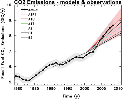
Figure 1: Observed global CO2 emissions from fossil fuel burning and cement production compared with IPCC emissions scenarios. The coloured area covers all scenarios used to project climate change by the IPCC (Copenhagen Diagnosis 2009).
Conservative Attribution of Global Warming to Humans
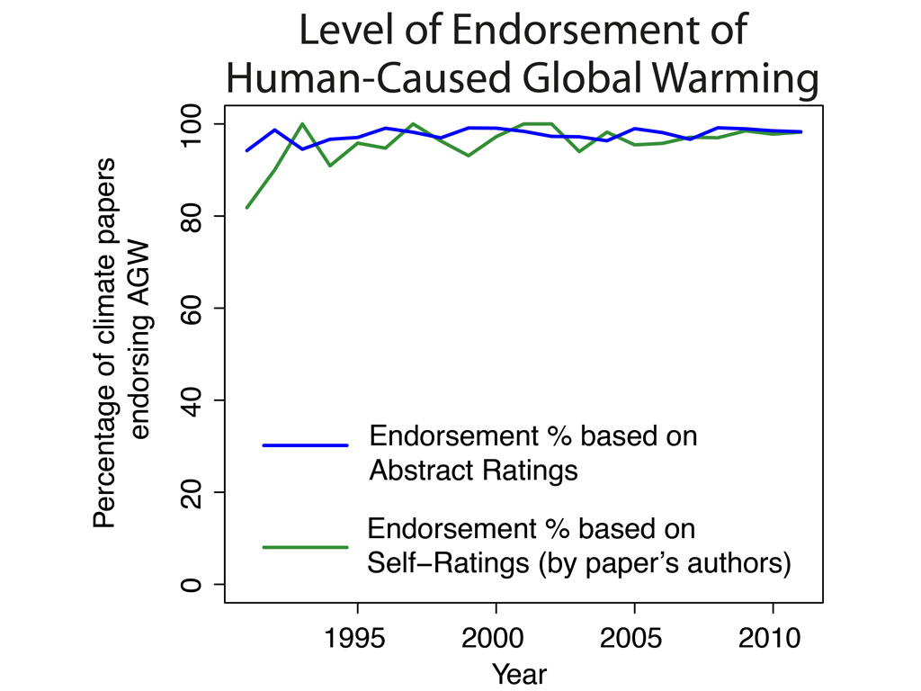
While the IPCC first made statements attributing global warming to humans in 1995, Cook et al. (2013) found that there has been over a 90% consensus in the peer-reviewed scientific literature that humans are causing global warming since at least 1991.
Figure 2: Percentage of papers endorsing the consensus among only papers that express a position endorsing or rejecting the consensus. From Cook et al. (2013).
Additionally, the 2007 IPCC report stated:
"Most of the observed increase in global average temperatures since the mid-20th century is very likely due to the observed increase in anthropogenic greenhouse gas concentrations"
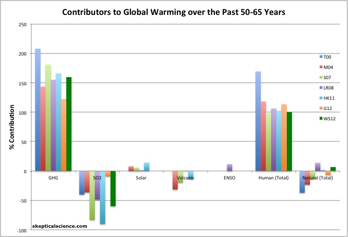
However, the body of scientific research has consistently shown that human greenhouse gas emissions are responsible for more warming than has been observed over the past half century (because aerosols and other non-greenhouse gas temperature influences have had a net cooling effect). Wigley and Santer (2012) found that this IPCC greenhouse gas warming attribution statemt is far too conservative.
"Here, the probability that the model-estimated GHG component of warming is greater than the entire observed trend (i.e., not just greater than ‘‘most’’ of the observed warming) is about 93%. Using IPCC terminology, therefore, it is very likely that GHG-induced warming is greater than the observed warming. Our conclusion is considerably stronger than the original IPCC statement."
In fact their central estimate is that humans are responsible for 100% of the observed global warming for the 1950–2005 timeframe, with greenhouse gases responsible for 160% (Figure 3).
Figure 3: Percent contributions of various effects to the observed global surface warming over the past 50-65 years according to Tett et al. 2000 (T00, dark blue), Meehl et al. 2004 (M04, red), Stone et al. 2007 (S07, green), Lean and Rind 2008 (LR08, purple), Huber and Knutti 2011 (HK11, light blue), Gillett et al. 2012 (G12, orange), and Wigley and Santer 2012 (WS12, dark green).
As Figure 3 shows, the body of scientific literature is still very consistent in finding that grenhouse gases have most likely caused more warming than has been observed over the past half century, and thus that the IPCC has been too conservative in this respect.
Conservative Sea Level Rise Projections
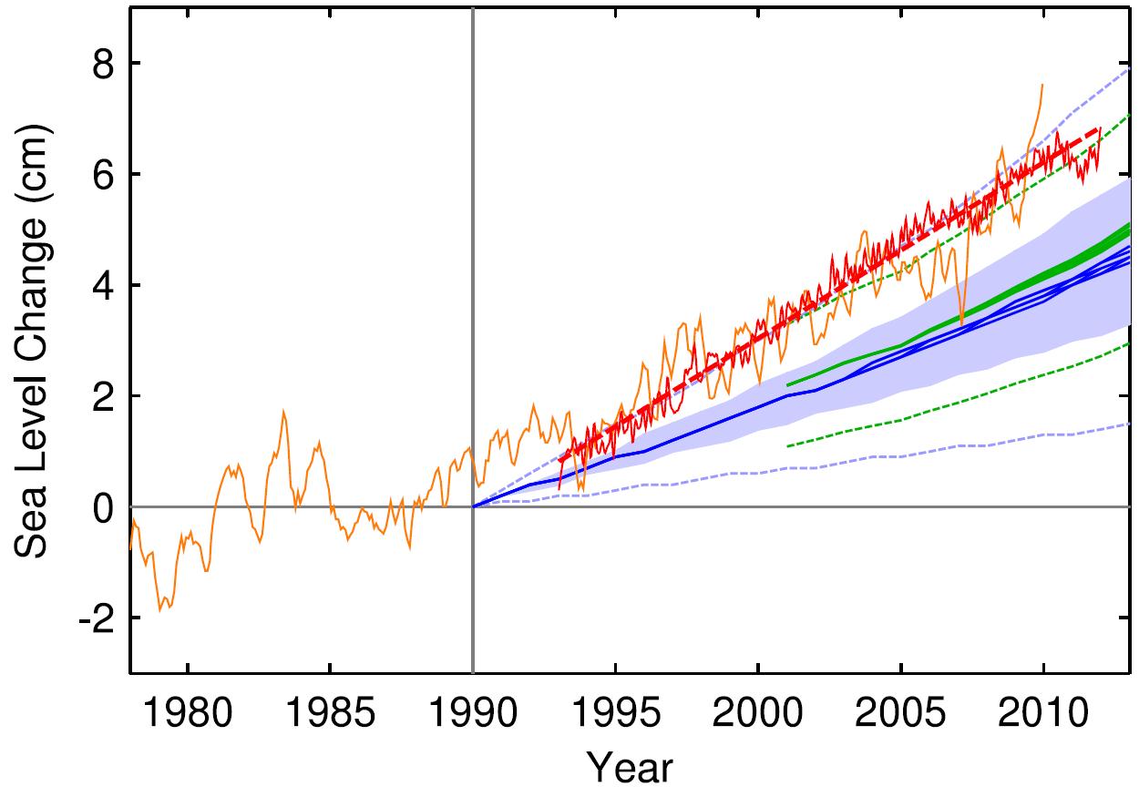
Satellite and tide-gauge measurements show that sea level rise is accelerating faster than expected. Rahmstorf, Foster, and Cazenave (2012) compares the historical sea level tide gauge data from Church and White (2011) and recent satellite altimetry sea level data (orange and red in Figure 4, respectively) to the 2001 and 2007 IPCC report model projections (blue and green in Figure 4, respectively). The observational data in Figure 4 are aligned so that extending the satellite best-fit line (red) back to 1990 will match the IPCC projections at that date, where the IPCC TAR model runs begin.
Figure 4: Sea level measured by satellite altimeter (red with linear trend line; AVISO data from (Centre National d’Etudes Spatiales) and reconstructed from tide gauges (orange, monthly data from Church and White (2011)). Tide gauge data were aligned to give the same mean during 1993–2010 as the altimeter data. The scenarios of the IPCC are again shown in blue (third assessment) and green (fourth assessment); the former have been published starting in the year 1990 and the latter from 2000.
The authors conclude as follows.
"The satellite-based linear trend 1993–2011 is 3.2 ± 0.5 mm yr-1, which is 60% faster than the best IPCC estimate of 2.0 mm yr-1 for the same interval"
The IPCC future sea level rise projections also appear to be too conservative, primarily because they do not account for dynamic ice melting processes.
Conservative Arctic Sea Ice Decline Projections
Summer-time melting of Arctic sea-ice has accelerated far beyond the expectations of climate models. The area of sea-ice melt during 2007-2009 was about 40% greater than the average prediction from IPCC AR4 climate models. The thickness of Arctic sea ice has also been on a steady decline over the last several decades. September sea ice thickness has been decreasing at a rate of 57 centimetres per decade since 1987.

Figure 5: Observed (red line) and modelled September Arctic sea ice extent in millions of square kilometres. Solid black line gives the average of 13 IPCC AR4 models while dashed black lines represent their range. The 2009 minimum has recently been calculated at 5.10 million km2, the third lowest year on record and still well below the IPCC worst case scenario (Copenhagen Diagnosis 2009).
Accurate Global Surface Warming Projections
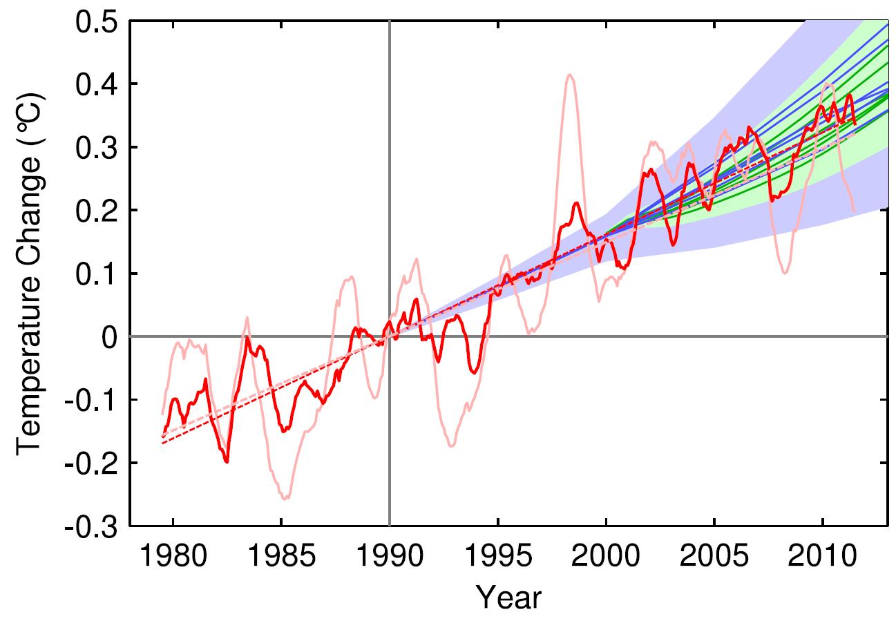
Rahmstorf, Foster, and Cazenave (2012) also found that the IPCC global surface temperature projections have been acccurate thus far. The paper applies the methodology of Foster and Rahmstorf (2011), using the statistical technique of multiple regression to filter out the influences of the El Niño Southern Oscillation (ENSO) and solar and volcanic activity from the global surface temperature data, finding that when these short-term influences are removed, the IPCC projections accurately match the observed human-caused global surface warming trend (Figure 6).
Figure 6: Observed annual global temperature, unadjusted (pink) and adjusted for short-term variations due to solar variability, volcanoes and ENSO (red) as in Foster and Rahmstorf (2011). 12-month running averages are shown as well as linear trend lines, and compared to the scenarios of the IPCC (blue range and lines from the 2001 report, green from the 2007 report). Projections are aligned in the graph so that they start (in 1990 and 2000, respectively) on the linear trend line of the (adjusted) observational data.
Asymmetric Challenges to Science
A recent study (Freudenburg 2010) investigated what it calls 'the Asymmetry of Scientific Challenge', the phenomenon in which reports on science fail to evaluate all outcomes, favoring certain probabilities while ignoring others. In the case of the IPCC, the researchers found that the media steadfastly challenge the predictions on the basis that they are exaggerated, worst-case scenarios. What they fail to speculate on is whether the opposite is true; that it may be equally correct to suggest that things might be far worse. This is how the researchers summarised their findings:
"...new scientific findings were more than twenty times as likely to support the ASC perspective [that disruption through AGW may be far worse than the IPCC has suggested] than the usual framing of the issue in the U.S. mass media. The findings indicate that...if reporters wish to discuss ‘‘both sides’’ of the climate issue, the scientifically legitimate ‘‘other side’’ is that, if anything, global climate disruption may prove to be significantly worse than has been suggested in scientific consensus estimates to date".
While their study specifically addressed the relationship between the maintream media (MSM) and climate science, the overall conclusion they reached suggests that criticisms of the kind elaborated here may be highly inappropriate:
"If the intention is to offer true balance in reporting, the scientifically credible ‘‘other side’’ is that, if the consensus estimates such as those from the IPCC are wrong, it is because the physical reality is significantly more ominous than has been widely recognized to date".
Brysse et al. (2012) suggests that the IPCC and climate scientists in general tend to be too conservative in their predictions because they are "erring on the side of least drama" (ESLD). However, they point out that an underprediction is just as wrong as an overprediction. Climate scientists may be introducing bias into their predictions for fear of being called "alarmist," but this conservative bias may leave us unprepared for the magnitude of future climate change.
Intermediate rebuttal written by dana1981
Update July 2015:
Here is a related lecture-video from Denial101x - Making Sense of Climate Science Denial
Additional video from the MOOC
Expert interview with K. Meissner
Last updated on 6 July 2015 by pattimer. View Archives


 Arguments




[DB] Hot-linked URL.