The climate change policy discussion I wish Andrew Neil would have on BBC
Posted on 23 July 2013 by dana1981
On the BBC program Sunday Politics, Andrew Neil hosted UK Energy and Climate Change Secretary Ed Davey for a discussion about climate science and policy. In the process, Neil made a variety of errors in discussing climate science that I subsequently detailed. Neil responded in turn on his blog, admitting one mistake but standing behind the rest of the errors, and making some new ones.
But before examining the scientific accuracy of Neil's latest comments, given that his show is a political one, let's first talk about climate policy. On that subject, Neil explained why he focused on the so-called 'pause' in global surface warming during his show:
"it is legitimate to ask if the government takes the pause seriously and if it has any implications for policy ie, if there is a pause in warming, is there a case for the government to pause or slowdown its expensive efforts to decarbonise the economy until the picture becomes clearer?"
That certainly is a legitimate question. In fact, it's a question that a number of climate scientists have answered.
The question is based on the fact that a few recent studies have concluded that the sensitivity of the Earth's climate to the increased greenhouse effect may be slightly less than previous best estimates, based on the recent slowed surface warming (for a basic primer on climate sensitivity, see my previous entry here). There are reasons to be skeptical of this conclusion, but it's certainly a possibility. If true, would that mean governments should pause or slow down their efforts to decarbonize the economy, as Neil asks?
The authors of these studies (e.g. Myles Allen, Piers Forster, and Alexander Otto) all seem to agree, the answer is no.
In short, if these studies are right, it might take us an extra decade or so to reach global warming levels considered unacceptably dangerous. If true, that would certainly be welcome news. The problem is that from a policy perspective today, these sorts of details don't matter.
In order to avoid what's internationally considered dangerous levels of global warming, we need to achieve tremendous levels of greenhouse gas emissions reductions. Developed nations like the UK and USA will need to reduce their emissions by about 80 percent by the year 2050 to give us a good shot to avoid committing the planet to 2°C average surface warming, and even that is considered too risky by many climate scientists.
So if these studies are right, maybe we have until 2060 rather than 2050 to reduce our greenhouse gas emissions by 80 percent. If we were on track to meet that target by 2050, it would be valid to ask whether we should slow down our efforts a bit, but we're not on track. In fact it's going to take everything we've got to get close – see here for a discussion of the level of effort it will take to meet these emissions targets.
We should certainly fashion a climate policy that will maximize the economic benefit associated with reducing greenhouse gas emissions, and what that policy should look like is a valid debate in which all who would like to participate are more than welcome. However, there is no question as to whether we can 'slow down' our efforts – we simply cannot afford to, even in the best-case scenario.
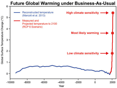
This graph shows that even at the lowest range of climate sensitivity, future global warming will take us well beyond any temperature experienced during civilized human history. The blue line represents reconstructed temperature. The red line represents measured and projected global surface temperature. The red dots show the projected warming in the year 2100 for three different climate sensitivities (high sensitivity 4.5°C, most likely sensitivity 3°C, low sensitivity 1.5°C).
Now, on to the science.
The "Pause"
Neil explained that he focused on the surface warming 'pause' because he was trying to challenge Davey to defend the government's climate policy in the face of this seemingly contradictory global warming evidence. The problem is that when Davey correctly pointed out that surface temperatures are only one small piece of overall global warming (about 2 percent), and melting ice and warming oceans must also be considered (over 90 percent of the overall heating of the planet), Neil remained focused exclusively on surface temperatures.
In science, and in informed policy making, you can't just ignore 98 percent of the evidence and focus on the 2 percent that seems to support the argument you're trying to make. Perhaps Neil was just doing his job "challenging" Davey, but in terms of a science and policy debate, Davey won the day by considering the full body of evidence.
The Faulty Temperature Graphic
In defending his use of an overly smoothed surface temperature graphic, Neil explained,
"The graph we presented illustrating the temperature plateau was not constructed by the Sunday Politics but taken from a website, produced by Phil Jones, a leading figure at the Climate Research Unit, University of East Anglia"
That is true - you can view the graphic in question here. Phil Jones should have explained on that page exactly what the black line represents, and that the smoothed data are not accurate after 2007 (or 2002, depending on whether it's a 10- or 20-year smoothing), as I explained in my last entry. Whoever is at fault, the temperature graph presented on BBC Sunday Politics was not accurate, and exaggerated the surface warming slowdown.
Frequent Plateaus
Neil responded to my point that there have been many similar 'plateaus' in the surface temperature record as follows.
"Mr Nuccitelli points out that temperatures have plateaued in the past, which is true. But since that was before, according to the IPCC, global warming became the dominant factor in temperature rises, it is not clear past plateaux [sic] are relevant to this debate"
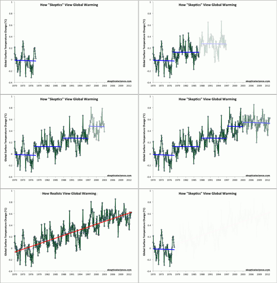
This is incorrect. As Neil notes, the IPCC says that greenhouse gases became the dominant factor in global temperature changes in the 1970s. My graphic begins in 1970 and shows four similar 'plateaus' since then, prior to the current one.
Average of NASA GISS, NOAA NCDC, and HadCRUT4 monthly global surface temperature anomalies from January 1970 through November 2012 (green) with linear trends applied to the timeframes Jan '70 - Oct '77, Apr '77 - Dec '86, Sep '87 - Nov '96, Jun '97 - Dec '02, and Nov '02 - Nov '12.
Ocean Warming
On the rapid warming of the oceans, Neil claimed,
"There is a huge debate in climate science over the relationship between global warming and ocean temperatures. As pointed out above some scientists (and Mr Nuccitelli) believe that global warming is causing the depths of the oceans to heat up and that one day this heat will be released.
This is widely contested and even, by some, dismissed. The data is short-lived and contentious"
The transfer of heat to the deep oceans has indeed accelerated over the past decade, but research indicates that this is a temporary change. I summarized the recent research on this subject here, and is also the conclusion in ongoing research by the Met Office, as their scientists discussed in a press briefing yesterday.
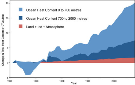
The ocean measurements quite clearly show that global warming continues at a rapid rate, equivalent to 4 Hiroshima atomic bomb detonations per second.
Global heat accumulation from Nuccitelli et al. (2012)
While ocean heating research is ongoing, the evidence points strongly in the direction that the oceans are absorbing more heat, contributing to the slowed surface warming, but that this is only a temporary effect.
Human-Caused Arctic Sea Ice Death Spiral
Neil also downplayed the human role in the rapid Arctic sea ice decline, which has seen a loss of three quarters of its ice mass over the past three decades.
"Others point out that satellite observations began in 1979 and caught a decline in Arctic ice already in progress. So the origin of the decline could be many decades ago, and might not have been started by man (though global warming could now be exacerbating a previous "natural" melting trend)."
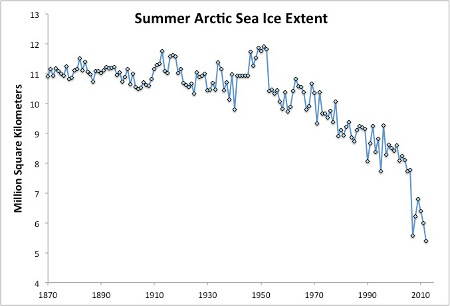
One of the most widely used long-term estimates of Arctic sea ice extent comes from the University of Illinois. A description of the vast array of measurements used to create this estimate is available here, and the data are plotted below. As you can see, the vast majority of the Arctic sea ice decline has happened since 1970.

Average July through September Arctic sea ice extent 1870–2008 from the University of Illinois and observational data from the National Snow and Ice Data Center for 2009–2012
I have also summarized the research about the causes of that decline, which shows that humans played a dominant role. For example, a 2012 study published in Environmental Research Letters estimated that only 5 to 30 percent of the Arctic sea ice decline from 1979 to 2010 could be attributed to natural cycles, and even more is human-caused if we extend the analysis as far back as the 1950s, because the influences of natural cycles tend to average out to zero over time.
The bottom line is that Arctic sea ice is declining exceptionally rapidly, and humans are the dominant cause.
Danish Meteorological Institute (DMI) Report
Neil cited a DMI report to argue otherwise.
"A new paper by the Danish Meteorological Institute (DMI) suggest that Greenland ice sheet melting is related to solar activity and "a considerable fraction of the current withdrawal could be a natural occurrence"."
First of all, this isn't a paper published in a peer-reviewed journal, it's a report issued by the DMI Ministry of Transport. Second, it's not new - it was published in 2005. However, for unknown reasons, some climate contrarian blogs recently decided to report on this study, which is undoubtedly why Neil thought this report was new. This reminds me of a comment I made in my previous article,
"If Neil relies on contrarian blogs for his climate information, that may explain why he is woefully misinformed on the subject."
The DMI report itself is simply based on correlations, and the comment about the current ice withdrawal highly speculative. I don't find it convincing for reasons discussed here and here, for those who are interested. In any case, if 5 to 30 percent of the current decline is considered "a considerable fraction," then it is consistent with the findings of Environmental Research Letters paper discussed above.
The 97 Percent Human-Caused Global Warming Consensus
Finally, Neil again discussed the paper I co-authored finding a 97 percent consensus in the peer-reviewed literature that humans are causing global warming. Neil backtracked from his previous (false) claim that our paper had been "substantially discredited" to now say it "is not uncontested." This is a rather meaningless statement - I would challenge Neil to find any scientific paper that is uncontested.
Neil cited recent congressional testimony by Roy Spencer (one of the few climate scientist "skeptics"), who said,
"Well, it turns out that the 97% consensus that they found, I am indeed part of ... What do all those people agree to? Well, they agree to something fairly innocuous and it's something most of us agree to. That humans must have some influence on climate."
This statement is wrong because it misses the nuance in our study. The "skeptic" papers included those that rejected human-caused global warming and those that minimized the human influence. Since we made all of our data available to the public, you can see our ratings of Spencer's abstracts here. Five of his papers were captured in our literature search; we categorized four as 'no opinion' on the cause of global warming, and one as implicitly minimizing the human influence.
Thus, contrary to his testimony, Spencer was not included in the 97 percent consensus. In fact his research was included in the fewer than 3 percent of papers that either rejected or minimized the human contribution to global warming.
Our survey also included categories for papers that quantified the human contribution to global warming. In the author self-ratings phase of our study, 237 papers fell into these categories. 96 percent of these said that humans are the primary cause of the observed global warming since 1950. The consensus on human-caused global warming is robust.


 Arguments


Regarding the graph of temperature paraded by Neil during the interview. I have superimposed Neil's graphic onto the section of the original CRU graph here.
Given the tiny size of the original, Neil's copy would not be that bad, except that the 2012 'axis' is displaced about a year, to 2013. This is because Neil's graph uses a finer line than CRU, a line which he extends to the very end of roundy termination of the thicker CRU line. The 2012 'axis' is then drawn in further away again, the point which then becomes the terminus of the temperature trace.
The lack of the annual values shown by CRU but deleted by Neil does make the graph suspect given its method of end smooting, and that is so even without the extention to 2013. And of course, it in no way supports anything like the 15 year "plateau" that Neil insists is there and that is the source of all his argument.
Can't the whole 'plateau' and 'mysterious ocean mechanisms' just be simply explained and put to bed for good by the fact that the ENSO has been mostly neutral or la nina since 1998 and that the temperatures are still rising on the same gradient for neutral an dla nina years, as shown perfectly in your graphic here on this site?
This one: http://skepticalscience.com/graphics.php?g=67
surely this just shows that the whole 'plateau' is an illusion, that is fully explained and well understood? is it not?
@jonthed The human eye is really good at detecting patterns in noise that don't exist. In this case the perception of a plateau may be simply an artefact of the 1998 El-Nino spike. If you blank out the spike, there is no longer much evidence of a plateau, just a steady increase at a fairly constant rate, with a bit of variability superimposed on top.
Shuckman seems to have some 'interesting' sources as well
(hat tip Semyorka on the Guardian thread)
Neil: "As pointed out above some scientists (and Mr Nuccitelli) believe that global warming is causing the depths of the oceans to heat up and that one day this heat will be released."
It seems important to clearly explain that the ocean heat will not be 'released' as such. What will happen is that the ocean is expected to stop 'helping' us by absorbing as much heat as it does now, which means that more heat will go into the atmosphere.
.. and then I guess it wouldn't even be very 'helpful' if the oceans would (unlikely) continue absorbing heat at this rate, as that would increase the speed of sea level rise. So if we could worry less about atmospheric warming, we should probably need to worry more about sea level rise.
Just an FYI for Dana. You have been 'honored' with an original "Josh" cartoon over at Bishop Hill' blog.
http://bishophill.squarespace.com/blog/2013/7/23/you-get-what-you-pay-for-josh-230.html
Hank.
I'm with Dikran on his comment about the futility of trying to see signals among noisy data. Something interesting to do, however, is plot the monthly sattelite data...but do so using roughly 13-year rolling averages. Such an averaging time would roughly smooth out solar cycles. If you do this, you'll see a nearly linear, upward trend. And, this occurs whether or not 1998 is included in the data.
Too many people will not have the time or depth of interest to follow the debunking of Andrew Neil's misrepresentation. In the spirit of the one-line responses here on Skeptical Science I suggest a link toi this excellent testimony by Dr Jennifer Francis.
An important point not highlighted by Dana, but critical in the policy arena, is the trajectory towards the necessary approx. 80% reduction of emissions (more if related to today's emissions) by 2050. The longer humanity dithers, the steeper the reductions will need to be, the stronger the adverse impacts on "traditional" economics. This was recently reiterated (aka it is old news) by Kevin Anderson here. It can be comprehended even by non-economists. Those who accept the science while defending current economic practises should probably be the strongest supporters of early and sweeping decarbonization efforts. And indeed, it looks to me that some, like the Germans, are trying hard. Maybe not hard enough considering the challenge, but harder than most ...
Andrew Neil blogs "The recent standstill in global temperatures is a puzzle. Experts do not know why it is occurring...". Most likely he's never heard about oceans or been to the seaside. Oceans are a double-edged sword. ~5,900 Zj for just 1 degree average rise is a huge buffer with ~8 Zj p.a. being added the last decade or so but once the heat is in the oceans it'll be tricky getting it out. ~10,000 Zj energy needed to melt all land ice off Antartica and Greenland. But the earlier potential effects such as frozen methyl hydrates release seems somewhat pressing. I haven't seen a climate science estimate of reasonably safe additional ocean heat.
Plus ca change. I saw Andrew Neil repeatedly asking the UK's Green Party Leader Caroline Lucas "Why has there been no statistically significant warming for 15 years?" on a programme called "Hardtalk" in 2010. I wrote to the BBC at the time pointing out that the audience was likely to have been severely misled by this question, that the warming over the previous 16 years reached a conventional threshold of statistical significance (p<0.05), and that over a short timescale natural causes of variability (ENSO, volcanoes, the solar cycle) tend to predominate, so the short answer is "15 years is too small a sample to demonstrate statistical significance." (I had no idea at the time how much the ocean is warming and how high a proportion of the warming goes into the ocean). 2010 proved to have the highest measured global surface temperatures ever according to some data sets, but alas, still the line of questioning persists. (Short term variability really is the gift that keeps on giving).
If Andrew Neil knew more about the science he might understand 1) how biased a perspective his chosen lines of questioning sometimes give on AGW, 2) that the IPCC's (AR4) suggested range for climate sensitivity is in line with the large body of evidence on the subject, and 2) how out on a limb scientists such as Judith Curry and Roy Spencer are from the mainstream evidence-based consensus.
This is why Skeptical Science is so important. To the uninitiated with no grasp of the vast weight of science behind the consensus on climate change, Curry and Spencer sound completely reasonable (although if you're aware of some of the science and actually bother to do a little digging you find the context of where they're coming from and IMHO their credibility is somewhat lost). Without websites like SKS, far more people would be taken in by the denial of dangerous AGW.
Prof Mike Hulme's comment about the 97% consenus paper and the Ed Dvaey / Andrew Neil interview has caught a few blogs attention. Perhaps it would be best discussed here:
“Ben PIile is spot on. The “97% consensus” article is poorly conceived, poorly designed and poorly executed.
It obscures the complexities of the climate issue and it is a sign of the desperately poor level of public and policy debate in this country that the energy minister should cite it.
It offers a similar depiction of the world into categories of ‘right’ and ‘wrong’ to that adopted in Anderegg et al.’s 2010 equally poor study in PNAS: dividing publishing climate scientists into ‘believers’ and ‘non-believers’.
It seems to me that these people are still living (or wishing to live) in the pre-2009 world of climate change discourse. Haven’t they noticed that public understanding of the climate issue has moved on?” - Mike Hulme
——————————–
from this article at Making Science Public - Nottingham University
http://blogs.nottingham.ac.uk/makingsciencepublic/2013/07/23/whats-behind-the-battle-of-received-wisdoms/
As Prof Mike Hulme (founding director of the Tyndall Centre for Climate Change) is not exactly a 'sceptic', the debate and issues raised should be of interest to all that are interested....
Interesting Barry, thanks.
Curiously, Dan Kahan, who is also referred to on the blog thread you refer to considers that the "97% consensus" paper is:
"an elegantly designed and executed empirical assessment".
Like Hulme, Kahan is opinionating. However it is interesting that a study can be described as both "elegantly designed and executed" and "poorly designed and ...executed" by individuals who seem not to like it very much to the point that they're exercised to make public prononcements on it!
Obviously the "97% consensus" paper doesn't "depict... the world into categories of ‘right’ and ‘wrong’" at all, and no doubt Prof Hulme, were he to publish something in a scientific forum on this topic would make a more considered judgement than his blog comment you reproduced.
In fact we would all probably agree that the "97% consensus" paper is a comprehensive assessment of the scientific literature on the scientific consensus relating to the role of anthropogenic greenhouse gas release in the marked global warming of the last ~ 50 years.
Hulme's comments (assuming you've faithfully transcribed these) on the Anderegg PNAS paper, are similarly odd since that paper doesn't "divide.. publishing climate scientists into ‘believers’ and ‘non-believers" either. It divides publishing climate scientists into those that are convinced or unconvinced by scientific evidence on anthropogenic climate change (and assesses the apparent relative scientific expertise of these according to their publishing history).
It's almost as if Prof. Hulme would like to wish away the essential element of scientific evidence from these assessments and portray the deceit that this is all about "beliefs"! Any idea why he would take such an approach Barry?