Satellite measurements of warming in the troposphere
What the science says...
| Select a level... |
 Basic
Basic
|
 Intermediate
|
 Advanced
| ||||
|
Satellite measurements do show warming in the Tropsphere when a cooling bias from the Stratosphere is removed. Warming trends agree well with surface temperatures and model predictions except near the Poles. Differences between various analyses are largely due to analysis techniques and compensations for satellite data issues. |
|||||||
Climate Myth...
Satellites show no warming in the troposphere
"Satellite measurements indicate an absence of significant global warming since 1979, the very period that human carbon dioxide emissions have been increasing rapidly. The satellite data signal not only the absence of substantial human-induced warming but also provide an empirical test of the greenhouse hypothesis - a test that the hypothesis fails." (Bob Carter)
The History of Tropospheric Temperature Measurement by Satellite
NASA has been building and launching the Tiros series (Television Infrared Observation Satellite) weather satellites since 1961. The satellites’ design has evolved over time. And after launch they are often operated by other agencies. The ones used for Tropospheric temperature measurement are operated by NOAA (National Oceanographic and Atmospheric Administration) beginning with Tiros N in Oct 1978 then NOAA 6 in June 1979 through to NOAA 19 Feb 2009. These satellites are designed principally as Weather Satellites; their use in Climatology is a secondary role. Also used in temperature measurement is the NASA AQUA satellite launched in May 2002 as a research Satellite, part of the NASA A-Train.
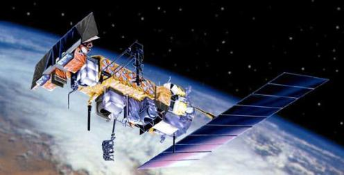
A general overview of the spacecraft and their equipment and roles can be found here
What the satellites do
These satellites have Microwave Sounding Units (MSU) that read the Brightness Temperature of microwave signals from below in 4 separate frequencies radiated by Oxygen molecules. These frequencies tend to originate at different altitudes in the air column below the satellite and reflect the temperature at that altitude. I say tend because this isn’t exactly true and will matter later in the discussion. Using microwave signals associated with Oxygen has the advantage that microwaves are not substantially blocked by the atmosphere and Oxygen is evenly distributed throughout the atmosphere so its concentration only varies by negligible amounts. So the temperature signal from Oxygen is easy to detect, and isn’t going to be distorted by concentration changes.
As the satellite orbits the Earth the MSU continually scans a swathe below the spacecraft, at nadir (looking straight down) and to the limits of the instrument on each side. Also on each scan the MSU calibrates its readings by taking readings from 2 other sources – cold deep-space, and an on-board, instrumented, hot reference source.
The satellites are Polar Orbiting & Sun Synchronous. Each makes around 14 orbits a day. Their orbit takes them nearly over the poles and the plane of the orbit lines up with the Sun. This is important because it ensures that each point on the Earth is always measured at the same time of day – Solar noon and Solar midnight.
On satellites up to NOAA-14, MSU’s were used. On later satellites, including AQUA, Advanced Microwave Sounding Units (AMSU) were fitted. These are more advanced designs that scan in more detail and over more frequencies, but the basics of how they work are the same. In this discussion I will refer mainly to MSU’s. The same concepts apply to the AMSU’s.
Some Science
This paper Grody 1983 (section 2) contains a discussion of the science of Microwave Sounding, and in particular the existence of Weighting Functions derived from solving the Radiative Transfer Equation. “…the temperature weighting function…defines the contribution of temperature at different altitudes to the brightness temperature.”. These functions are produced by summing the contribution at each frequency of microwave emissions from multiple levels in the atmosphere, taking into account the radiating behaviour of the atmosphere, pressure, temperature, path length etc. 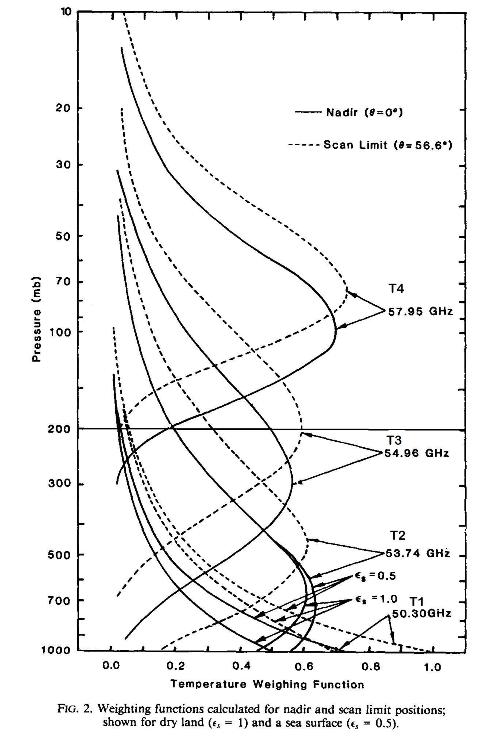
Here, as is common with atmospheric measurements, altitudes are given as pressures rather than kilometres. The dotted lines are the weighting functions for the extreme side parts of the scans while the solid lines are for the nadir view. The fact that the weighting functions at different frequencies have very different profiles wrt altitude is what allows us to measure temperatures at these different altitudes. Each frequency obtains most of its signal from a band of altitude. This altitude behaviour adds a major complication to measurement however; More on this later…
The signal received by the MSU in its target frequency is made up of three components: Signals from the atmosphere radiated up to the satellite, signals from the atmosphere radiated down and reflected off the Earth’s surface, and signals emitted by the Earth itself.
The 4 frequencies are designated MSU Channels 1 (50.30 GHz), 2 (53.74 GHz), 3 (54.96 GHz), and 4 (57.95 GHz). Because the peak of the weighting function for Channel 1 is so close to the surface, this has a rather high component being emitted from the surface and is not very useful for Tropospheric temperature measurement because of this surface ‘contamination’. For the other channels, the surface component is much smaller but still needs to be allowed for. And this differs over land and sea.
Some Nomenclature
A range of terms are used in the following discussion so I will summarise their meaning here:
Terminology |
Meaning |
| T1, MSU Channel 1 | Real channel peaking near ground level. Seldom used |
|
T2, MSU Channel 2, TMT |
Real channel peaking in mid to lower Troposphere. Stratospheric bias not removed |
| T3 MSU Channel 3, TTS, TUT | Real channel peaking in mid to upper Troposphere. Stratospheric bias not removed |
|
T4, MSU Channel 4, TLS |
Real channel peaking in lower Stratosphere. |
| TLT | Synthetic channel derived from T2, peaking in lower Troposphere, Stratospheric bias is removed |
Who Analyses the data
Data from the various instruments onboard the NOAA satellites are distributed to a wide range of organisations for various purposes. For Climatological temperature measurement the two main groups performing this regular analysis of the data from the MSU’s and providing temperature products are at the University of Alabama, Huntsville (UAH) & at Remote Sensing Systems in California (RSS). A number of other research groups have also done analyses of the data, but to investigate the methodology, not to produce regular temperature series products. To produce a long term temperature series from the satellite data these groups need to address a number of issues:
Satellite Problems:
NOAA-B, 1980 failed to achieve orbit. NOAA-13 had a catastrophic power failure 2 weeks after launch. NOAA-9 only had a relatively short overlap (3 months) with its follow-on satellite NOAA-10. Questions have been raised about the calibration of NOAA-16.
Overlap between satellites.
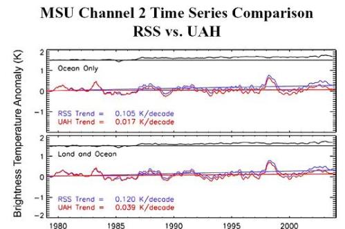
Each satellite has slightly different calibrations, orbits etc. To get a long term temperature series, you need to ‘splice’ together the data from various satellites, launched and de-activated at different times. You need enough overlap between the operating lives of each satellite to compare their results to establish a common baseline. Many of the satellites have had quite long lives so another factor is degradation of the equipment and ‘drift’ in their calibrations. There is then the question of whether to use a new satellite’s data with its overlap issues or continue using an older satellite with its ageing issues. Some commentators have suggested that a major part of the discrepancy between the UAH & RSS products is due to the different methods they have used to handle the limited overlap of NOAA-9 & NOAA-10, perhaps as high as 65% of the difference. The following graph shows the difference between UAH & RSS temperature series for channel T2. The divergence is noticeable from around 1987 when NOAA-9 & NOAA-10 had their limited overlap period. The upper line on each graph is the difference between RSS & UAH. These graphs only go to 2004.
Switching from MSU to AMSU:
Since the AMSU has a different number of channels at slightly different frequencies, this makes ‘splicing’ their data to that of the older MSU’s more complex.
Orbital Decay:
The NOAA satellites do not have propulsion systems to correct for decay in their orbit due to friction from the very top of the atmosphere. So their altitude slowly drops over time. This has an effect on the readings; in much the same way as changing the scan angle alters the weighting function. This must be compensated for. Orbital decay is not always even. Changes in solar activity cause the Earths atmosphere to bulge & contract, changing the decay rates. However, the AQUA satellite does have propulsion so does not suffer as much from these problems.
Instrument Body Effect:
This is the problem of the satellite experiencing varying heating and cooling as it travels around its orbit. The hot target is meant to be fixed to a single temperature but actually they experience some change over the life of the satellite. Also the body of the MSU warms and cools and this can affect the readings it takes. Some of this IBE can be adjusted for after launch by analyses that compare between satellites. Also, over long periods these variations will tend to average out. But not all errors can be removed.
Diurnal Drift:
Earlier I mentioned that the satellites are in Sun Synchronous orbits and are meant to stay aligned with the Sun so that they always cross the equator at the same time – the Local Equator Crossing Time (LECT). If they don’t then the normal daily temperature cycles below (the Diurnal cycle) will start to add a false bias to the data. To stay Sun Synchronous the satellite’s orbit has a small precession, just less than one degree per day. However, this precession isn’t perfectly accurate and small drifts in this can introduce a ‘diurnal drift’ for each satellite, slowly changing it’s LECT. Drifts of up to 0.5 hr/year have been observed. So a Diurnal Drift correction is needed for each satellite. The two groups – UAH & RSS have used different methods to achieve this.
UAH use data from view angles to left & right of nadir at fixed times in the orbit to look at different times of day below. This data allows a calculation that can remove the effect of the drift rate. The approach is simple but the calculations can magnify the effects of other uncertainties.
RSS take the approach of using a high resolution climate model to simulate the expected daily variations beneath the satellite and use this to remove the diurnal drift. The modelled simulation is validated against the actual daily temperature ranges observed by the satellite. This method uses a simulation but has much less sampling noise compared to the UAH method.
And as the following graph shows, the net effect is that the UAH method has added a cooling bias over time while RSS’s adds a warming bias to the raw temperature data.
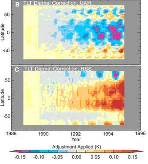
Figure 2: Diurnal drift corrections by UAH and RSS. UAH corrections add an overall cooling effect. RSS corrections added an overall warming effect. Both teams show strongest corrections in the tropics but in opposite directions.
Sea Ice & Summer Melt Pools
A complicating factor in the Polar Regions is surface emissions from ice. These make up the normal surface emissions that have to be allowed for in calculating temperature but with the large seasonal variations in sea ice extent, no single surface factor for these regions can be used. Similarly the appearance of melt pools on the ice in summer confuses the picture since these emit like water not ice. For this reason the temperature products don’t go all the way to the poles.
Stratospheric Biasing: Why T2 isn’t what it seems.
Twice I have mentioned that the way the microwave signal is generated at different altitudes in the atmosphere is important. Go back and look at the first figure, of weighting functions. The horizontal line at 200 mbar marks the approximate starting height of the Stratosphere. (this actually varies from 1l km near the pole to 17 km at the equator). Look at how much of each curve is above this line. And recall that one of the major effects of AGW is a cooling of the Stratosphere. So Stratospheric cooling adds a cooling bias to the microwave signals. The signal the satellite measures underestimates the Tropospheric temperature. This is most an issue with channels T2 & T3. For T2, around 15% of the signal originates in the Stratosphere and since the Stratosphere has cooled much more than the Troposphere has warmed the effect of this is more than15% of the reading. T3 is split almost 50/50 between the 2 layers. T4 on the other hand gets most of its signal from the Stratosphere with very little from the Troposphere. As a result T2 & T3 significantly underestimate the warming that has occurred in their nominal altitude band. Without some form of correction, they are almost useless.
T2 vs. TLT
The problems with Stratospheric cool biasing were recognised early and in 1992, Spencer & Christy at UAH introduced a new temperature product to remove the Stratospheric bias and focus more on the lower Troposphere. This removed most of the bias by mathematically combining readings from multiple view angles on the same scan to produce a reading weighted more strongly to the lower Troposphere. This was originally called MSU2LT and later with the addition of AMSU readings MSUTLT. This method produces the lower Troposphere weighting expected but is vulnerable to significantly increased sampling errors – essentially taking the difference between two samples will magnify the sample errors. Also, by looking at an East/West swathe, they are sensitive to temperature variations across the swathe. They are also more sensitive to direct surface emissions since they are magnifying the lower level signal.
However, this approach was a significant advance in reading lower Tropospheric temperatures. In 2005 RSS also introduced a TLT product using the same nadir/side scan approach and in this work they introduced the different Diurnal Drift compensation described above.
Fu et al 2004, 2005
In 2004/2005 Qiang Fu, Celeste Johanson et al published an alternative method for removing the Stratospheric bias from the T2 signal. Since the T4 channel is predominantly Stratospheric in origin they removed a proportion of the T4 signal from the T2 signal to remove the Stratospheric bias. In order to determine how much to remove, they used radiosonde data to establish a vertical temperature profile for the atmosphere. Then they determine by a least squares regression technique the appropriate weight to give to T2 & T4. They performed this on global, hemispheric and tropical zones on both the UAH & RSS data, to calculate a temperature series for each between 850 & 300 hPa, producing the following trend values: 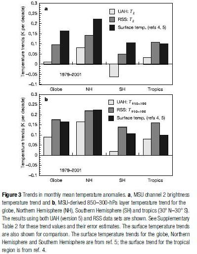
Note that these values were produced in 2004, before RSS had added their Diurnal Drift compensation. And the following shows the modified weighting function from Fu et al: 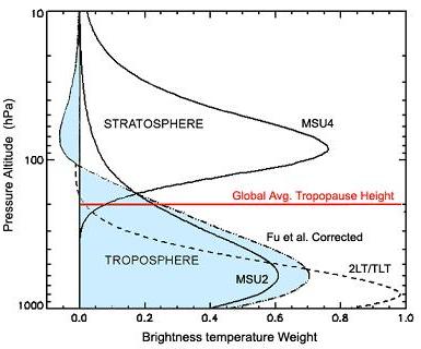
Their weighting function has a broader weighting over the entire Troposphere than the TLT products so is likely to be more representative of the overall Troposphere. NOAA maintains a comparison temperature record for UAH, RSS & the Fu et al adjustments to them here.
The technique of Fu et al has limitations. It depends on an independent source for the vertical temperature profile it uses – the Radiosonde record. This record suffers from limited geographic coverage and has its own issues with data quality. Also the profile may alter over time. And since it uses profiles averaged over large regions, it is not useful for estimating regional trends other than very approximately. However it provides an important validation of the broad results from the TLT products.
In further work here Fu et al used a similar technique to their 2004 study but instead of using radiosonde data they performed a correlation directly between T2 and T4 directly to produce a mid Troposphere result TTT and between T2 and the less frequently used T3 channel to produce a lower Troposphere series TTLT, removing the Stratospheric bias from both and showing results for the tropics. The resulting trends are: 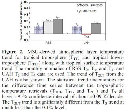
The data for this only covers 1987 to 2003 since the T3 Channels on earlier satellites were unreliable prior to 1987. They also critique the UAH data, suggesting that their results are un-physical. However, since their data only goes to 2003, it does not include more recent corrections by UAH.
Vinnikov & Grody
In 2005 Vinnikov & Grody et al published another analysis of MSU data trends. Based on their previous work, it used a quite different, frequency & statistically based method to determine the underlying trends for the MSU measurements. They also consider additional issues related to calibration errors. Instead of assuming that there is a linear calibration error associated with the hot target calibration, they allow for this calibration varying over the satellites orbit due to external factors. They show that they can calculate this effect based just on latitude/longitude variation of the reading without needing to look at any time dependency.
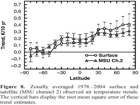
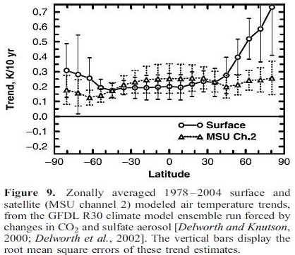
In their earlier work they had put a figure on trends of 0.22 to 0.26 C/Decade. In this work they are estimating 0.20 C/Decade. The following graphs show measured Surface, and their calculated TMT trends vs. latitude, and the same values calculated by climate models. The key discrepancies are at the poles with the modelled Northern Surface temps being much higher than measured Northern Surface temps, but modelled and measured Northern Troposphere values agreeing well. Surface temperature products don’t cover the Northern polar region or extrapolate from lower latitude measurements. Southern polar values also disagree but this is commonly ascribed to the effects of the Ozone hole which climate models do not include yet. There is significant agreement at mid and tropical latitudes.
Zou et al
In 2010 Zou et al published a new analysis method to produce low level MSU data for T2. This deals with removing many of the other calibration and inter-satellite correlation issues. Their method uses Synchronous Nadir Overpasses – points in time where two satellites are able to observe the same point below. This happens more commonly at high latitudes. Using this they are able to evaluate most of the onboard inter-satellite calibration issues since the satellites are receiving the same signal from below. The main outstanding areas that their analysis does not address are Diurnal Drift and Stratospheric cooling bias. They are not really trying to do this, instead producing a lower level data set to which others could apply further work. Their results are shown below. The data from their analysis can be obtained here.
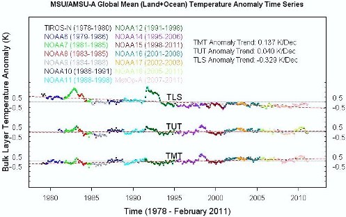
Monthly anomaly time series and trends for the global mean TMT, TUT and TLS, where TMT,TUT, and TLS represent deep-layer temperatures at mid-Troposphere, upper-Troposphere, and lower-Stratosphere.
So who is right?
So which teams analysis method is correct? Throughout the history of Tropospheric temperature measurement, the UAH analysis has always been lower than RSS for all temperature products. However, as time has gone by they have been drawing closer together. Currently their TLT trends are RSS 0.147 °C/decade and UAH 0.138 °C/decade which are down from earlier trends due to the slow down in warming in recent years. The convergence of their results may be due to the diminishing impact of the overlap problems between NOAA-9/NOAA-10. By comparison, the Fu et al method applied to RSS TMT & UAH TMT give RSS/FU 0.153 °C/decade , UAH/FU 0.112 °C/decade. Vinnikov & Grody have given around 0.20 °C/decade while Zou et al give 0.137 °C/decade; both without Stratospheric bias adjustment.
Which of the techniques of UAH or RSS are correct? Both have weaknesses – UAH use comparisons between different view angles from one scan in two different parts of their analysis, magnifying the sensitivity to errors. RSS use a short term climate model rather than just data. Commentators seem to prefer the RSS analysis. Neither applies the lat/long dependent analysis of hot source calibration used by V&G so this could well increase their trends somewhat. And applying the Fu et al technique to V&G or Zou may give more divergent results again.
Perhaps what can be said is that the UAH/RSS approach probably straddles the result their methods would find. Other methods suggest higher values. So a reasonable estimate at this point is that warming lies somewhere between the mid estimate of UAH/RSS and the figures that would be produced by V&G & Zou if Stratospheric cool biasing were removed. This suggests a long term trend of around 0.15 to 0.18 °C/decade for the lower Troposphere, much in line with the surface trends. And similar or higher for the mid-Troposphere based on the fact that Fu et al is looking at the entire Troposphere and V&G are showing higher Tropospheric than surface warming through the mid and tropical latitudes.
So these various analyses clearly show that the Troposphere IS warming, as determined from multiple sources. And if anyone quotes satellite temperature data to make a point with you, make sure you ask them which series they are referring to. If they simply say ‘the satellite data from UAH’, they may not know what they are talking about.
Further reading:
The IPCC had this to say about the satellite record (section 3.4.1.2).
And Scott Church tells you even more than that up to 2005.
Addendum
This post also has relevance to the ‘There's no Tropospheric hot spot’ argument. Look at some of the graphs above. Fu et al 2004 and 2005 showed greater warming in the Troposphere than the surface for the Tropics & Southern Hemisphere for their adjustments to the RSS data. And Vinnikov & Grody also show greater warming in the Troposphere compared to surface records and also in agreement with models in the Tropics & Southern Hemisphere. Whereas the analyses by UAH, RSS & Zou are not able to show reliably what has happened in the mid & upper Troposphere
Last updated on 24 March 2011 by Glenn Tamblyn.


 Arguments


[DB] Please, no All-Caps.
[JH]CCSP = US Climate Change Science Program.Roy Spencer's latest claim that the tropospheric temperature proves the models wrong, has been aptly shot full of holes by Glenn Tamblyn and others. For example, Spencer compared temperature observations from only the tropics, to model results between 20 and 20 latitudes. Spencer compared model results for the surface, to observations of the "middle troposphere." Spencer's observations of the "middle troposphere" actually are 1/4 from the stratosphere, which of course cools as a consequence of increased greenhouse gases.
The question WHY the trend line was from 1982 to ~2009 intrigues me because it is said that climatology deals in 30 year intervals or more. So 1979 to 2009 would be a "better" line. But it looks like the chart would show nearly the same result.