Climate Science Glossary

Term Lookup

Enter a term in the search box to find its definition.

Settings

Use the controls in the far right panel to increase or decrease the number of terms automatically displayed (or to completely turn that feature off).

Term Lookup

Settings


All IPCC definitions taken from Climate Change 2007: The Physical Science Basis. Working Group I Contribution to the Fourth Assessment Report of the Intergovernmental Panel on Climate Change, Annex I, Glossary, pp. 941-954. Cambridge University Press.

Home Arguments Software Resources Comments The Consensus Project Translations About Support

Bluesky Facebook LinkedIn Mastodon MeWe

Twitter YouTube RSS Posts RSS Comments Email Subscribe


Climate's changed before
It's the sun
It's not bad
There is no consensus
It's cooling
Models are unreliable
Temp record is unreliable
Animals and plants can adapt
It hasn't warmed since 1998
Antarctica is gaining ice
View All Arguments...


Username
Password
New? Register here
Forgot your password?

Latest Posts

Archives

What has global warming done since 1998?

What the science says...

Select a level... Basic Intermediate

Every part of the Earth's climate system has continued warming since 1998, with the ten record temperature years all occurring since 2010.

Climate Myth...

It hasn't warmed since 1998

For the years 1998-2005, temperature did not increase. This period coincides with society's continued pumping of more CO2 into the atmosphere. (Bob Carter)

At a glance

This date-specific talking-point is now something of a historical curiosity, but we'll leave it in the database for now because it's such a good illustration of the simplistic yet reckless mindset of the serial climate change misinformer. And indeed, we could (out of sheer mischief) have revised this myth by replacing "1998" with "2016". In fact, that's what we started to see in the climate change misinformation stream, © the Usual Suspects. But 2023's record temperatures put a stop to that.

Anyway, as first predicted over a century ago, Earth's surface, oceans and atmosphere are all heating up. That's due to our increasing greenhouse gas emissions, but over the years the warming has occurred at varying rates. This should in no way come as a surprise. Other physical phenomena periodically act either to suppress or enhance temperatures.

A prime example of such a phenomenon is the effects of La Nina and El Nino. This natural climatic oscillation features variations in winds and sea surface temperatures over the tropical eastern Pacific Ocean. The cycle can at times strongly influence temperature and rainfall patterns right around the world.

In a La Nina year, temperatures are suppressed, whereas an El Nino year sees them enhanced. This is noise on the long-term upward trend. That's why climatologists work with multiple decades, not just a few years in isolation, in order to get a grasp on what is going on.

The year 1998 featured a massive El Nino. The temperature spike it caused was a huge outlier, like a pinnacle towering over the landscape of the temperature record. In the following years there was a return to more typical conditions, with an erratic but upward warming pattern. That sequence of events gave deniers a brief opportunity to insist that global warming had “paused” or had even stopped.

You only need to remember one thing here. Those who create and spread misinformation about climate change don't care about reality. Public confusion is their aim. In this instance, the misinformation exercise involved deliberately selecting a limited block of years starting with the massive El Nino of 1998 and using that very warm starting-point to insist that global warming had stopped. They knew this would likely work for a few years and that the public would quickly forget why that was the case. Mother Nature had handed them a gift. It was an irresistible bunch of low-hanging fruit to exploit: little wonder the tactic is known as 'cherry-picking'.

Talking about reality, what actually happened? Well, as of 2024, a couple of decades down the line, the top ten warmest years have all been since 2010, whatever observation-based dataset you choose, with eight of them being in the 2015-2023 period. 1998 is nowhere to be seen any more. By modern standards, it simply wasn't warm enough.

Please use this form to provide feedback about this new "At a glance" section, which was updated on May 27, 2023 to improve its readability. Read a more technical version below or dig deeper via the tabs above!


Further details

Even if we ignore long term trends (something deniers often do in order to make a point) and just look at the record-breakers, as of early 2024 the top ten warmest years have all been since 2010, whatever dataset you choose, with eight of them being in the 2015-2023 period. In this top ten grouping, 1998 is nowhere to be seen any more. It was not warm enough.

The myth of no warming since 1998 was largely based on the satellite record estimates of the temperature of the atmosphere.  However, as discussed in the video below by Peter Sinclair, even that argument is no longer accurate.  The satellites show warming since 1998 too.

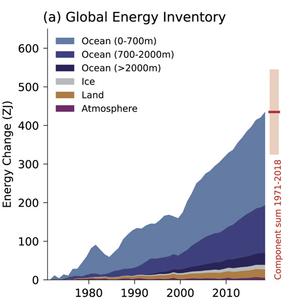
There's also a tendency for some people just to concentrate on atmospheric or surface air temperatures when there are other, more useful, indicators that can give us a better idea how rapidly the world is warming. More than 90% of global warming heat goes into warming the oceans, while less than 3% goes into increasing the atmospheric and surface air temperature.  Records show that the Earth has been warming at a steady rate before and since 1998 and there is no sign of it slowing any time soon (Figure 1). 

Fig 1

Figure 1:  Global Energy Inventory: observed changes in the global energy inventory for 1971–2018 (shaded time series) with component contributions as indicated in the figure legend. Cross-Chapter Box 9.1 Figure 1 (part a) - From IPCC AR6 WGI Chapter 9.

Even if we focus exclusively on global surface temperatures, Cowtan & Way (2013) shows that when we account for temperatures across the entire globe (including the Arctic, which is the part of the planet warming fastest), the global surface warming trend for 1997–2015 is approximately 0.14°C per decade.

Ultimately, every part of the Earth's climate system is warming, and has continued warming since 1998.

Last updated on 8 March 2024 by John Mason. View Archives

Printable Version  |  Offline PDF Version  |  Link to this page

Argument Feedback

Please use this form to let us know about suggested updates to this rebuttal.

Further reading

Tamino further explores the warming trend since 1998 in Garbage is Forever and Wiggles.

I've kept my original treatment of the subject as other websites hotlink to the images. My original treatment uses similar arguments to Fawcett and Jones 2008 although their analysis is much more rigorous (as you'd expect in a peer-reviewed paper).

Further viewing

Fact brief

Click the thumbnail for the concise fact brief version created in collaboration with Gigafact:

fact brief

Comments

Prev  1  2  3  4  5  6  7  8  9  10  11  12  13  14  15  16  17  Next

Comments 151 to 175 out of 415:

  1. CBDunkerson: exactly...there are claims...that is why I asked if anyone has the original paper.
  2. CBDunkerson Yes, I agree that these are only claims by a newspaper about a report. Believe me, I know that newspapers are not always truthful. Aren't you a bit quick to resort to an accusation of lying? Lets see if anyone has the original paper first. I will state that it is a bit odd that the newspaper doesn't supply a link to the original paper or press release.
  3. SirNubwub You are making a common error in interpretiing a statistical statement. "no [statistically] significant warming in the last 15 years" does not mean that "that temps have remained level for the last 15 years". If a trend is not statistically significant, this means that there isn't enough evidence to be able to confidently reject the possibility that the actual trend is flat. However, evidence requires data and if the timespan over which you estimate the trend is sufficiently short, the test for statistical significance will fail to reject this "null hypothesis" even when it is incorrect. Essentially if the trend is not significant, then there are two explanations (i) the trend actually is flat or (ii) there isn't enough data. This is why climatologists use 30 year trends, as these are long enough for the test to be statistcally meaningful. I suspect the paper is referring to a BBC interview with Prof. Phil Jones, where he agreed that the 15 year trend was not statisticlly significant (I think that is no longer true), and also had a go at explaining why this is not surprising.
  4. SirNubwub, there are claims by the Daily Mail. They are based on the press release by the Met Office which shows no increase in temperature on HadCRU figures over the period 1997-2011, but the press release also shows GISTEMP, GHCN, and WMO figures which all show an increase over that period. Ergo, the Daily Mail, by choosing just one of four data sets that suites their narrative are cherry picking. What is worse, it is known that HadCRUT is about to be updated by including more station data, thus reducing some of their gaps in coverage. In the updated HadCRUT, 2005 and 2010 are both warmer than 1998, and there is a distinct positive trend over the period 1997-2011. In other words, not only have the Daily Mail cherry picked, they have cherry picked a data set which is known to be inaccurate compared to the others, and which is about to be supplanted. I discussed this in more detail here. As the moderator indicates @149, the Daily Mail's intellectual integrity as shown by that article cannot be accurately described on SkS due to the comments policy.
  5. P.S. I could only bring myself to read the first few paragraphs of the newspaper report, but they were enough to show that the problem is that Mr Rose is not competent to be writing articles on this topic, and would benefit from reading a few SkS articles.
  6. SirNubwub, actually that is rather the point. There isn't any 'original paper/press release'. The Daily Mail took the latest updates of the CRU temperature data and NASA solar readings as 'foundation', but all the 'conclusions' they draw came from other sources entirely. DB, the only way to provide "definitive proof" for my position (i.e. that no such statements from CRU/NASA exist) would be to review all statements from those organizations. However, given that we have seen the 'no warming since XYZ' and 'it is the Sun' nonsense over and over and over and over again it doesn't really seem like a stretch to say, 'no, that tripe did not come from NASA or the CRU' without extensive documentation of all NASA/CRU statements. In truth, if you read very carefully, The Daily Mail does an adequate job of differentiating between the data from CRU and NASA and the 'conclusions' deniers outside those organizations draw from them.... except for the claim in the article title that, "if NASA scientists are right the Thames will be freezing over again". NASA didn't say anything about the Thames... that's all Rose. Also, SirNubwub's statement that, "NASA and CRU have stated that there has been no significant warming in the last 15 years", demonstrates how easy it is to miss the transitions in Rose's article from things said by NASA and CRU sources and those said by deniers.
  7. Dikran Marsupial @153, in this case it is no warming. The 1997 and 2011 figures are identical in the press release, and 2011 is actually colder than 1997 in the actual data. More importantly the HadCRUT3v trend from 1997 to 2011 inclusive is 0.01 degrees C per decade. Of course, as shown by Foster and Rahmstorf, once short term independent factors such as volcanoes, the El Nino Southern Oscillation and the Solar Cycle are accounted for, the HadCRU trend from 1997 is > 0.1 C per decade, and is statistically indistinguishable from the long term trend of 0.17 C per decade:
  8. Tom, I wouldn't use the temperature of the start and end point as a reliable indicator of the trend. An OLS trend can show warming even when the start point is warmer than the end point, because individual years are sensitive to ENSO etc.
  9. Dikran, the nature of David Rose's opus is clearly revealed by the fact that he found the time to interview 5 AGW deniers, but not one mainstream climate scientist. Nor did he find the time to interview any of the authors of paper on which he supposedly based his article, and which his article directly contradicts. That is not journalism, except in that very broad sense in which Pravda practiced journalism, and Madison Avenue is the center of Journalism in the USA.
  10. Yes, it does show a certain bias in that direction!
  11. Albatross's comment here is also relevant.
  12. Tom Curtis: Thank you for your reply. I have not seen the press release. Do you have a link to it? I suspected that something like this would be the answer. If it is the case that the newspaper cherry-picked one data set, I would be satisfied with your answer. But do you have a link? I would love to show it to my school classes as an example of bad journalism.
  13. Hi SirNub, The Met Office's reply can be found here.
  14. With regard to press releases, etc., this is the original Met Office Press Release (supposedly sneaked out, according to Rose of the Mail), about the paper in question (which was also sneakily referred to here by the Met. The abstract of the paper itself is available here. No doubt Rose would reckon that was sneakily published too. The Met Office's correction to the Mail is available here. Shame not too many Mail readers will get to see it, though...
  15. OK...I found a response from the Met office. They say its lousy journalism. http://metofficenews.wordpress.com/2012/01/29/met-office-in-the-media-29-january-2012/ I will be moving on now to other things in life.
  16. SirNubWub @162, if you are going to show they article as an example of poor journalism, you should highlight the following poor journalistic practices: 1) Failure to report the consensus scientific opinion. In journalism, assuming the truth of political far from consensus opinions, such as, for example, those held by the communist party, is considered bad journalistic practice. In science this attitude is well and truly justified in that theories reach consensus support based on overwhelming empirical success relative to other candidate theories. 2) False balance. In journalism, balance is assumed to require giving equal voice to opposing political opinions, but only opinions held within mainstream political parties are sort out. This can be justified on the basis that balance should be proportionate to the relative support of the opinions. In science, however, the relative support must be the relative support among scientists expert in the field. "Balance", therefore would require reporting of opinions in proportion to their relative support (in this case) among climate scientists. 3) Failure to report a balance of veiws at all. Indeed, rather than simply falsely balancing scientific opinions, the paper reports the views of five climate change deniers, but fails to report the views of mainstream climate scientists (even though we now know that they were provided by the Met Office). 4) Failure to report the provenance of opinions reported. The climate change deniers whose opinions where sort where not identified as climate change deniers in the article. By doing so the author has taken away from the reader the right of judging the trustworthiness of his sources by depriving them of obviously relevant information. 5) Cherry Picking of Data Obviously. You could also point out that Rose has a track record of writing propaganda in preference to pursuing journalism, as reported by George Monbiot and Tim Lambert. Tim Lambert shows a cartoon that adequately encapsulates Roses' approach to science reporting:
  17. Tom Curtis@166 Saturday Morning Breakfast Cereal is my favorite web comic. Lots of sciencey comedy.
  18. 1. Is it perhaps time to update some of your graphs many of which end around 2007? 2. Do you not feel that the Foster and Rahmstorf analysis is compromised by the fact that they assumed a linear trend? ("The influence of exogenous factors will be approximated by multiple regression ... and a linear time trend"). They then derived the coefficients that came closest to that hypothesis. On my own web site for fun I've done a similar analysis for the period 1998 to 2011 and 'proved' that the trend is completely flat for that period. Adjusted temperature 1998 to 2011
  19. RonManley @168, climate models predict non-linear trends that still approximate to linear trends over short intervals (30 years or less). Therefore, the easiest test to falsify the climate model projections in the short term is does the temperature record depart significantly from a linear trend approximating to the model predictions over that short term. In order to falsify those projections, you would need to do two simple things: 1) Show that a statistically significant and robust short term trend lies outside the significance interval of a trend approximating to that of the predictions; and 2) Show that the assumed conditions of the projections in fact held over the period in question. Fake skeptics have repeatedly drawn attention to short term trends which are not statistically significant. What is more, they are not robust. The are not duplicated across all temperature indices (for instance), and they change significantly with small changes in start and end point. Therefore they have not shown (1). Never-the-less Foster and Rahmstorf jumped ahead and tested (2). They showed that conditions did vary significantly from those assumed by the model projections, due to the coupling of several strong La Ninas with an exceptionally weak period of insolation. Further, the showed that if you correct for those factors, the trend is well within the confidence interval of the projected model trends. The use of the linear trend in that context is unexceptional because of the hypothesis they were testing.
  20. Further to Tom Curtis' comments the image below is from Loeb (2012) and is the subject of an upcoming post: Note the 15 climate model simulations versus observations of the period in question. But then fake-skeptics always focus on what they want to see and ignore the obvious - just like the GWPF:
  21. I am trying to find a response to the data collected by Dr David Evans. It show climate modeling has not proceeded as predicted and flattening in the ARGO data. Four fatal pieces of evidence
    Response:

    [DB] Please limit image widths to 450 pixels (now fixed).  And keep in mind this site's Comments Policy.  You deleted comment was in violation of it.

  22. s0nathan I suspect the response for the first figure would be to ask for it to be plotted again, this time showing the uncertainty on the observations and the spread of the model runs (which is an indication of the uncertainty in the projection). For the second image, try this article.
  23. s0nathan, the first figure is simply incorrect in two respects. (i) Analysis of the full ocean depth record indicates that the oceans have continued to take up heat at least through 2008 (e.g.): Church, J. A. et al (2011), Revisiting the Earth’s sea-level and energy budgets from 1961 to 2008, Geophys. Res. Lett., 38, L18601, doi:10.1029/2011GL048794. (since the AGU website is down this afternoon, I'll reproduce the abstract at the bottom of this post) (ii) Climate models don't predict a regular monotonic increase in ocean heat. abstract: "We review the sea-level and energy budgets together from 1961, using recent and updated estimates of all terms. From 1972 to 2008, the observed sea-level rise (1.8 +/- 0.2 mm yr(-1) from tide gauges alone and 2.1 +/- 0.2 mm yr(-1) from a combination of tide gauges and altimeter observations) agrees well with the sum of contributions (1.8 +/- 0.4 mm yr(-1)) in magnitude and with both having similar increases in the rate of rise during the period. The largest contributions come from ocean thermal expansion (0.8 mm yr(-1)) and the melting of glaciers and ice caps (0.7 mm yr(-1)), with Greenland and Antarctica contributing about 0.4 mm yr(-1). The cryospheric contributions increase through the period (particularly in the 1990s) but the thermosteric contribution increases less rapidly. We include an improved estimate of aquifer depletion (0.3 mm yr(-1)), partially offsetting the retention of water in dams and giving a total terrestrial storage contribution of -0.1 mm yr(-1). Ocean warming (90% of the total of the Earth's energy increase) continues through to the end of the record, in agreement with continued greenhouse gas forcing. The aerosol forcing, inferred as a residual in the atmospheric energy balance, is estimated as -0.8 +/- 0.4 W m(-2) for the 1980s and early 1990s. It increases in the late 1990s, as is required for consistency with little surface warming over the last decade. This increase is likely at least partially related to substantial increases in aerosol emissions from developing nations and moderate volcanic activity."
  24. s0nathan - climate models do not anticipate La Nina & El Nino to suddenly disappear, so clearly the figures in your post are wrong - surface temperatures are not expected to increase in a straight line. This is from a recent Real Climate post by climate modeler Gavin Schmidt: Note how the observations are still within the range of the IPCC climate model ensemble. And also check out figure 1 in my comment @170. The ocean heating rate and TOA (top-of-the-atmosphere) radiation flux fall within the simulations of the 15 climate models used there. And this is quite revealing too:
  25. sOnathan @171, I recommend to you the two excellent replies by Chris and Rob Painting (and Dikran's sage advise). As they have covered much of the territory I would have, I will try to restrict my comments to points they have not already covered. 1) Ocean Heat Content The obvious point here is that David Evans has picked a high point in the data as his start point, thereby artificially increasing the apparent discrepancy between the data and the models. This is made obvious by comparing the graph shown by David Evans with that shown by Rob Painting. Evans justifies his start point by saying,
    "We’ve only been measuring ocean temperature properly since 2003, using the ARGO system."
    That claim is simply false. Prior to Argo, a number of different methods where used to measure ocean heat content, of which the largest was the XBT in which over 5 million eXpendable BathyThermographs were deployed from the 1960s onwards. They do not give perfect information, but imperfect information is not the same as no information. The habit of ignoring imperfect information because it does not tell you what you want to here is, to put it mildly, not scientific. What is more, the Argo program was not yet extensive enough in 2003 to give significantly improved data compared to the XBT program: It is only in 2006 that it became an effectively global program. But had Evan's zeroed the curves in 2005 or 2006 it would not have told the right story, which I guess is exactly the point. 2) Hansen's 1988 predictions You have to wonder why Evans chooses to focus on a 1988 model when computing power was to crude for the model to include aerosols, a known significant factor, instead of on later models from the 2001 IPCC report, or the 2007 IPCC report. This is particularly the case because Hansen's predictions are known to be wrong, and are predicted to be wrong by the global warming community. This is primarily because the forcing factor of CO2 was determined in 1998 to be overstated by 18%. Therefore, as a criticism of AGW, Evans' blogpost is fourteen years out of date. More concerning is Evans little edit to the 1988 forecast graph indicating that scenario A is what happened. For reference, here is a comparison between actual 2010 GHG concentrations and Hansen's scenario B projections for 2010: Table 1: Scenario B greenhouse gas (GHG) concentration in 1984, as projected by Hansen's Scenario B in 2010, and actual concentration in 2010 GHG 1984 Scen. B 2010 Actual 2010 CO2 344 ppmv 389 ppmv 392 ppmv N2O 304 ppbv 329 ppbv 323 ppbv CH4 1750 ppbv 2220 ppbv 1788 ppbv CCl3F 0.22 ppbv 0.54 ppbv 0.24 ppbv CCl2F2 .038 ppbv 0.94 ppbv 0.54 ppbv To be fair, Hansen's scenario A projection for CO2 was 391.5 ppmv, which is pretty close. But CO2 concentrations where well less than Hansen's scenario A projections in the 1990s due to the collapse of the Soviet Union, and caught up again in the 2000s due to the rapid industrialization of China. The net effect is that on average the CO2 forcing was well below the Scenario A projection, and because of thermal lag, it is the earlier (and lower) part of that projection which has the most significance for current temperatures. It should also be noted that NO2 concentrations and CFC 12 concentrations are less than Hansen's scenario C projections. Overall the effect is as if GHG concentrations had tracked just below Hansen's scenario B. The interesting question to ask Evans is, why did he state Scenario A is what happened, and how did he check? The answer, as it cannot have been a thorough check will reveal that what he is doing is not science, but propaganda. This is also shown by his use of the HadCRUT3 temperature index, which is known to have less than global coverage, which is known to create inaccuracies. What is more, it is also known that it is obsolete and is about to be replaced by HadCRUT4, which like GISTEMP shows 2010 as being hotter than 1998. That would lift the end point of the temperature graph to just below Hansen's scenario B projection. Given the actual development of GHG concentrations, that's not such a bad projection, but of course, again, its the wrong story. (For far more details on Hansen's 1988 projections, I suggest you read Dana's excellent article on the topic.) I notice Evan's finishes with a call for a debate. Well, apparently unknown to Evans, there is an actual scientific debate about AGW that goes on in the scientific literature. Unfortunately for Evans, in that debate you are required to handle your data with integrity, which it would appear would leave Evans shooting blanks. In fact, the stunning dearth of "skeptical" voices in the scientific literature really seems to come from that one requirement. Until so-called skeptics actual start publishing their theories in respectable, climate oriented scientific journals, the proper assumption is that they cannot because their argument evaporates when you are required to handle data with integrity. It therefore follows that on climate they really have nothing interesting to say.

Prev  1  2  3  4  5  6  7  8  9  10  11  12  13  14  15  16  17  Next

Post a Comment

Political, off-topic or ad hominem comments will be deleted. Comments Policy...

You need to be logged in to post a comment. Login via the left margin or if you're new, register here.

Link to this page


The Consensus Project Website

THE ESCALATOR

(free to republish)


© Copyright 2025 John Cook
Home | Translations | About Us | Privacy | Contact Us