Climate Science Glossary

Term Lookup

Enter a term in the search box to find its definition.

Settings

Use the controls in the far right panel to increase or decrease the number of terms automatically displayed (or to completely turn that feature off).

Term Lookup

Settings


All IPCC definitions taken from Climate Change 2007: The Physical Science Basis. Working Group I Contribution to the Fourth Assessment Report of the Intergovernmental Panel on Climate Change, Annex I, Glossary, pp. 941-954. Cambridge University Press.

Home Arguments Software Resources Comments The Consensus Project Translations About Support

Bluesky Facebook LinkedIn Mastodon MeWe

Twitter YouTube RSS Posts RSS Comments Email Subscribe


Climate's changed before
It's the sun
It's not bad
There is no consensus
It's cooling
Models are unreliable
Temp record is unreliable
Animals and plants can adapt
It hasn't warmed since 1998
Antarctica is gaining ice
View All Arguments...


Username
Password
New? Register here
Forgot your password?

Latest Posts

Archives

Was 1934 the hottest year on record?

What the science says...

Select a level... Basic Intermediate

1934 used to be the hottest year on record in the USA (2012 is now the hottest by a wide margin), but the USA only comprises 2% of the globe. According to NASA temperature records, the hottest years on record globally are 2005 and 2010.

Climate Myth...

1934 - hottest year on record

Steve McIntyre noticed a strange discontinuity in US temperature data, occurring around January 2000. McIntyre notified NASA which acknowledged the problem as an 'oversight' that would be fixed in the next data refresh.  As a result, "The warmest year on US record is now 1934. 1998 (long trumpeted by the media as record-breaking) moves to second place." (Daily Tech).

Steve McIntyre's discovery of a glitch in the GISS temperature data is an impressive achievement. Make no mistake, it's an embarrassing error on the part of NASA. But what is the significance?

NASA's "Y2K" glitch

Contrary to many reports, the error wasn't a Y2K bug but a mixup over data corrections with the NOAA. NASA GISS obtain much of their temperature data from the NOAA who adjust the data to filter out primarily time-of-observation bias (although their corrections also include inhomogeneities and urban warming - more on NOAA adjustments). From January 2000, NASA were mistakenly using unadjusted data.

USA temperature versus global temperature trends

What is often overlooked is the temperature adjustments in question only applied to temperatures in 48 U.S. states. The U.S.'s land area accounts for only 2% of the earth's total surface area. Thus this has had infinitesimal effect on global trends.

The graph below (courtesy of Open Mind) compares the global temperature trend from before and after adjustments. Before the error was discovered, the trend was 0.185°C/decade. After corrections were made, the trend was still 0.185°C/decade. The change to the global mean was less than one thousandth of a degree.
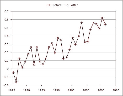
GISS temperature before and after Y2K adjustment
Figure 1: Global temperature anomaly before (red squares) and after (black diamonds) NASA's "Y2K" corrections (Open Mind).

Last updated on 15 January 2013 by dana1981. View Archives

Printable Version  |  Offline PDF Version  |  Link to this page

Argument Feedback

Please use this form to let us know about suggested updates to this rebuttal.

Related Arguments

Comments

1  2  3  4  5  Next

Comments 1 to 25 out of 124:

  1. The graph cannot be right. 1934 is the hottest year, with 1998 second. The graph shows 2005 as hotter than 1998. The whole thing does not ring true, it looks manufactured to promote the alarmists assertions and to minimise the exposed errors.
    Response: The graph is of global temperature. '1934 is the hottest year' applies to US temperature.
  2. Also the graph here only goes back to the end of a 30 year cooling period. And establishes this as the zero point.
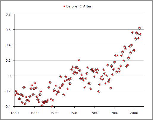
    Response: The point of the graph is to show the miniscule difference before and after the "Y2K correction". The reason it only showed the last 30 years was because if you display an even longer period, the difference is even harder to detect. Here is the same data going back to 1880 (again courtesy of Tamino):

    befaft.jpg

    The difference between the temperature record before the Y2K correction (red dots) and after the correction (black diamonds) is insignificant anytime before 2000 and still barely noticeable after 2000. The change has had practically no detectable impact on the global warming trend over the past 30 years. As for the zero point, temperature anomaly graphs take an average over a specified period (eg - 1960 to 1990) - the temperature anomaly is the difference from this average. The period selected is arbitrary (GISS and CRU use different time periods) as the trend will be the same regardless.
  3. The United States shows no warming trend but that doesn't matter because it's only 2% of the surface area of the Earth, correct? While this is true, the concern here is that the US surface temperature records are regarded as the best in the world. If they show no warming trend, how reliable are the records of countries such as China where there has been massive urbanisation (thus increased heat from cities)? This is an open question. And a legitimate one. It should also be pointed out that the land surface records we have don't show warming trends in South America or Africa or Antarctica. I suppose the only thing we can get out of this is to consider that global warming is perhaps more regional and local in nature and impact than the term would have us assume. Or perhaps we should focus on other temperature measures as the land surface record may not be particularly accurate in and of itself.
  4. A further observation: The seasonal Arctic ice melt is significant (based at least on the short observational records that we have) and it's been argued that it is strong evidence in support of global warming. Yet this area covers only 3% of the planet. Could you please clarify why the 2% land mass of the United States has only an 'infinitesimal effect on global trends' yet the 3% land area of the Arctic is apparently significant 'concrete' proof? Wouldn't the way such information is selectively used or ignored, indicative of certain biases?
  5. "The United States shows no warming trend but that doesn't matter because it's only 2% of the surface area of the Earth, correct?" No. The U.S. definitely shows a warming trend. Look at the actual NASA correction: http://www.columbia.edu/~jeh1/distro_LightUpstairs_70810.pdf 2000 is the hottest year in this graph. Also, although there is a bump in the 30's, the overall trend is clearly up. All that aside, global statistics are clearly what matter for a global phenomenon. If you look around a bit on this site you'll find plenty of references to well-averaged, peer-reviewed data (permafrost, deep ocean temps, etc.) from all over the globe showing warming that matches anthropogenic forcing.
  6. Will Nitschke - "... the US surface temperature records are regarded as the best in the world." Sheesh, some of you Americans have such a superiority complex! Many other nations have excellent temperature records. For example Australia. You can check out our climate statistics at the Australian Bureau of Meteorology. The temperature and rainfall trends down here are ugly and getting worse all the time. Besides that, the temperature of the World's oceans is monitored by a multinational project called Argo. They do it with 3000 floats that alternately rise and sink through the top 2km of as they drift around the oceans.
  7. Will Nitschke, you asked for an explanation as to why the "2% land mass of the United States has only an 'infinitesimal effect on global trends' yet the 3% land area of the Arctic is apparently significant 'concrete' proof?". Your argument is a strawman. No one is claiming that what is happening in the Arctic alone is "significant 'concrete' proof". Your comparison would be fair only if those arguing that GW is happening are basing their arguments entirely on what is happening in the Arctic and no where else, but this is absolutely not true. What is happening in the Arctic, along with what is happening elsewhere around the globe is what is considered.
  8. This post needs updating. USHCN v2 makes a slight adjustment upward in U.S. mean temperature over the last decade, which puts 2006 and 1998 above 1934. Almost nil implication as far as global warming goes, just like the previous adjustment, although one wonders what the spin from the global warming denial crowd will be this time...something like "NASA fabricates data to support hoax! Erases fact that 1934 was the warmest year on record!" "Nov. 14, 2009: USHCN_V2 is now used rather than the older version 1. The only visible effect is a slight increase of the US trend after year 2000 due to the fact that NOAA extended the TOBS and other adjustment to those years. " http://data.giss.nasa.gov/gistemp/graphs/ Revised U.S. data: http://data.giss.nasa.gov/gistemp/graphs/Fig.D.txt
  9. Also, if you look at the US-only graph, you see that after peaking in the 1930's & 1940's, temperatures fall off again (in line with the rapid rise in average sunspot numbers, followed by a sudden dip), but then start to rise again quite quickly-in spite of the fact that average sunspot numbers haven't risen again since the 1950's. Nor do average US temperatures show any sign of falling-as they did in the 1940's!
  10. The Germans also appear to keep track of their temperatures well.
  11. Perhaps the one-line argument should be : "1934 was one of the hottest years in the US, not globally."
    Response: Better, I was really sweating on that 1934/1998/2006 inaccuracy. Thanks for the suggestion, I've updated it.
  12. The hottest year in the U.S. was 1921. 1934 was second. The average temperature for the 48 contiguous states in 1921 was 55.6°F. To confirm this one can read the first paragraph of THE WEATHER OF 1940 IN THE UNITED STATES (W.W. Reed) or THE WEATHER OF 1942 IN THE UNITED STATES (J.L. Baldwin). http://docs.lib.noaa.gov/rescue/mwr/069/mwr-069-02-0049.pdf http://docs.lib.noaa.gov/rescue/mwr/070/mwr-070-12-0271.pdf The average temperature in 1934 was 55.1°F. The original temperature measurements published each month for each state for those years by the U.S. Weather Bureau will add up correctly. BTW... Two-thirds of the state record high temperatures in the U.S. were recorded before 1955. More than half were recorded from 1921-1934. None has been recorded since 2003. Yes, it is warming today, but it also did so during the first half of the last century... and at about the same rate.
  13. Broadlands, you have missed the main (really, the entire) point of this post: The U.S. is only 2% of the globe. "Global warming" by definition means the whole 100% of the globe. So your point is pointless. Nobody is going to argue with you, because it doesn't matter--at all.
  14. Worth noting also, the first day a thermometer is in operation it'll record its first record high. Records will continue to smashed with decreasing frequency in that location. Same deal with a network of thermomeners covering an entire state; most record-breaking years will be found early in the history of the network. I'm left surprised that a state record should be broken as late as 2003. Here's a more sophisticated way of looking at the issue, looking at Meehle 2009.
  15. Tom... Whew! Relieved to know that since the US is only 2% of the globe it doesn't matter. I believe you may have missed a point too... the NCDC-NOAA has systematically lowered the early Weather Bureau records. But since it doesn't matter anyway, its not a problem I guess. Doug... These were not single-day records, but monthly records. The single-day records are, however, similar... 1895-2009, 40 states with record single-day extreme highs before 1955, only 8 extremes after 1975. It is curious that Meehle (your 'sophisticated' way to look at it) chose to look only at the records from 1950 onward. Might this be called sophisticated 'cherry-picking'? In choosing this period he ignored the 30 record states before 1950, 26 of which were set from 1921 to 1934. Furthermore, from 1954 to 1987 there were no state record highs broken at all... not one.
  16. Broadlands, your sources are from 1941 and 1943 - a bit out of date now, don't you think ? If you look at NewYorkJ's comment, you will find more up-to-date and accurate information. From one of the links there, you will find that 1998 was the 'hottest year' in the US, closely followed by 2006, then 1934, 1921, 1999. If you don't trust those figures, that is up to you to explain. Perhaps you should show in what way you believe they have been fiddled somehow. Also, you shouldn't concentrate on daily or monthly maximum temperatures, which are more likely to be the result of local weather - best to concentrate on trends, like this study : The relative increase of record high maximum temperatures compared to record low minimum temperatures in the U.S
  17. I believe you may have missed a point too... the NCDC-NOAA has systematically lowered the early Weather Bureau records. Heavily freighted words. I suppose you'd like us to form some conclusion? Why not say it, or is it more theatrical to leave a decaying, unresolved chord in the dramatic score? These were not single-day records, but monthly records... So what? Put a network of thermometers together, produce a monthly high and low averaged between stations and the same effect I mentioned will apply except more so: most unprecedented and subsequently unparalleled extremes will be found in the earlier history of the network. If there's an overall shift in surface temperature it'll take a while to show up in monthly state-wide records. There's nothing complicated about this. I don't think you understand Meehle's paper, perhaps because you're looking at things through a conspiracy filter. Certainly your failure to understand the expected longitudinal distribution of extremes from a thermometer network suggests you're not very clear on the topic Meehle discusses. Try to be more objective, take the opportunity to learn from Meehle's expertise.
  18. Further to Broadland's remarks, here's something that just popped up: The year 2010 is now tied with 2007 as the year with the most national extreme heat records--fifteen. There has been one country that has recorded its coldest temperature on record in 2010; see my post last week for a list of the 2010 records. My source for extreme weather records is the excellent book Extreme Weather by Chris Burt. His new updates (not yet published) remove a number of old disputed records. Keep in mind that the matter of determining extreme records is very difficult, and it is often a judgment call as to whether an old record is reliable or not. For example, one of 2007's fifteen extreme hottest temperature records is for the U.S.--the 129°F recorded at Death Valley that year. Most weather record books list 1913 as the year the hottest temperature in the U.S. occurred, when Greenland Ranch in Death Valley hit 134°F. However, as explained in a recent Weatherwise article, that record is questionable, since it occurred during a sandstorm when hot sand may have wedged against the thermometer, artificially inflating the temperature. Mr. Burt's list of 225 countries with extreme heat records includes islands that are not independent countries, such as Puerto Rico and Greenland. Seventy four extreme hottest temperature records have been set in the past ten years (33% of all countries.) For comparison, 14 countries set extreme coldest temperature records over the past ten years (6% of all countries). I thank Mr. Burt and weather record researchers Maximiliano Herrera and Howard Rainford for their assistance identifying this year's new extreme temperature records. Jeff Masters Weather Blog
  19. JMurphy and Doug... OK. Here are some numbers. The first column shows weighted monthly temperatures for the 48 contiguous states (no Hawaii or Puerto Rico) derived from the original 1921 US Weather Bureau monthly reports... the Tables in the Condensed Climatological Summary. Example: http://docs.lib.noaa.gov/rescue/mwr/049/mwr-049-12-0684.pdf The average temperature (°F) for each state is given in these official reports. Only the contiguous 48 are used. The second column gives the temperatures from the NCDC-NOAA 1895-2009 US database where, presumably, the same historical information is given for each state, each month. The third column is the amount that the NCDC has lowered each temperature. JAN 36.0 33.8 2.2 FEB 38.5 35.9 2.6 MAR 49.5 47.5 2.0 APR 53.7 52.2 1.5 MAY 61.9 60.5 1.4 JUN 72.1 70.8 1.3 JUL 76.1 75.3 0.8 AUG 73.0 71.6 1.4 SEP 69.0 67.7 1.3 OCT 56.4 54.9 1.5 NOV 44.7 42.9 1.8 DEC 36.7 34.5 2.2 YEAR 55.6 53.9 1.6 Note that the annual average for 1921 has been lowered by 1.6°F. This lowering has the net effect of removing the year 1921 from its position as the warmest year on record in the US... as the Weather Bureau observed in several annual reports I cited earlier. The same pattern of lowering can be found in other years. I've checked 1934, 1938, 1940. All of the original Weather Bureau temperatures have been systematically changed and all have been lowered. The winter months have been lowered more the summer months...every time. It would be absurd to think that some sort of conspiracy has taken place but some plausible explanation should be available for this consistent trend.
  20. Broadlands: It would be absurd to think that some sort of conspiracy has taken place but some plausible explanation should be available for this consistent trend. I'll be you're right. Why not just ask?: "Questions? For all climate questions, please contact the National Climatic Data Center's Climate Services and Monitoring Division: Climate Services and Monitoring Division NOAA/National Climatic Data center 151 Patton Avenue Asheville, NC 28801-5001 fax: +1-828-271-4876 phone: +1-828-271-4800 email: ncdc.info@noaa.gov To request climate data, please E-mail:ncdc.orders@noaa.gov "
  21. Doug... Thanks. I did write to them, back on June 9th. So far, no reply. Maybe you can do better? But, if you do write be careful to ask which of their two averages one should use. There are two for each year... one can be derived from summing the individual states and averaging them as I did for the comparable individual Weather Bureau states. This average differs from their own 48 state average. They argue that the former should not be used because "a simple arithmetic mean is not appropriate". ?? The latter are more appropriate having been state re-weighted... Montana is bigger than Delaware? But, either way, both are consistently lower than the original "raw" weighted Weather Bureau values. More "up-to-date" but very confusing. Three different monthly averages for the year, each lower than the other? I will try to learn from Meehl's (not Meehle) expertise but I'm a bit reluctant to simply accept the conclusions of a study that left out 50 years worth of record high monthly temperatures in 30 states... that's almost two-thirds of the contiguous US. Also, 80% of the record lows occurred before 1950... most in 1917. I've written to Dr. Meehl about why he chose to start his study in 1950.
  22. Broadlands, again, you're not getting a very simple point here. At any temperature station record highs and lows will be distributed in a skewed way, with most appearing nearer to the -beginning- of the station history. You're also missing the notion that later records are more significant. The first record is automatic, the second a little less likely, etc. until once you're into decades of station history new records are both infrequent and represent more unusual excursions. Try setting up a thermometer in the shade at your house w/a tabula rasa record and record local record temperatures and the phenomenon will be easily visible. As to Meehl's selection of the date range, the article is still in press so you're not likely to get a response of any kind until his paper has been published.
  23. Meehl has quickly responded and sent me a copy of his paper, published last December. He wrote this: "We chose 1950 as the starting point because we needed a significant number of US stations with nearly continuous daily temperature measurements. Prior to 1950 the data quality falls off at many stations and there are a lot more missing daily temperatures thus making those stations not usable in our study." The new NCDC and old Weather Bureau records are, of course, monthly with the yearly averages being derived from each. Meehl's co-author said this about their work: "But as the average temperatures continue to rise this century, we will keep setting more record highs." Why shouldn't that apply to the yearly averages derived from monthly data since the northern hemisphere has been rising?
  24. Meehl has quickly responded and sent me a copy of his paper, published last December. Whoops, I stand corrected! I could only find a preprint draft which actually did include the item you quoted, seemed better not to rely on that. As to your last question, if this year is any indication (Moscow, Las Vegas, etc.) Meehl's coauthor seems to be remarking on something visible outside of their work. I can't speak for him but what I'd expect to see is that an overall change in temperature is not going to immediately emerge as a smoothly monotonic increase in global record highs thereby breaking average records year after year but in increasing frequency of excursions in various specific locales. As those point records aggregate and bulk up in relation to broader statistics I'd expect to see much slower movement in the yearly averages, often masked by variability. Taking for instance the case of Moscow we're seeing many contiguous days of temperatures some 25 degrees fahrenheit over norms, but these numbers being folded into a much larger collection of data then will of course in a single year only produce changes at a level of precision we don't look at. Given long enough these changes will work their way up through decimal places and emerge. That's exactly what we see in the global record, variability gradually moving upward. This is something that's amenable to experimentation with a spreadsheet. Folks like Meehl will consider it all old hat but that does not mean you could not have fun with it all.
  25. doug_bostrom at 08:39 AM, I agree that it is the frequency of excursions, rather than the magnitude of individual excursions that are more relevant. For that reason I feel the Quinn reconstruction of El-Nino events is important to put more recent excursions into perspective.

1  2  3  4  5  Next

Post a Comment

Political, off-topic or ad hominem comments will be deleted. Comments Policy...
You need to be logged in to post a comment. Login via the left margin or if you're new, register here.

Link to this page


The Consensus Project Website

THE ESCALATOR

(free to republish)


© Copyright 2024 John Cook
Home | Translations | About Us | Privacy | Contact Us